Guide to Color Theory: Understanding, Applying, and Mastering Color
Table of Contents
- Characteristics of Warm Colors
- Characteristics of Cool Colors
- How Temperature Affects Space
- Creating Balance with Temperature
- Red: Energy and Passion
- Orange: Creativity and Enthusiasm
- Yellow: Happiness and Intellect
- Green: Balance and Growth
- Blue: Calm and Trust
- Purple: Luxury and Creativity
- Black: Sophistication and Power
- White: Purity and Simplicity
- Interior Design
- Graphic Design and Branding
- Fashion and Personal Style
- Art and Painting
- Digital Media
Introduction
Color is one of the most powerful elements in our visual world. It influences our emotions, shapes our perceptions, and communicates without words. Whether you’re a designer, artist, decorator, or simply someone who appreciates the beauty of color, understanding color theory provides you with the tools to use color effectively and purposefully.
This comprehensive guide will take you through the fundamentals of color theory, exploring how colors work together, how they affect our psychological state, and how to apply this knowledge in practical situations. From the basic principles of the color wheel to the nuanced applications of color psychology, this guide aims to enhance your color literacy and empower you to make informed color choices in any context.
Color theory is both a science and an art. It combines objective principles about how colors interact with cultural associations and subjective preferences. By mastering this balance, you’ll gain the ability to create harmonious color palettes, evoke specific moods, and communicate effectively through color.
Let’s begin our journey through the fascinating world of color theory, starting with the cornerstone of color relationships: the color wheel.
Color Wheel 101: The Foundation of Color Theory
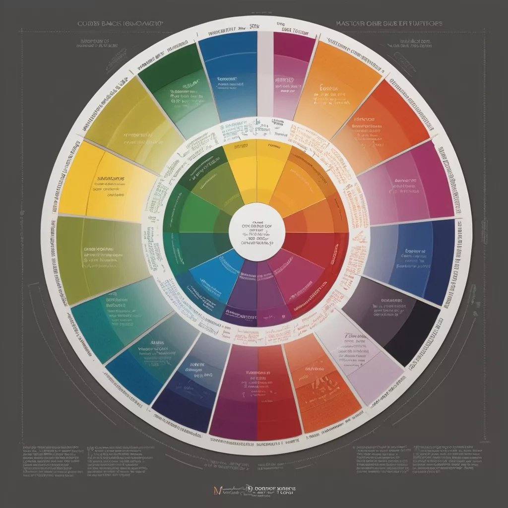
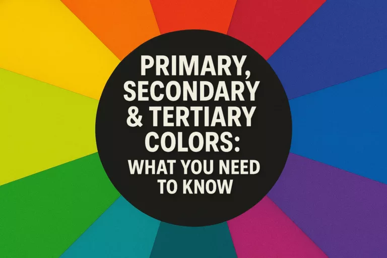
The color wheel is a visual representation of colors arranged according to their chromatic relationship. First developed by Sir Isaac Newton in 1666, the color wheel has become the fundamental tool for understanding how colors relate to one another.
Primary Colors
Primary colors are the building blocks of color theory. These are colors that cannot be created by mixing other colors together. In traditional color theory (using pigments like paint), the primary colors are:
- Red: A warm, vibrant color associated with passion and energy
- Yellow: A bright, attention-grabbing color linked to optimism and clarity
- Blue: A cool, calming color connected to peace and reliability
These three colors form the foundation of the color wheel and serve as the basis for creating all other colors.
Secondary Colors
Secondary colors are created by mixing equal parts of two primary colors:
- Green (Blue + Yellow): Represents growth, harmony, and freshness
- Orange (Red + Yellow): Conveys enthusiasm, creativity, and determination
- Purple (Red + Blue): Symbolizes royalty, luxury, and ambition
Secondary colors sit between the primary colors they’re created from on the color wheel, forming the next layer of the wheel’s structure.
Tertiary Colors
Tertiary colors are formed by mixing a primary color with its adjacent secondary color. These create the subtle variations that complete the 12-part color wheel:
- Red-Orange (Vermilion)
- Yellow-Orange (Amber)
- Yellow-Green (Chartreuse)
- Blue-Green (Teal)
- Blue-Purple (Violet)
- Red-Purple (Magenta)
Tertiary colors add complexity and nuance to the color wheel, providing a wider range of options for color schemes and combinations.
The Art of Color Mixing
Understanding how colors mix is essential for practical applications of color theory. There are two primary systems of color mixing:
Subtractive Color Mixing (CMYK):
- Used in printing and traditional art forms
- Primary colors are Cyan, Magenta, Yellow, and Black (Key)
- Colors absorb (subtract) certain wavelengths of light and reflect others
- Mixing all colors theoretically creates black (though in practice often creates a muddy brown)
Additive Color Mixing (RGB):
- Used in digital displays, lighting, and projected media
- Primary colors are Red, Green, and Blue
- Colors are created by adding light wavelengths together
- Mixing all colors creates white
Mastering color mixing requires practice and observation. Key principles to remember:
- Colors opposite each other on the wheel (complementary colors) create maximum contrast
- Mixing complementary colors creates neutral tones (grays and browns)
- Adding white to a color creates a tint
- Adding black to a color creates a shade
- Adding gray to a color creates a tone
Color Properties
To truly understand and work with color effectively, you need to be familiar with the four main properties of color:
Hue
Hue is the purest form of a color, without any tint or shade added. It’s what we typically mean when we name a color like “red” or “blue.” Hues are the colors positioned around the color wheel in their purest form.
Value
Value refers to the lightness or darkness of a color. Adding white to a hue creates a tint (making it lighter), while adding black creates a shade (making it darker). Value is crucial for creating depth, contrast, and visual hierarchy in designs.
Saturation
Saturation (also called chroma or intensity) refers to the purity or vividness of a color. Highly saturated colors appear vibrant and intense, while desaturated colors appear muted, subtle, or grayish. Controlling saturation helps create mood and focus in a composition.
Temperature
Temperature divides colors into warm (reds, oranges, yellows) and cool (blues, greens, purples) categories. Color temperature can significantly impact the perceived mood, energy, and spatial qualities of a design.
Warm vs. Cool Colors: Creating Balance and Energy
The temperature of colors plays a crucial role in how they affect our perception and emotional response. Understanding the distinction between warm and cool colors allows you to manipulate space, create balance, and evoke specific atmospheres.
Characteristics of Warm Colors
Warm colors include reds, oranges, yellows, and variations like coral, amber, and terracotta. These colors:
- Appear to advance toward the viewer, making spaces feel cozier and more intimate
- Evoke feelings of energy, optimism, and passion
- Create a sense of warmth, comfort, and stimulation
- Grab attention quickly and can be used as focal points
- Are associated with sunshine, fire, and heat
Psychological effects: Warm colors tend to energize a space and stimulate conversation. They can increase appetite, heart rate, and even perceived temperature.
Characteristics of Cool Colors
Cool colors include blues, greens, purples, and variations like teal, mint, and lavender. These colors:
- Appear to recede, making spaces feel more spacious and open
- Evoke feelings of calm, peace, and relaxation
- Create a sense of serenity, focus, and clarity
- Have a more subtle presence and can serve as excellent backgrounds
- Are associated with water, nature, and sky
Psychological effects: Cool colors tend to calm and soothe. They can decrease perceived temperature, create focus, and promote a sense of tranquility.
How Temperature Affects Space
Color temperature has significant implications for spatial perception:
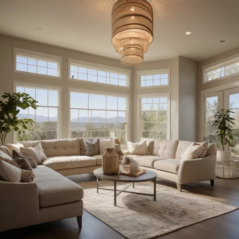
- Warm colors in interiors: Make large rooms feel more intimate, cozier, and welcoming. They’re excellent for gathering spaces like living rooms and dining areas.
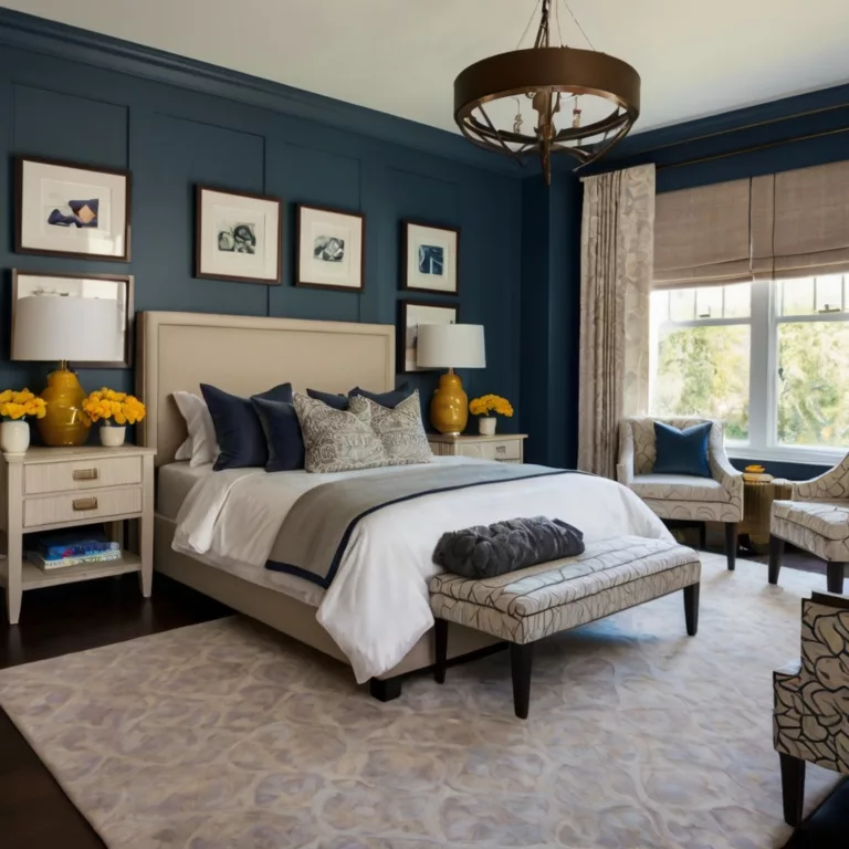
- Cool colors in interiors: Make small spaces feel larger and more open. They work well in bathrooms, bedrooms, and offices where relaxation or focus is desired.
- Warm colors in art and design: Draw attention, create focal points, and bring elements forward in the visual plane.
- Cool colors in art and design: Create depth, establish background elements, and provide visual relief.
Creating Balance with Temperature
Most successful color schemes incorporate both warm and cool colors to create balance and visual interest. Consider these approaches:
- Dominant temperature with accents: Use one temperature family as the main palette with small touches of the opposite temperature as accents.
- Temperature zoning: Designate different areas within a space for warm and cool colors to create distinct functional zones.
- Temperature gradients: Create a smooth transition from warm to cool or vice versa to guide the eye through a design.
- Neutral bridge: Use neutral colors (beige, gray, white) to mediate between warm and cool color areas.
The interaction between warm and cool colors creates dynamic tension that can make your designs more engaging and harmonious.
Color Harmonies and Schemes
Color harmonies are structured ways to combine colors that create visually pleasing results. These proven formulas provide a starting point for creating effective color combinations.
Monochromatic
A monochromatic color scheme uses variations in lightness and saturation of a single hue. This creates a cohesive, unified look that’s elegant and easy to manage.
Characteristics:
- Subtle and sophisticated
- Creates a sense of cohesion and harmony
- Works well for minimalist designs
- Can lack contrast if not carefully implemented
Best uses: Corporate identities, elegant interiors, and situations where you want a color to take center stage without competition.
Complementary
Complementary color schemes use colors from opposite sides of the color wheel. These high-contrast combinations create vibrant, energetic looks.
Characteristics:
- Maximum contrast and visual impact
- Creates vibration when placed adjacently
- Can be overwhelming if not balanced with neutrals
- Creates a dynamic tension that draws attention
Best uses: Calls to action, warning signs, sports teams, and any design where you want to create strong visual impact.
Split Complementary
A split complementary scheme uses a base color plus the two colors adjacent to its complement. This provides high contrast while being less intense than a pure complementary scheme.
Characteristics:
- Vibrant but less tension than complementary
- Provides more variety than complementary schemes
- Easier to balance than pure complementary
- Creates a sense of harmony with visual interest
Best uses: Websites, marketing materials, and designs where you want visual appeal without overwhelming contrast.
Analogous
Analogous color schemes use colors that are adjacent to each other on the color wheel. These harmonious combinations are found abundantly in nature.
Characteristics:
- Harmonious and pleasing to the eye
- Creates a serene, comfortable design
- Easy to apply successfully
- Can lack contrast if not carefully implemented
Best uses: Interior design, websites aiming for comfortable user experiences, natural product branding.
Triadic
A triadic color scheme uses three colors equally spaced around the color wheel. This provides vibrant contrast while maintaining balance and color richness.
Characteristics:
- Vibrant even when using paler or unsaturated colors
- Provides visual interest and balance
- Can be bold and playful
- Offers good contrast
Best uses: Children’s products, creative businesses, artistic applications, and designs targeting younger audiences.
Tetradic (Double Complementary)
A tetradic color scheme uses four colors arranged in two complementary pairs. This rich scheme offers plenty of possibilities for variation.
Characteristics:
- Offers the most variety of all schemes
- Can be overwhelming if all colors are used in equal amounts
- Works best when one color dominates
- Provides both contrast and harmony opportunities
Best uses: Seasonal designs, complex branding systems where variety is needed, and designs requiring multiple accent colors.
Color Psychology: Emotional and Psychological Impact
Colors evoke emotional and psychological responses based on both biological and cultural factors. Understanding these associations allows you to use color strategically to influence mood, perception, and behavior.
Red: Energy and Passion
Psychological effects: Stimulates energy, increases heart rate and respiration, boosts appetite, creates urgency
Positive associations: Love, passion, excitement, strength, importance
Negative associations: Anger, danger, warning, aggression
Marketing applications: Sales, clearance items, fast-food establishments, impulse purchases
Interior design effects: Stimulates conversation, creates intimate atmosphere in social spaces
Orange: Creativity and Enthusiasm
Psychological effects: Stimulates enthusiasm and creativity, promotes social interaction, energizes
Positive associations: Warmth, excitement, adventure, optimism, affordability
Negative associations: Frivolity, immaturity, attention-seeking
Marketing applications: Budget offers, creative products, children’s items, food establishments
Interior design effects: Creates warmth in rooms with northern exposure, stimulates appetite in dining areas
Yellow: Happiness and Intellect
Psychological effects: Stimulates mental activity, generates optimism, increases energy
Positive associations: Sunshine, joy, intellect, hope, optimism
Negative associations: Caution, cowardice, anxiety (in certain shades)
Marketing applications: Window displays, children’s products, affordable items, mental stimulation
Interior design effects: Brightens dark spaces, creates cheerful atmospheres, works well in kitchens and studies
Green: Balance and Growth
Psychological effects: Creates balance, promotes restfulness, reduces anxiety, easiest color for the eye to process
Positive associations: Nature, growth, freshness, wealth, abundance
Negative associations: Envy, inexperience, illness (in certain shades)
Marketing applications: Environmental products, financial services, organic goods, wellness brands
Interior design effects: Creates calming transition between spaces, connects interiors with exteriors
Blue: Calm and Trust
Psychological effects: Lowers blood pressure, reduces appetite, promotes tranquility and security
Positive associations: Trust, reliability, professionalism, serenity, strength
Negative associations: Coldness, depression, passivity
Marketing applications: Banking, insurance, technology, healthcare, corporate identities
Interior design effects: Makes spaces feel larger, promotes concentration in offices, creates restful feeling in bedrooms
Purple: Luxury and Creativity
Psychological effects: Stimulates imagination, associated with spiritual awareness and creativity
Positive associations: Royalty, luxury, wisdom, dignity, creativity
Negative associations: Artificiality, excess, immaturity
Marketing applications: Luxury goods, anti-aging products, artistic ventures
Interior design effects: Adds richness and depth to spaces, creates dramatic backdrops
Black: Sophistication and Power
Psychological effects: Creates feelings of power, sophistication, and authority
Positive associations: Elegance, formality, power, strength, authority
Negative associations: Death, evil, mourning, mystery
Marketing applications: Luxury products, sophisticated brands, authoritative messaging
Interior design effects: Creates contrast, adds definition, makes spaces feel smaller and more intimate
White: Purity and Simplicity
Psychological effects: Creates feelings of purity, cleanliness, and space
Positive associations: Innocence, purity, cleanliness, simplicity, efficiency
Negative associations: Sterility, coldness, emptiness
Marketing applications: Health products, minimalist design, tech products
Interior design effects: Makes spaces feel larger and brighter, creates clean backdrops for other design elements
Cultural Context of Color
Color meanings vary significantly across cultures, making cultural awareness essential when designing for global audiences. Understanding these cultural differences prevents miscommunication and potential offense.
Western Color Associations
- White: Purity, cleanliness, simplicity, weddings
- Black: Formality, sophistication, death, mourning
- Red: Love, passion, danger, importance
- Blue: Trust, stability, masculinity, corporate
- Green: Nature, luck (Ireland), money, environmental consciousness
- Yellow: Happiness, caution, optimism
- Purple: Royalty, luxury, spirituality
Eastern Color Associations
- White: Death, mourning (China, Korea, Japan), purity
- Red: Good fortune, celebration, joy, prosperity (China)
- Gold: Wealth, prosperity, importance
- Yellow: Imperial (China), commerce (Japan), mourning (Egypt)
- Green: Eternity, family, harmony, health (China), youth and energy (Japan), sacred (Middle East)
- Blue: Immortality, healing (China), villainy (Japan)
- Black: Career, knowledge (China), masculinity (Japan)
Cultural Considerations in Design
When designing for multicultural audiences, consider these principles:
- Research target cultures: Understand specific color associations for your target audience.
- Consider context: The meaning of colors can change based on context and combination with other colors.
- Use color combinations: Cultural sensitivity to individual colors may be mitigated by thoughtful combinations.
- Test designs: When possible, test designs with members of the target culture.
- Allow for customization: For digital products, consider allowing users to select color themes.
Practical Applications of Color Theory
Color theory finds application across numerous fields. Here’s how these principles are applied in various contexts:
Interior Design
In interior design, color theory helps create spaces that feel harmonious, functional, and emotionally appropriate:
- Room size perception: Cool colors make spaces feel larger; warm colors make them feel cozier.
- Natural light considerations: Northern light (bluer) is complemented by warm colors; southern light (warmer) works well with cool colors.
- Functional zoning: Different color temperatures help define functional areas within open-plan spaces.
- Color flow: Related colors create smooth transitions between rooms.
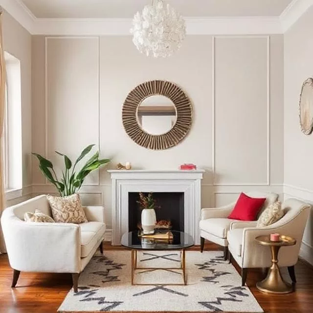
- 60-30-10 rule: A classic interior design formula where 60% of a room is a dominant color, 30% a secondary color, and 10% an accent color.
Graphic Design and Branding
In graphic design and branding, color serves as a powerful communication tool and identity marker:
- Brand recognition: Consistent color usage increases brand recognition by up to 80%.
- Hierarchy and navigation: Color directs attention and creates visual pathways through information.
- Emotional targeting: Colors are chosen to evoke specific emotions aligned with brand values.
- Accessibility: Color combinations must maintain sufficient contrast for readability.
- Reproduction considerations: Colors are selected with consideration for how they’ll appear across different media.
Fashion and Personal Style
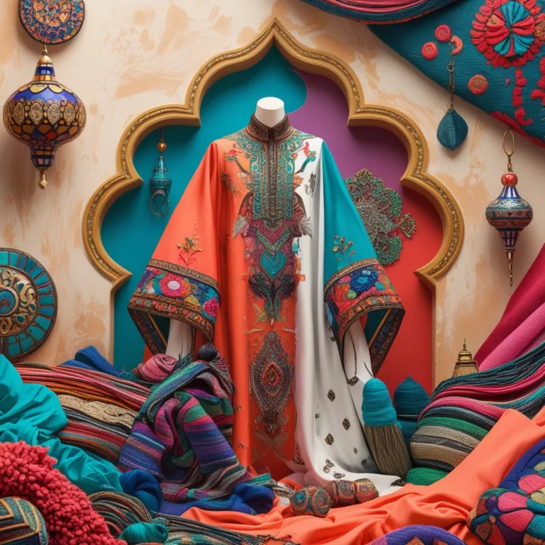
In fashion and personal styling, color theory helps create flattering, cohesive, and expressive wardrobes:
- Color seasons: Personal coloring (skin, hair, eyes) is categorized into seasons to determine flattering colors.
- Capsule wardrobes: Limited color palettes help create versatile, mix-and-match collections.
- Color blocking: Strategic use of color creates visual interest and can alter perceived body proportions.
- Emotional dressing: Colors are chosen to influence mood or project specific impressions.
- Cultural context: Color choices respond to cultural significance and situational appropriateness.
Art and Painting
In fine art, color theory provides tools for expression, composition, and visual impact:
- Color mixing: Artists use color theory to create precise hues and avoid muddy mixtures.
- Atmospheric perspective: Cool colors recede while warm colors advance, creating depth.
- Emotional expression: Color palettes are chosen to convey emotional tone and narrative elements.
- Color harmony: Various color schemes create different aesthetic effects.
- Optical mixing: Techniques like pointillism use visual blending of separate colors.
Digital Media
In digital contexts, color theory influences user experience, engagement, and functionality:
- User interface design: Colors guide users through digital experiences and communicate interactive elements.
- Accessibility standards: WCAG guidelines ensure sufficient contrast for users with visual impairments.
- Cross-device compatibility: Colors are selected to display consistently across different screens.
- Dark/light modes: Color systems adapt to different viewing conditions while maintaining brand identity.
- Data visualization: Colors help users interpret information quickly and accurately.
Color Systems
Multiple color systems exist for different applications. Understanding these systems helps you work effectively across different media.
RGB: Digital Color
Description: An additive color model where red, green, and blue light are combined to create colors.
Values: Expressed as three numbers from 0-255 (e.g., pure red is 255,0,0)
Primary application: Digital displays, web design, and any screen-based media
Key characteristics:
- Creates colors by adding light
- Primary colors are red, green, and blue
- White is created when all colors are at maximum (255,255,255)
- Black is created when all colors are at minimum (0,0,0)
CMYK: Print Color
Description: A subtractive color model using cyan, magenta, yellow, and black inks.
Values: Expressed as percentages (e.g., pure cyan is 100,0,0,0)
Primary application: Commercial printing, print publications
Key characteristics:
- Creates colors by absorbing (subtracting) light
- Primary colors are cyan, magenta, and yellow
- Black (K) is added for true darkness and to save ink
- Colors often appear duller than RGB equivalents
Pantone: Standardized Color
Description: A proprietary color matching system ensuring color consistency.
Values: Expressed as PMS numbers (e.g., Pantone 300 C)
Primary application: Brand colors, product manufacturing, specialized printing
Key characteristics:
- Provides exact color specifications independent of display or printing method
- Includes specialty colors like metallics and fluorescents
- Ensures consistency across different materials and applications
- Used as the industry standard for color communication
HSB/HSV: Design-Oriented Color
Description: A color model organizing colors by hue, saturation, and brightness/value.
Values: Hue (0-360°), Saturation (0-100%), Brightness/Value (0-100%)
Primary application: Design software, color selection interfaces
Key characteristics:
- Organizes colors in a way that’s intuitive for designers
- Separates color identity (hue) from qualities (saturation/brightness)
- Makes systematic color adjustment easier
- Facilitates creating harmonious color relationships
Advanced Color Concepts
Beyond the basics, these advanced concepts deepen your understanding of how colors interact and are perceived.
Color Constancy
Color constancy is the phenomenon where our brain perceives colors as relatively constant despite changes in lighting conditions. This perceptual mechanism helps us recognize objects under different illumination:
- Our visual system automatically compensates for color casts from lighting
- This explains why a white shirt appears white under both daylight and incandescent light
- Designers must be aware of this effect when selecting colors for different environments
- The famous “blue/gold dress” controversy demonstrated how this mechanism can be tricked
Simultaneous Contrast
Simultaneous contrast occurs when our perception of a color is affected by surrounding colors:
- A gray square appears darker when surrounded by white and lighter when surrounded by black
- Colors appear more vibrant when surrounded by their complementary colors
- This effect can be used strategically to enhance or modify color appearance
- In design, this means colors must be evaluated in context, not in isolation
Optical Color Mixing
Optical color mixing occurs when two or more colors are perceived as blending into a new color when viewed from a distance:
- Used extensively in pointillist painting and print techniques
- Explains how RGB pixels on screens create the illusion of continuous color
- Creates more vibrant color impressions than physical mixing
- Used in textiles through techniques like dithering and halftone printing
Additive vs. Subtractive Color
Understanding the difference between additive and subtractive color mixing is essential for working across different media:
- Additive color (light): RGB, starts with black (no light), adds colored light to create brightness
- Subtractive color (pigment): CMYK, starts with white (paper/surface), adds pigments that subtract wavelengths
- Digital designs must be converted appropriately when transitioning to print
- Each system has different gamut limitations (range of possible colors)
Conclusion
Color theory provides a rich framework for understanding, combining, and applying colors effectively. By mastering the principles outlined in this guide, you’ll develop a more sophisticated color sensibility that enhances your creative work, whether in design, art, fashion, or interior spaces.
Remember that while color theory provides valuable guidelines, it’s not a rigid set of rules. Personal preference, cultural context, and specific project requirements all influence appropriate color choices. The most successful color applications balance theoretical knowledge with aesthetic intuition and practical considerations.
As you continue exploring color, maintain a spirit of experimentation. Observe how colors interact in the world around you, analyze color usage in designs you admire, and build your own color literacy through practice and observation.
Color is one of our most powerful tools for communication, expression, and creating memorable experiences. With the knowledge from this guide, you’re well-equipped to harness this power in your own creative endeavors.
Further Resources
To continue your exploration of color theory, consider these resources:
Books:
- “Interaction of Color” by Josef Albers
- “Color: A Course in Mastering the Art of Mixing Colors” by Betty Edwards
- “The Elements of Color” by Johannes Itten
Online Tools:
- Adobe Color (color.adobe.com)
- Coolors.co
- ColorSpace (mycolor.space)
Further Learning:
- Color theory courses on platforms like Skillshare, LinkedIn Learning, and Coursera
- Museum exhibitions focused on color in art and design
- Color forecasting resources like Pantone Color Institute
Remember that mastering color is a lifelong journey. The more you work with color, the more refined your sensitivity and application will become.
Art11deco

