Colors in Interior Design
Introduction: The Power of Color in Your Home
Color is perhaps the most fundamental and impactful element in interior design. Beyond mere aesthetics, colors influence our emotions, perceptions, behaviors, and even our physical well-being. The right color palette can transform an ordinary space into something extraordinary creating harmony, highlighting architectural features, establishing visual connections between rooms, and reflecting your personal style.
This comprehensive guide will walk you through everything you need to know about using color effectively in your home. From color theory basics to room-specific recommendations, we’ll explore how to create spaces that not only look beautiful but also feel exactly the way you want them to.
Understanding Color Theory for Interior Design
The Color Wheel: Your Design Foundation
The color wheel is the cornerstone of color theory and provides a visual representation of how colors relate to one another:
- Primary Colors: Red, blue, and yellow—the three colors that cannot be created by mixing other colors
- Secondary Colors: Green, orange, and purple—created by mixing two primary colors
- Tertiary Colors: Yellow-orange, red-orange, red-purple, blue-purple, blue-green, and yellow-green—created by mixing primary and secondary colors
Color Relationships That Work
Understanding these relationships helps create harmonious color schemes:
- Complementary Colors: Colors opposite each other on the color wheel (blue and orange, red and green) create strong contrast and visual interest
- Analogous Colors: Colors adjacent to each other on the color wheel (blue, blue-green, green) create a serene and comfortable design
- Triadic Colors: Three colors equally spaced around the color wheel create a vibrant and balanced look
- Monochromatic Colors: Different shades, tints, and tones of a single color create a sophisticated, cohesive look
The Psychology of Color
Colors affect our mood and behavior in profound ways:
- Red: Energizing, stimulating, and passionate—increases heart rate and appetite
- Orange: Warm, welcoming, and energetic—promotes enthusiasm and creativity
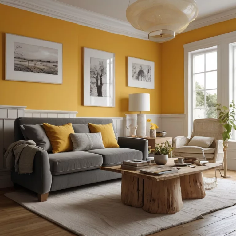
- Yellow: Bright, cheerful, and attention-grabbing—stimulates mental activity and optimism
- Green: Natural, restful, and balanced—promotes relaxation and harmony
- Blue: Calming, peaceful, and serene—lowers blood pressure and heart rate
- Purple: Luxurious, creative, and contemplative—stimulates problem-solving and introspection
- White: Clean, pure, and spacious—creates a sense of clarity and openness
- Black: Sophisticated, formal, and dramatic—creates depth and contrast
- Gray: Neutral, sophisticated, and balanced—provides a perfect backdrop for other colors
How to Choose the Perfect Colors for Every Room
Consider the Room’s Purpose and Function
Start by asking what activities will take place in the space:
- Will you be entertaining guests or relaxing privately?
- Is it a high-energy space (kitchen, home gym) or a low-energy space (bedroom, reading nook)?
- How much time will you spend in the space?
Evaluate the Room’s Natural Light
Light dramatically affects how colors appear:
- North-facing rooms: Receive less direct sunlight and can feel cooler, so warmer colors can counter this effect
- South-facing rooms: Receive ample warm light throughout the day, making both cool and warm colors work well
- East-facing rooms: Receive morning light that casts a yellow glow, with colors appearing cooler later in the day
- West-facing rooms: Receive afternoon light that casts a warm glow, with colors appearing cooler in the morning
Consider the Room’s Size and Proportions
- Small rooms: Lighter colors typically make spaces feel larger and more open
- Large rooms: Darker colors can make spaces feel more intimate and cozy
- Low ceilings: Lighter ceiling colors create the illusion of height
- High ceilings: Darker ceiling colors can make the space feel more grounded
Factor in Existing Elements
- Flooring, cabinetry, furniture, and architectural features that will remain in the space
- Art, textiles, or collections you wish to highlight
- Views from windows that will interact with your interior palette
Use the 60-30-10 Rule
A classic interior design principle for balanced color distribution:
- 60%: Dominant color (walls, large furniture pieces)
- 30%: Secondary color (accent furniture, textiles)
- 10%: Accent color (accessories, artwork, small decorative elements)
Living Room Colors: Create a Cozy & Stylish Space
The living room is typically the heart of the home—a multifunctional space for relaxation, entertainment, and connection.
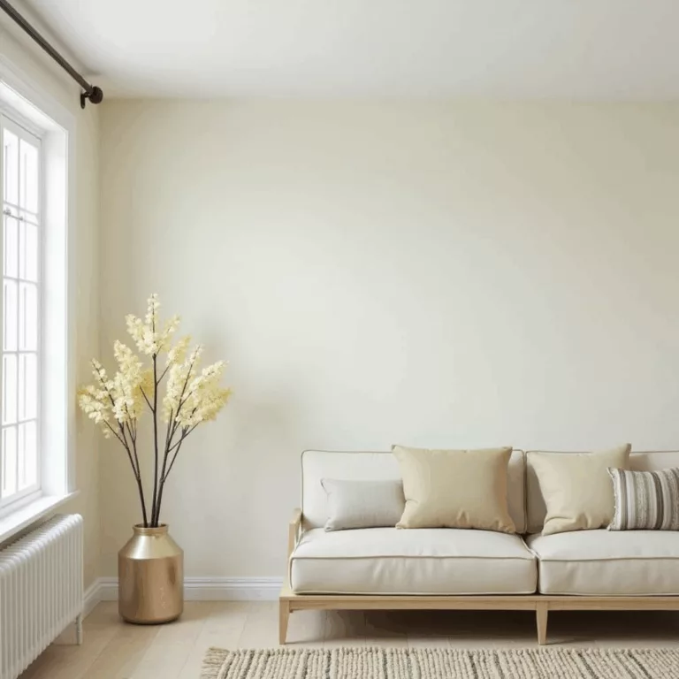
Warm Neutrals for Timeless Comfort
Beige, taupe, warm gray, and greige (gray-beige) create a versatile foundation that:
- Works with virtually any accent color
- Creates a timeless backdrop for changing trends
- Provides flexibility as your style evolves
Designer Tip: Layer different textures in similar neutral tones to create depth and interest without overwhelming the space.
Blues and Greens for Relaxation
From soft sage to deep navy, these colors:
- Promote relaxation and conversation
- Create a sense of tranquility
- Connect the indoors with nature
Designer Tip: Pair blues and greens with natural elements like wood and stone to enhance their calming effect.
Earthy Tones for Grounded Sophistication
Terracotta, olive, ochre, and rust:
- Create a warm, welcoming atmosphere
- Add richness and depth
- Connect to natural elements
Designer Tip: Incorporate these colors through textiles and accent furniture for a trendy yet timeless look.
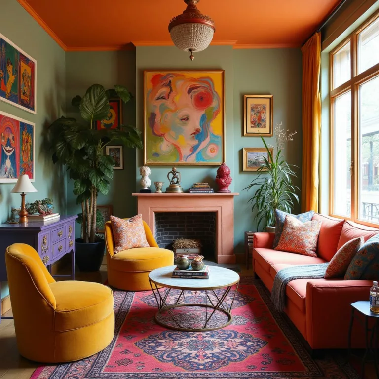
Statement Colors for Personality
Deep jewel tones like emerald, sapphire, and ruby:
- Create a sophisticated, memorable space
- Express confidence and personality
- Establish a strong design direction
Designer Tip: If using bold colors on walls feels overwhelming, incorporate them through a statement sofa or accent chairs instead.
Bedroom Colors for Better Sleep & Relaxation
Your bedroom should be a sanctuary that promotes rest and rejuvenation.
Soft Blues for Quality Sleep
Pale blue to soft dusty blue:
- Lowers blood pressure and heart rate
- Reduces stress and anxiety
- Creates a feeling of serenity
Designer Tip: Pair blue with crisp white for a clean, coastal feel or with warm woods for a more grounded, cozy effect.
Gentle Greens for Natural Calm
Sage, mint, and soft olive:
- Connect to nature and promote healing
- Create a refreshing yet soothing atmosphere
- Work beautifully with natural textiles
Designer Tip: Layer different shades of green with plenty of texture for a calming, multidimensional look.
Warm Neutrals for Cozy Comfort
Soft beige, warm gray, and taupe:
- Create a cocooning effect
- Promote feelings of security
- Provide versatility with accent colors
Designer Tip: Incorporate these colors in plush fabrics like velvet, chenille, or bouclé for maximum coziness.
Soft Lavender for Gentle Relaxation
Pale purples with gray undertones:
- Promote restful sleep and relaxation
- Add a subtle touch of luxury
- Create a uniquely serene atmosphere
Designer Tip: Choose lavenders with gray undertones for sophistication rather than overly sweet purple shades.
Colors to Avoid in Bedrooms
- Bright red: Too stimulating and may increase heart rate
- Pure white: Can feel clinical and stark
- Neon or fluorescent shades: Disrupt sleep and relaxation
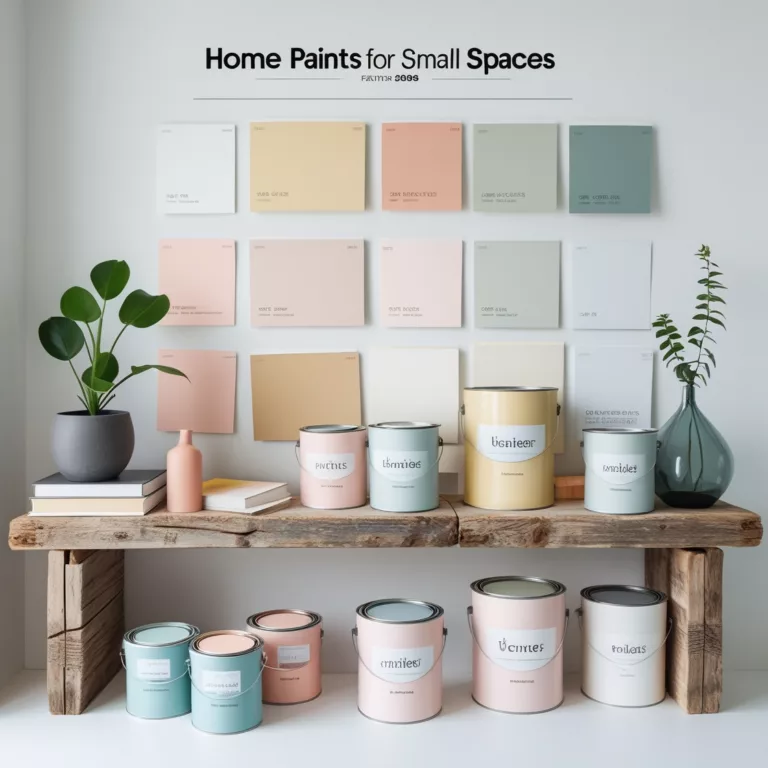
Make Small Spaces Look Bigger with the Right Colors
Strategic color choices can dramatically affect the perception of space.
Light Neutrals for Visual Expansion
Soft whites, light grays, and pale beiges:
- Reflect light to make spaces feel airier
- Create a seamless look that expands visual boundaries
- Provide a calm backdrop that doesn’t overwhelm small spaces
Designer Tip: Paint trim and moldings the same color as walls in small spaces to create an uninterrupted visual flow.
Monochromatic Color Schemes for Cohesion
Using different shades of the same color:
- Creates depth without visual interruption
- Makes space feel more cohesive and therefore larger
- Provides sophisticated simplicity
Designer Tip: Incorporate texture through different fabrics and materials to add interest to a monochromatic scheme.
Strategic Accent Colors
Using color as a focal point:
- Draws the eye to specific areas
- Creates intentional visual interest
- Distracts from size limitations
Designer Tip: A single bold accent wall at the far end of a small room can create the illusion of depth and distance.
Cool Colors for Receding Effects
Light blues, greens, and purples:
- Visually recede, making walls appear farther away
- Create a sense of openness and airiness
- Promote a calming atmosphere in tight quarters
Designer Tip: The lighter and cooler the color, the more expansive a space will feel.
Color Continuity Between Spaces
Carrying the same color palette through connected spaces:
- Removes visual barriers between rooms
- Creates flow throughout the home
- Makes each individual space feel like part of a larger whole
Designer Tip: Use different intensities of the same colors in connected spaces to create subtly defined zones while maintaining cohesion.
Neutral Colors: How to Keep Them Chic, Not Boring
Neutrals provide a sophisticated foundation but require thoughtful application to avoid blandness.
Layering Neutrals with Texture
Adding tactile dimension through:
- Natural materials like wood, stone, and rattan
- Textiles such as bouclé, linen, wool, and velvet
- Textured wallcoverings, plaster finishes, or grasscloth
Designer Tip: Mix at least three different textures in a neutral room to create visual and tactile interest.
Playing with Undertones
Understanding that neutrals have subtle color bases:
- Warm neutrals: Yellow, red, or orange undertones
- Cool neutrals: Blue, green, or purple undertones
Designer Tip: Choose neutrals with consistent undertones throughout a space for harmony, or deliberately contrast warm and cool neutrals for dynamic tension.
Adding Metallic Accents
Incorporating metals for sophistication:
- Brass and gold add warmth and luxury
- Silver and chrome add sleek, contemporary contrast
- Bronze and copper add rich, earthy warmth
Designer Tip: Mix metallic finishes for a collected, evolved look rather than a matched set.
Using Pattern in Neutral Spaces
Adding visual interest through:
- Geometric patterns for contemporary energy
- Organic patterns for natural softness
- Tone-on-tone patterns for subtle sophistication
Designer Tip: In a neutral space, patterns become more noticeable—use this to highlight special pieces.
Strategic Moments of Contrast
Creating visual anchors with:
- Black accents for dramatic punctuation
- Dark wood for grounding warmth
- Matte black fixtures for contemporary edge
Designer Tip: Every neutral room needs at least one element that provides significant contrast—it creates a visual resting point and prevents the eye from gliding past.
Kitchen Color Trends That Boost Appetite & Energy
The kitchen is a high-energy space where color can enhance function and pleasure.
White Kitchens with Personality
Evolving the classic white kitchen:
- Warm whites rather than stark whites
- Textured subway tiles or zellige tiles
- Contrasting islands in wood or color
Designer Tip: Choose a white with subtle undertones that complement your countertop material and flooring.
Nature-Inspired Greens
From sage to olive to emerald:
- Connect to natural elements
- Create a fresh, invigorating atmosphere
- Complement both wood tones and metallics
Designer Tip: Green cabinetry paired with marble or quartzite with green veining creates a sophisticated, cohesive look.
Moody Blues for Sophisticated Depth
Navy, indigo, and deep slate blue:
- Create a grounded, elegant foundation
- Work beautifully with brass hardware
- Provide timeless appeal
Designer Tip: Blue cabinetry with a matte finish feels more contemporary than high-gloss.
Warm Woods and Earthy Tones
Natural wood cabinetry and earthy colors:
- Create a welcoming, comfortable atmosphere
- Connect to nature and organic materials
- Add warmth to cool countertop materials
Designer Tip: Mix wood tones for a more collected, natural look—just ensure they share similar undertones.
Two-Tone Cabinetry for Dynamic Balance
Combining complementary colors:
- Lower cabinets in darker shades for grounding
- Upper cabinets in lighter shades for airiness
- Island in a contrasting color as a focal point
Designer Tip: Keep countertops consistent between different cabinet colors to tie the look together.
Bathroom Colors That Create a Spa-Like Atmosphere
Bathrooms benefit from colors that promote cleanliness and relaxation.
Tranquil Blues and Aquas
Ocean and water-inspired tones:
- Create a natural connection to water elements
- Promote feelings of cleanliness
- Induce a sense of calm
Designer Tip: Pair watery blues with white fixtures for a crisp, clean look.
Elegant Marble-Inspired Palettes
Colors that reference natural stone:
- Soft whites with gray veining
- Pale greens reminiscent of verde marble
- Warm beiges inspired by travertine
Designer Tip: Pull the accent colors for towels and accessories from the veining in your marble or stone.
Soft Greens for Natural Rejuvenation
Sage, mint, and eucalyptus tones:
- Create a connection to nature
- Promote feelings of renewal
- Add freshness to typically small spaces
Designer Tip: Continue green elements through plants that thrive in bathroom environments for a truly rejuvenating space.
Warm Neutrals for Cozy Luxury
Taupe, beige, and warm gray:
- Create a cocooning effect
- Complement natural wood beautifully
- Add warmth to typically cold surfaces
Designer Tip: Incorporate natural materials like wood, bamboo, or cork to enhance the organic warmth.
Deep Colors for Intimate Drama
Charcoal, navy, or forest green:
- Create a sense of luxurious envelopment
- Make small spaces feel intentionally intimate
- Provide dramatic contrast with white fixtures
Designer Tip: Ensure ample lighting in dark-colored bathrooms to prevent the space from feeling gloomy.
Bold Colors: How to Use Them Without Overwhelming Your Space
Strong colors create memorable spaces when used strategically.
The Power of a Single Bold Wall
Creating a focal point through:
- An accent wall behind a bed or sofa
- A painted ceiling for unexpected drama
- A bold entry or hallway that transitions to quieter spaces
Designer Tip: Choose a wall that already has architectural significance for your accent color.
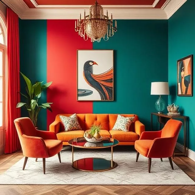
Strategic Color Blocking
Defining zones with distinct colors:
- Partial wall applications that highlight specific areas
- Two-tone walls with darker colors below and lighter above
- Color changes that follow architectural transitions
Designer Tip: Use trim or molding to create clean transitions between different colored sections.
Bold Colors in Transitional Spaces
Making an impact in areas with limited dwell time:
- Powder rooms
- Hallways
- Entryways
- Laundry rooms
Designer Tip: Small transitional spaces are perfect for experimenting with dramatic colors or patterns you might find overwhelming in larger spaces.
Balancing Bold with Neutrals
Creating harmony through thoughtful distribution:
- Bold color paired with plenty of white space
- Vibrant hues balanced with natural materials
- Strong colors complemented by neutral textures
Designer Tip: For every bold element, include at least two calming elements to maintain balance.
Using Intense Colors in Small Doses
Adding powerful pops of color through:
- Furniture pieces like accent chairs or ottomans
- Textiles including pillows, throws, and curtains
- Art and accessories that can be easily changed
Designer Tip: Choose bold colors that appear in multiple pieces throughout the space in varying amounts for cohesion.
Common Color Mistakes in Home Decor & How to Fix Them
Even experienced decorators can make these color missteps.
Ignoring the Quality of Light
Problem: Colors appear drastically different under various lighting conditions.
Solution:
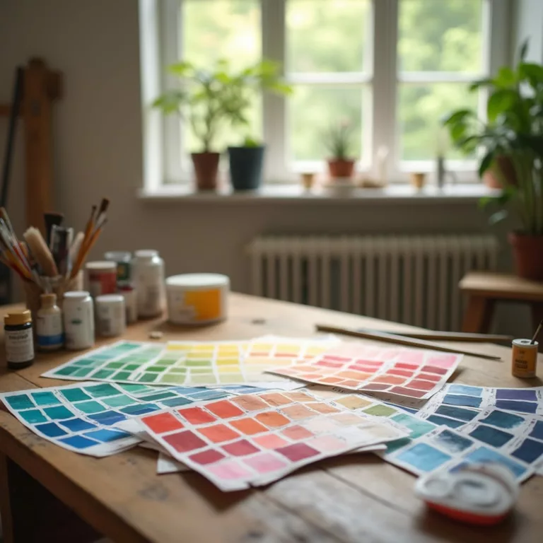
- Test paint samples at different times of day
- Consider how both natural and artificial light affect your color choices
- Choose lightbulbs with appropriate color temperatures (warm vs. cool)
Overlooking Undertones
Problem: Colors clash because their underlying tints are incompatible.
Solution:
- Compare colors side by side on a white background to reveal undertones
- Ensure fixed elements (flooring, countertops) have compatible undertones with wall colors
- Choose neutrals from the same color family for harmony
Choosing Colors in Isolation
Problem: Individual elements look great separately but don’t work together.
Solution:
- Create a cohesive color palette before making any purchases
- Use fabric or a piece of art with multiple colors as inspiration
- Test samples together rather than individually
Playing It Too Safe
Problem: A space feels flat, uninspiring, or lacks personality.
Solution:
- Add at least one unexpected color element to every room
- Incorporate different shades and tints of your chosen colors
- Include black or another dark neutral to add depth and definition
Forgetting About Cohesion Between Rooms
Problem: Each room feels disconnected from the others.
Solution:
- Choose a core color palette for the entire home
- Vary the proportions of these colors in different rooms
- Ensure adjacent spaces have at least one common color element
Using Accent Colors to Highlight Your Home’s Best Features
Strategic pops of color draw attention to architectural elements and focal points.
Architectural Highlights
Emphasizing unique features with color:
- Moldings and trim in contrasting shades
- Window frames that stand out against walls
- Colorful interior door faces with neutral surrounds
Designer Tip: Use high-gloss paint on architectural details for additional emphasis through both color and sheen.
Niche and Alcove Enhancement
Creating depth through recessed areas:
- Bookcase backs in contrasting colors
- Reading nooks with cocooning hues
- Display shelves with colorful backdrops
Designer Tip: Choose accent colors from artwork or textiles in the room to create visual connections.
Furniture Definition
Using color to highlight important pieces:
- Reupholstered vintage finds in vibrant fabrics
- Painted furniture that stands out from the background
- Statement pieces in colors that contrast with walls
Designer Tip: If a furniture piece has beautiful lines or details, a bold color will draw attention to its form.
Ceiling Treatments
Creating interest overhead:
- Painted ceilings that complement wall colors
- Subtle color shifts from wall to ceiling
- Dramatic ceiling colors in rooms with ample height
Designer Tip: In rooms with standard ceiling heights, choose a ceiling color slightly lighter than the walls for a subtle lift.
Connection to Nature
Using color to highlight views and transitions:
- Window frames painted to emphasize outdoor vistas
- Door colors that connect to landscape elements
- Nature-inspired accent colors that bring the outdoors in
Designer Tip: Choose accent colors that appear in your natural surroundings for a harmonious indoor-outdoor connection.
Conclusion: Creating Your Personal Color Story
Color is deeply personal. While design principles provide a foundation, the most successful interiors reflect the unique preferences, experiences, and lifestyles of their inhabitants. As you develop your home’s color palette, consider not only the technical aspects but also the emotional responses different colors evoke for you and your family.
Remember that the most beautiful homes evolve over time. Start with a thoughtful foundation, experiment with accent colors, and allow your spaces to develop naturally as you discover what truly resonates with you. The perfect palette isn’t about following trends—it’s about creating spaces that make you feel exactly the way you want to feel when you walk through your door.
Whether you prefer the serene embrace of soft neutrals, the energizing presence of vibrant hues, or the sophisticated balance of a carefully curated color scheme, your home should be your personal color story one that welcomes, inspires, and comforts you every day.
Art11deco


