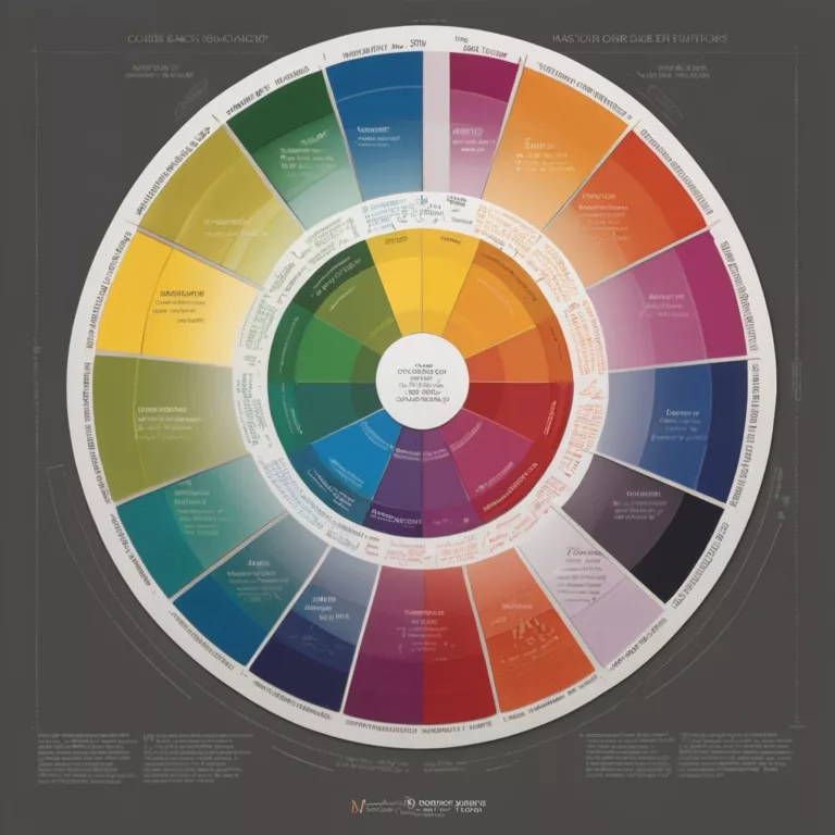
The Psychology of Colors in Interior Design
Introduction: The Invisible Influence of Color
Color surrounds us everywhere we go, silently shaping our experiences, influencing our emotions, and even affecting our physiological responses. While we might consciously choose colors for our homes based on aesthetic preferences, the impact of these choices runs much deeper than simple visual appeal. The psychology of color the study of how color affects human behavior and emotional states reveals that our color choices can profoundly impact our daily lives.
In this comprehensive exploration for Art11deco, we’ll delve into the fascinating world of color psychology in interior design. From understanding how specific colors affect your mood at home to discovering how cultural contexts change color meanings, we’ll provide you with the knowledge to make intentional, beneficial color choices for every space in your home. Whether you’re redesigning your home office for maximum productivity or seeking to create a perfectly balanced living space, understanding the psychological impact of color will transform how you approach interior design.
How Colors Affect Your Mood at Home
The spaces we inhabit daily have a profound impact on our mental and emotional wellbeing. Color plays a crucial role in this relationship, with different hues triggering specific psychological and physiological responses. Let’s explore how various colors influence our mood and how you can harness these effects in your home.
Warm Colors: Energizing and Stimulating
Red stimulates energy and can raise the room’s perceived temperature. It increases heart rate, blood pressure, and appetite, making it powerful but potentially overwhelming in large doses. In living spaces, red creates an atmosphere of excitement and passion, perfect for areas where you entertain guests or want to encourage lively conversation.
Orange combines the energy of red with the cheerfulness of yellow. It evokes enthusiasm, creativity, and warmth. Less overwhelming than red, orange still brings significant energy to a space. In dining areas, it stimulates appetite and conversation, while in creative spaces, it can inspire innovation and artistic expression.
Yellow captures the essence of sunshine, bringing optimism, clarity, and vitality to any space. It stimulates mental activity and generates muscle energy, making it excellent for kitchens, dining areas, and home offices where alertness is beneficial. However, research shows that babies cry more in yellow rooms, and too much yellow can create feelings of anxiety or agitation.
Cool Colors: Calming and Restful
Blue lowers blood pressure, heart rate, and respiration, creating feelings of calm and tranquility. It promotes relaxation and peaceful sleep, making it ideal for bedrooms and bathrooms. Blue also aids concentration and intellectual thought, beneficial for home offices or study areas. However, very dark blues can evoke feelings of sadness if not balanced properly.
Green balances the stimulation of yellow and the calm of blue, creating perfect equilibrium. Associated with nature, growth, and renewal, green reduces anxiety and promotes comfort. It’s the easiest color on the eyes and can improve reading speed and comprehension, making it excellent for any room where balance is desired.
Purple historically associated with royalty and luxury, purple creates a sense of contemplation and spirituality. Lighter lavenders promote restfulness without the chilliness of blue, while deeper purples add drama and sophistication. Purple stimulates problem-solving and creative thinking, making it suitable for artistic spaces or meditation areas.
Neutral Colors: Foundation and Balance
White represents purity, cleanliness, and simplicity. It makes spaces feel open, airy, and larger than they are. However, too much white can feel sterile and cold without warming elements. White is excellent for creating clean foundations that can be accented with more emotionally evocative colors.
Black adds sophistication, definition, and weight to a space. Used judiciously, it grounds a room and adds dramatic contrast. Too much can feel oppressive, but as an accent, it adds remarkable depth and elegance to any color scheme.
Gray offers sophisticated neutrality that allows other colors to shine. It provides a calming backdrop that doesn’t stimulate emotional responses, allowing you to control the mood through accents and furnishings. When chosen carefully with the right undertones, gray creates a timeless, elegant foundation.
Brown derived from wood, stone, and earth, brings a sense of stability, reliability, and warmth. It creates grounding energy and connects spaces to the natural world. Various wood tones add richness and depth without overwhelming a space with strong emotional cues.
The Psychological Impact of Color Combinations
While individual colors have distinct psychological effects, combinations create more complex emotional landscapes:
- Complementary colors (opposite on the color wheel) create vibrant, energetic spaces that feel balanced yet dynamic
- Analogous colors (adjacent on the color wheel) create harmonious, comfortable spaces with subtle energy variation
- Monochromatic schemes (variations of one color) create sophisticated, cohesive spaces that feel curated and intentional
- Triadic schemes (three colors equally spaced on the color wheel) create balanced yet vibrant spaces with controlled energy
Practical Applications in Home Design
To effectively use color psychology in your home:
- Consider room function first—match the color to the desired activity and energy level
- Account for natural light—northern light brings out cool undertones, while southern exposure enhances warm tones
- Start small if uncertain—test colors through accessories before committing to larger applications
- Observe your reactions—pay attention to how different colors make you feel personally
- Balance intensity—even energizing spaces need calm areas for visual and emotional rest
Remember that personal associations can override general psychological effects. If a particular color holds special meaning for you or triggers specific memories, these personal connections may influence your response more strongly than universal psychological patterns.
Color Meanings in Different Cultures Around the World
While color psychology identifies universal human responses to certain colors, cultural context adds another layer of meaning that varies significantly across the globe. Understanding these cultural associations is particularly important in our increasingly connected world, especially when designing spaces that welcome people from diverse backgrounds.
Red: From Celebration to Warning
In Western cultures, red often symbolizes danger, passion, and power. It’s associated with love and desire but also with warning and prohibition. However, in Chinese culture, red represents good fortune, joy, and celebration—it’s the traditional color for weddings and New Year celebrations. In India, red symbolizes purity and is often worn by brides, while in South Africa, it’s associated with mourning.
Design Implication: When using red in a multicultural home, consider its placement and context. In a dining room, it generally reads as energizing and appetite-stimulating across cultures. In bedrooms, it may feel passionate to Western occupants but auspicious and protective to those with Chinese heritage.
White: Purity or Mourning?
In Western and many Middle Eastern cultures, white represents purity, cleanliness, and peace—thus its popularity in minimalist design and its traditional use for Western wedding dresses. However, in many East Asian cultures including China, Korea, and Japan, white is associated with funerals and mourning.
Design Implication: All-white spaces, while trending in Western design, might feel uncomfortable or inauspicious to guests from certain cultural backgrounds. Warming white with natural elements like wood can help create a more universally welcoming atmosphere.
Yellow: Caution vs. Imperial Power
In Western contexts, yellow symbolizes happiness, optimism, and intellect, but can also indicate caution or cowardice. In Japan, yellow represents courage, while in Egypt it’s associated with mourning. In China, yellow was historically reserved for emperors and represents power, royalty, and prosperity.
Design Implication: Yellow can energize a kitchen or living space in most cultural contexts, but be mindful of its prominence in spaces designed for multicultural gatherings, where its meaning might vary significantly for different guests.
Blue: From Trust to Protection
Blue enjoys relatively consistent positive associations across cultures. In Western contexts, it represents trust, stability, and professionalism. In Middle Eastern cultures, blue (particularly turquoise) is associated with protection, spirituality, and heaven. In Chinese art and design, blue represents immortality.
Design Implication: Blue is one of the safest cross-cultural colors for main living spaces, as it rarely carries negative associations. Its calming properties are recognized across many cultural traditions.
Green: Nature and Beyond
Green’s association with nature is nearly universal, but its secondary meanings vary. In Western cultures, it can represent envy or inexperience (“green with envy,” “greenhorn”). In Middle Eastern cultures, green holds religious significance in Islam, representing paradise. In Chinese culture, green can symbolize infidelity, while in India, it represents harvest and happiness.
Design Implication: Green generally works well in spaces meant for relaxation across cultures, but be mindful of specific green shades that might carry stronger cultural associations for certain guests.
Purple: From Royalty to Spirituality
Historically associated with royalty in Western cultures due to the rarity and expense of purple dye, purple continues to symbolize luxury and extravagance. In Thailand and Brazil, purple is associated with mourning, while in Japan, it represents privilege and wealth. In many spiritual traditions worldwide, purple connects to mysticism and higher consciousness.
Design Implication: Deep purples add a sense of luxury across most cultural contexts, while lavenders and lighter purples can create spiritual, contemplative spaces regardless of specific cultural background.
Black: Sophistication or Inauspicious?
In contemporary Western design, black represents sophistication, power, and elegance. However, in many Asian cultures, black carries stronger associations with bad luck, evil, or disaster. In Middle Eastern contexts, black can represent rebirth and possibility.
Design Implication: Use black judiciously in spaces where cultural sensitivity is important. As an accent rather than a dominant color, black’s contemporary association with sophistication usually prevails over more traditional negative associations.
Brown: Earthiness and Stability
Brown’s association with earth, wood, and stability translates well across most cultures, making it one of the most universally comfortable colors. In Western contexts, it can sometimes be seen as boring or conventional, while in many indigenous cultures worldwide, earth tones connect deeply to cultural heritage and natural harmony.
Design Implication: Natural wood tones and earthy browns create grounding, welcoming spaces across virtually all cultural contexts, making them excellent choices for multicultural environments.
Creating Culturally Sensitive Color Palettes
When designing spaces that welcome diverse cultural perspectives:
- Research specific cultural backgrounds relevant to your household or expected guests
- Layer colors rather than committing to single-color schemes
- Use potentially problematic colors as accents rather than dominant elements
- Balance traditional cultural elements with contemporary applications
- When in doubt, natural materials and colors derived from nature tend to translate positively across cultures
Understanding these variations enriches our approach to color, allowing us to create spaces that not only express our personal aesthetic but also respectfully consider the diverse cultural meanings colors can hold.
Best Colors for Productivity in Home Offices
As remote work becomes increasingly common, creating a home office environment that enhances focus and productivity has never been more important. Color psychology offers valuable insights into which hues can help us perform at our best, depending on the type of work we do and our individual work styles.
Blue: The Productivity Powerhouse
Blue is widely regarded as the most productive color for most cognitive tasks. Research consistently shows that blue environments can:
- Improve focus and attention to detail
- Enhance logical thinking and efficiency
- Promote a sense of calm that reduces work anxiety
- Support stable, consistent performance over time
Best for: Analytical work, financial tasks, administration, programming, and any detail-oriented project requiring sustained concentration.
Application tips: Choose mid-tone blues rather than very dark or very light shades for maximum cognitive benefit. Navy can feel too somber for daily work, while very pale blues might not provide enough cognitive stimulation.
Green: Balance and Creative Endurance
Green offers excellent cognitive benefits while adding elements that blue lacks:
- Reduces eye strain during long work sessions
- Enhances creative thinking while maintaining focus
- Provides a sense of balance between mental alertness and calm
- Connects to nature, reducing stress and mental fatigue
Best for: Work requiring both analytical thinking and creative problem-solving, long duration tasks, or jobs requiring sustained mental effort.
Application tips: Incorporate actual plants alongside green elements for enhanced benefits. Sagey greens with gray undertones offer sophistication while maintaining cognitive benefits.
Yellow: Optimism and Creative Energy
Yellow stimulates:
- Optimism and positive outlook
- Creative thinking and idea generation
- Energy and enthusiasm for projects
- Memory and information retention
Best for: Creative professions, brainstorming spaces, writing areas, design work, and collaborative zones.
Application tips: Use yellow judiciously—too much can create anxiety and distraction. Consider a yellow accent wall or significant yellow elements rather than an entirely yellow space.
Red: Detail-Oriented Energy
Red should be used strategically in workspaces:
- Increases heart rate and energy
- Enhances attention to detail for short periods
- Creates a sense of urgency and importance
- Stimulates passion and emotional engagement with work
Best for: Areas requiring short bursts of intense focus, deadline-driven spaces, or environments where physical energy is beneficial.
Application tips: Red is best used as an accent color in most work environments—a red chair, artwork, or single wall can provide benefits without the overwhelming effects of a fully red room.
Purple: Thoughtful Problem-Solving
Purple combines cognitive aspects of blue with creative elements:
- Enhances problem-solving abilities
- Stimulates contemplation and deep thinking
- Supports creative approaches to structured problems
- Adds an element of unique perspective to analytical work
Best for: Strategic planning, creative problem-solving, spaces for contemplation and innovation within structured frameworks.
Application tips: Deeper purples can feel too heavy for daily work; choose mid-tone purples with blue undertones for better cognitive support.
Neutral Colors: Foundation for Focus
Neutrals provide essential balance in productive workspaces:
- White creates clarity and minimizes distractions but can feel sterile without warming elements
- Gray offers sophisticated neutrality that allows for focus without emotional distraction
- Brown (especially in wood tones) adds warmth and natural grounding to prevent spaces from feeling too clinical
Best for: Creating foundational environments where accent colors can be strategically added according to specific work needs.
Application tips: Even in predominantly neutral spaces, incorporate elements of color psychology through furniture, artwork, or accessories to enhance particular types of cognitive performance.
Creating a Productivity-Enhancing Home Office
For maximum productivity through color psychology:
- Analyze your work type and choose a dominant color appropriate for your primary tasks
- Consider your personal work style—morning people may need less energizing colors than those who struggle with motivation
- Create color zones for different types of work—a blue desk area for focused work, yellow brainstorming corner, green meeting space
- Use the 60-30-10 rule—60% dominant color (walls), 30% secondary color (furniture), 10% accent color (accessories)
- Incorporate natural elements—plants, wood, and stone provide grounding balance to any color scheme
Remember that lighting dramatically affects how colors influence cognition—cool white lighting enhances the alertness effects of blue and green, while warmer lighting softens the environment for creative thinking.
The Science Behind Blue: Why It Boosts Focus & Calm
Blue stands out in color psychology for its remarkably consistent effects across individuals and cultures. The science behind blue’s impact on our psychology and physiology reveals why it’s so effective at creating environments that support both focus and relaxation—seemingly contradictory states that blue uniquely balances.
The Physiological Impact of Blue
When we perceive the color blue, measurable physiological changes occur:
- Lowered blood pressure: Studies consistently show exposure to blue environments reduces systolic blood pressure
- Decreased heart rate: Blue surroundings can slow elevated heart rates, creating physical calm
- Reduced respiratory rate: Breathing naturally slows and deepens in blue environments
- Decreased stress hormones: Research indicates lower cortisol levels in subjects exposed to blue spaces
- Regulated circadian rhythms: Blue light (particularly blue-enriched white light) helps regulate sleep-wake cycles
These physiological responses create an ideal foundation for focused cognitive work—a calm body supports a clear, attentive mind.
The Neurological Effects of Blue
Neuroimaging studies reveal that blue environments influence brain activity in specific ways:
- Increased production of calming neurotransmitters: Blue stimulates the release of tranquilizing hormones
- Enhanced alpha brain waves: These brain waves are associated with relaxed alertness and meditation
- Activation of executive function centers: Areas responsible for organization and priority-setting show increased activity
- Reduced amygdala activity: The brain’s emotional processing center shows decreased activity, supporting logical rather than emotional responses
This combination creates an ideal state for analytical thinking, problem-solving, and sustained mental effort—calm alertness without emotional distraction.
Evolutionary Psychology of Blue
Our response to blue likely has evolutionary roots:
- Association with clear skies: Signaling good weather and safety from storms
- Connection to clean water: Representing vital resources and safety
- Absence of immediate dangers: Few naturally occurring toxic substances or dangerous animals are blue
- Day sky orientation: Blue light regulates our circadian rhythms, alerting our bodies that it’s daytime and time for activity
These ancient associations may explain why blue environments feel inherently safe, allowing our brains to focus on tasks rather than potential threats.
Blue in Scientific Research and Application
The scientific understanding of blue’s effects has led to practical applications across various fields:
- Blue light for cognitive performance: Research facilities use blue-enriched lighting to improve alertness and cognitive performance
- Blue in healthcare settings: Surgical staff often wear blue because it improves focus and reduces eye fatigue
- Blue in educational environments: Many educational theorists recommend blue elements in learning spaces to enhance concentration
- Blue in therapeutic settings: Blue environments are used to reduce anxiety and create calm in treatment spaces
The Spectrum of Blue: Different Shades, Different Effects
Not all blues affect us the same way. Research indicates variations across the blue spectrum:
- Navy and dark blues: Promote feelings of trust, authority, and competence; excellent for establishing credibility but can feel oppressive in large amounts
- Mid-tone blues: Offer the strongest cognitive benefits for focus and productivity without heaviness
- Sky blues: Create feelings of openness and possibility while maintaining calming effects
- Turquoise blues: Combine some of the creative benefits of green with the focus of blue, supporting innovative thinking
Practical Applications in Home Design
To effectively harness blue’s scientific benefits:
- Home offices: Mid-tone blues support productive work without inducing sleepiness
- Bedrooms: Softer, slightly grayish blues promote restful sleep while maintaining a sophisticated aesthetic
- Bathrooms: Blue’s association with water makes it naturally appropriate while adding calming benefits to morning routines
- Living areas: Navy accents add depth and promote meaningful conversation without overwhelming the space
Blue Limitations and Considerations
Despite its benefits, blue isn’t universal in its appropriateness:
- Cold climates: Too much blue can enhance feelings of chilliness in already cold environments
- Limited natural light: Blue can feel flat or depressing without adequate lighting
- Food spaces: Blue has been shown to suppress appetite (few naturally blue foods exist) so use cautiously in dining areas
- Very young children: Research suggests very young children respond more positively to warmer colors that stimulate development
Balancing Blue for Optimal Effect
To create perfectly balanced blue environments:
- Pair with warm accents: Wood tones, brass, or gold warm blue’s coolness
- Incorporate texture: Plush textiles add tactile warmth to visually cool blue spaces
- Consider undertones: Blues with slightly purplish undertones feel warmer than those with green undertones
- Layer different blues: Create richness and avoid flatness by using multiple blue tones
The science is clear: blue environments create an optimal state for both concentration and calm, making it perhaps the most versatile color for creating functional, comfortable spaces in the modern home.
Red in Interior Design: Passion or Overpowering?
No color in interior design generates more polarized responses than red. Bold, unapologetic, and psychologically potent, red demands careful consideration when incorporated into home environments. Understanding the complex psychological impact of red allows us to harness its dramatic benefits while avoiding its potential pitfalls.
The Psychological Power of Red
Red’s psychological impact is immediate and measurable:
- Increased heart rate and respiration: Red environments physically stimulate the body
- Heightened senses: Research shows red environments increase smell and taste sensitivity
- Increased brain activity: Red stimulates alertness and quick decision-making
- Time perception changes: Exposure to red makes time seem to pass more quickly
- Enhanced attraction and attention: Red naturally draws the eye and increases attraction
These effects make red both powerful and potentially problematic in home environments where various activities take place.
The Cultural Context of Red
Red carries strong but varied cultural associations that influence our perception:
- Western cultures: Love, passion, danger, importance, power
- Eastern cultures: Good fortune, joy, prosperity, celebration
- South Asian cultures: Purity, marriage, fertility
- Various African cultures: Mourning, sacrifice, transition
Understanding these associations helps explain our complex relationship with red in interior spaces.
Red’s Place in the Home: Strategic Applications
Given its psychological intensity, red works best when used with clear purpose:
1. Dining Spaces: Appetite and Connection
Red’s ability to stimulate appetite and conversation makes it excellent for dining areas:
- Increases food aroma perception and taste enjoyment
- Stimulates lively conversation and social bonding
- Creates memorable entertaining experiences
- Encourages diners to engage rather than linger
Designer Tip: A red dining room creates a dramatic experience for evening entertaining but may feel overwhelming for daily use. Consider red chairs, artwork, or table accessories in multipurpose eating areas.
2. Living Areas: Energy and Warmth
In living spaces, red creates:
- Warmth and physical comfort, particularly in cooler climates
- A sense of expressiveness and emotional openness
- Dramatic, memorable impressions for guests
- Energetic environments that discourage lethargy
Designer Tip: Deep burgundy or brick reds feel sophisticated and grounding compared to bright primary reds. Consider the undertone—blue-reds (like crimson) feel more elegant, while orange-reds (like terra cotta) feel more earthy and accessible.
3. Transitional Spaces: Dynamic Movement
Red excels in areas of movement and transition:
- Entryways, where it creates memorable first impressions
- Hallways, where it encourages movement rather than lingering
- Staircases, where it adds drama to architectural elements
- Exercise areas, where it stimulates physical energy
Designer Tip: Red in transitional spaces creates energy without the potential overwhelming effect it might have in rooms where people spend extended periods.
4. Workspaces: Focused Energy
In home offices, red can:
- Create urgency and importance for deadline-driven tasks
- Stimulate active, quick thinking rather than contemplative work
- Increase physical energy during midday energy slumps
- Enhance determination and willpower
Designer Tip: Use red selectively in workspaces—perhaps a red chair or accent wall—rather than surrounding yourself completely with such a stimulating color.
The Dangers of Red: When It Becomes Overpowering
Red’s intensity creates potential problems when misapplied:
- Overexcitement: Too much red can create anxiety and inability to relax
- Aggression: Studies link extensive red environments to increased irritability
- Visual dominance: Red tends to visually advance, making spaces feel smaller
- Fatigue: The physical stimulation from red environments can become exhausting over time
- Overwhelming other elements: Red easily dominates more subtle design elements
Balancing Red: Techniques for Success
To harness red’s benefits while avoiding its drawbacks:
1. The 60-30-10 Rule Reversed
For red, consider reversing the standard color distribution:
- 10% red (accents and focal points)
- 30% secondary color (furniture and textiles)
- 60% neutral base (walls and large surfaces)
This allows red’s psychological benefits without visual or emotional overwhelm.
2. Strategic Placement for Psychological Effect
Place red where its psychological impact serves your goals:
- Red behind the host’s chair in dining rooms stimulates guests’ appetite while moderating the host’s
- Red on the wall you face when entering a room creates immediate impact
- Red behind a television or fireplace enhances the focal nature of these elements
3. Tonal Variations for Sophistication
Not all reds create the same psychological impact:
- Crimson and wine reds: Sophisticated, mature, controlled passion
- Berry reds: Playful, feminine, natural energy
- Terra cotta and brick: Earthy, grounded, organic warmth
- Primary red: Bold, childlike, demanding attention
Choose the red variation that matches your desired psychological effect.
4. Complementary Balance
Red pairs naturally with:
- Green: Creating dynamic balance through complementary opposition
- Navy blue: Offering classic, controlled elegance
- Gold/yellow: Projecting luxury and warmth
- White: Providing crisp, graphic contrast
These combinations help manage red’s intensity while enhancing its positive attributes.
Specific Room Applications: Using Red Successfully
Bedrooms: The Red Paradox
Red’s association with passion seems to make it a natural choice for bedrooms, yet its stimulating properties can interfere with sleep. Solutions include:
- Using red on the wall behind the bed, visible when entering but not while sleeping
- Choosing deeper reds with brown undertones that retain sensuality while reducing stimulation
- Incorporating red through textiles that can be removed or covered at bedtime
Kitchens: Appetite and Energy
Red works exceptionally well in kitchens for several reasons:
- Stimulates appetite and enhances food appreciation
- Provides energy for cooking activities
- Has traditional associations with hearth and home
- Complements many food colors naturally
Children’s Spaces: Controlled Stimulation
For children’s areas, red:
- Stimulates activity and engagement
- Enhances learning and information retention
- Creates environments that feel lively and fun
- Requires careful application to prevent overstimulation
Bathrooms: Unexpected Warmth
Red can transform utilitarian bathrooms by:
- Adding unexpected warmth to typically cool spaces
- Creating spa-like experiences when using deeper reds
- Making small powder rooms memorable statement spaces
- Complementing skin tones in mirror reflections
The Future of Red in Interior Design
Contemporary interior design is seeing more nuanced applications of red:
- Heritage reds: Historical pigment-inspired reds with complexity and depth
- Environmental psychology: Using red specifically for its proven psychological benefits
- Biophilic approaches: Incorporating reds found in nature rather than synthetic versions
- Cultural fusion: Embracing red’s varied cultural meanings in global design approaches
Red will always maintain its place as one of the most psychologically powerful colors in the designer’s palette. When used with intention, understanding, and balance, it creates spaces of unmatched energy, warmth, and memorability.
Conclusion: Creating Color Harmony Through Understanding
As we’ve explored throughout this comprehensive guide on [Your Blog Name], the psychology of color in interior design offers fascinating insights into how our environments affect our emotions, behaviors, and well-being. By understanding both the universal psychological impacts of colors and their cultural contexts, we can create homes that not only look beautiful but also support our desired mental states and activities.
The most successful color applications in interior design don’t simply follow trends but arise from thoughtful consideration of:
- Function: Aligning color choices with the activities and emotional states desired in each space
- Personal response: Honoring your unique associations and preferences with colors
- Cultural context: Respecting the diverse meanings colors hold across different traditions
- Scientific understanding: Leveraging research on how colors affect our minds and bodies
- Artistic principles: Creating visual harmony through thoughtful color relationships
Remember that color is dynamic it changes with light throughout the day, interacts with the architecture of your space, and evolves in perception as you live with it. The most successful home environments often incorporate a thoughtful color strategy that balances stimulation and calm, personal expression and universal principles.
We encourage you to approach color with both knowledge and intuition, using the psychological principles we’ve discussed as a foundation for your unique creative expression. Your home should ultimately reflect and support your authentic life, and understanding color psychology gives you a powerful tool to achieve that goal.
Join us at [Art11deco] for more explorations of how design psychology can transform your living spaces and enhance your everyday experience.
Art11deco


