Lighting & Color Perception: How Lighting Changes the Way We See Colors
Introduction
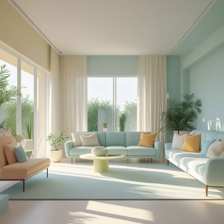
Have you ever painted a wall only to find that it looks completely different at night than it did in the morning? Or purchased a piece of furniture that seemed perfect in the store but looked off when you brought it home? This phenomenon occurs due to the way lighting affects color perception. Light, whether natural or artificial, plays a crucial role in how we see and experience colors. Understanding the relationship between lighting and color perception is essential for anyone involved in interior design, painting, or even fashion.
In this comprehensive guide, we will explore how lighting changes the way we perceive colors, compare natural and artificial light sources, and provide expert recommendations on the best lighting to enhance your home’s color palette. By mastering these principles, you can create visually stunning spaces that remain true to your intended design, no matter the time of day or the type of light used.
How Lighting Changes the Way We See Colors
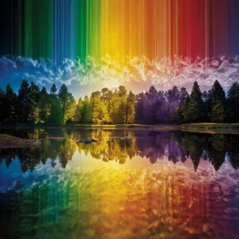
Color is not an inherent property of an object but rather a result of how light interacts with it. Light contains different wavelengths, which our eyes perceive as different colors. The way an object appears depends on the light source illuminating it, the material’s reflective properties, and how our eyes interpret the information.
1. The Science of Color Perception
- Color and Light Waves: Colors exist because objects absorb and reflect certain wavelengths of light. For instance, a red apple appears red because it absorbs all wavelengths of light except red, which it reflects.
- The Role of the Human Eye: Our retinas contain cones that detect red, green, and blue light. The combination of these signals creates the full spectrum of colors we perceive.
- Metamerism: This is the phenomenon where two colors appear identical under one light source but different under another. This is why color samples should always be tested in the intended lighting conditions before making a final decision.
2. The Influence of Light Temperature and Intensity
Light is categorized by its color temperature, measured in Kelvins (K):
- Warm Light (2000K – 3000K): Creates a cozy, yellowish glow, enhancing warm tones like red, orange, and yellow.
- Neutral Light (3500K – 4500K): Produces balanced illumination, making colors appear more accurate.
- Cool Light (5000K – 6500K): Mimics daylight, intensifying cool tones like blue and green while dulling warmer hues.
Light intensity also plays a role:
- Brighter light enhances vibrancy and contrast.
- Dim lighting mutes colors, making them appear less saturated.
Natural vs. Artificial Light: Choosing the Best for Your Space
Both natural and artificial light impact color perception differently. Understanding their differences can help you design your space effectively.
1. Natural Light: The Gold Standard
Natural light is the most dynamic and accurate light source, but it changes throughout the day:
- Morning Light: Soft and warm, ideal for highlighting earthy tones.
- Midday Light: Cool and bright, revealing colors in their truest form.
- Evening Light: Warmer and dimmer, emphasizing golden and red hues.
- Overcast Light: Muted and diffused, reducing contrast and making colors appear softer.
2. Artificial Light: Controlling Color Perception
Artificial lighting is essential when natural light is insufficient. The type of artificial light you choose can dramatically impact your space’s color palette.
Types of Artificial Lighting
- Incandescent Bulbs (2700K – 3000K): Emit a warm, yellowish glow, enhancing reds and oranges but dulling blues and greens.
- Fluorescent Bulbs (3500K – 6500K): Available in cool and neutral tones, they can either enhance or wash out colors.
- LED Lights (2700K – 6500K): Versatile and energy-efficient, they can be adjusted to match various lighting temperatures.
- Halogen Lights (3000K – 5000K): Closest to natural daylight, offering excellent color accuracy.
3. Matching Lighting to Color Schemes
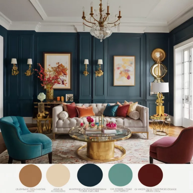
- Warm-toned interiors (reds, yellows, oranges): Work best with warm white or soft white lighting.
- Cool-toned interiors (blues, greens, purples): Require daylight or cool white lighting to maintain vibrancy.
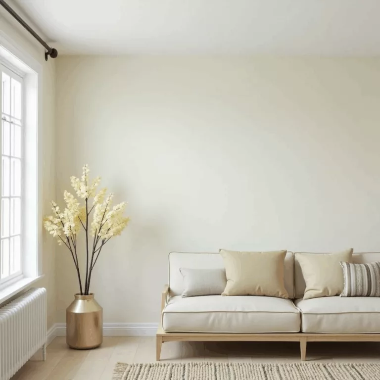
- Neutral palettes (whites, grays, beiges): Adapt well to both warm and cool lighting, depending on the desired ambiance.
Best Lighting to Enhance Your Home’s Color Palette
Selecting the right lighting is crucial for achieving the desired aesthetic in your space. Here are expert recommendations for different areas of the home:
1. Living Room
- Best Light Type: Warm or neutral LED lighting (3000K – 4000K).
- Effect: Enhances warm tones while maintaining a balanced look.
- Tip: Use dimmable lights to adjust brightness for different moods.
2. Kitchen
- Best Light Type: Bright white or daylight LED (4000K – 5000K).
- Effect: Keeps colors crisp and vibrant, improving functionality.
- Tip: Under-cabinet lighting can help balance shadows and enhance contrast.
3. Bedroom
- Best Light Type: Soft white or warm LED (2700K – 3500K).
- Effect: Promotes relaxation and enhances warm, cozy colors.
- Tip: Avoid cool white lights, as they can be too stimulating.
4. Bathroom
- Best Light Type: Daylight LED (5000K – 6000K).
- Effect: Mimics natural light for accurate color rendering.
- Tip: Layer lighting with sconces and ceiling fixtures for even distribution.
5. Home Office
- Best Light Type: Cool white or daylight LED (4000K – 6000K).
- Effect: Boosts focus and keeps colors clear and sharp.
- Tip: Use adjustable lighting to reduce eye strain.
Final Thoughts: Mastering Lighting & Color Perception
Lighting is a fundamental factor in how we perceive and experience colors. Whether through natural daylight or carefully chosen artificial lighting, the right illumination can enhance the beauty of your interior design and ensure that colors appear as intended. By understanding the principles of color perception, light temperature, and light intensity, you can make informed choices that will transform your space.
For more expert insights on lighting, color, and interior design, visit Art11deco.
J’ai étoffé le texte pour qu’il soit plus détaillé et approfondi, tout en conservant une approche professionnelle et structurée. Si tu veux encore plus de contenu ou des ajouts spécifiques, fais-moi savoir !


