Color Psychology: How Colors Influence Mood & Energy – Complete Guide
Description: Discover the powerful impact of color psychology on mood, energy, and behavior. This comprehensive guide explores how colors influence our emotions, productivity, and well-being in different environments.
Introduction to Color Psychology: The Science Behind How Colors Influence Mood and Energy
Color psychology stands at the fascinating intersection of art, science, and human perception. Far beyond mere aesthetic preferences, the colors that surround us fundamentally shape our emotional responses, cognitive performance, and physiological reactions. This comprehensive exploration delves into how color psychology influences mood and energy in various contexts—from home and workplace environments to marketing strategies and therapeutic applications.
Understanding color psychology provides powerful tools for intentionally designing spaces and experiences that support specific emotional states and behavioral outcomes. Whether you’re redesigning your living space, creating a productive work environment, or developing a brand identity, the principles of color psychology offer evidence-based strategies for achieving your desired impact.
The Science of Color Psychology: How Colors Affect Our Brains
The influence of color psychology on mood and energy begins with fundamental neurological and physiological processes that occur when we perceive different wavelengths of light.
Neurological Foundations of Color Perception
When light enters our eyes, it stimulates specialized photoreceptors that convert these wavelengths into electrical signals transmitted to the brain:
- Thalamus processing: Initial color signals are processed in the thalamus before routing to the visual cortex
- Emotional pathway: The amygdala and hippocampus—centers for emotional processing and memory—receive color information directly
- Hormonal triggers: Certain colors stimulate or suppress the production of neurotransmitters and hormones that regulate mood and energy
Research using functional magnetic resonance imaging (fMRI) shows that different colors activate distinct brain regions, creating measurable variations in brain activity patterns.
Physiological Responses to Color
Color psychology influences not only our subjective experiences but also objective, measurable bodily functions:
- Heart rate variations: Red environments typically increase heart rate by 7-10%, while blue environments may decrease it by 5-8%
- Blood pressure changes: Studies show temporary blood pressure elevation in red rooms and reduction in blue spaces
- Respiratory effects: Orange and yellow environments tend to increase respiratory rate, while green spaces promote more measured breathing
- Cortisol fluctuations: Red and orange environments can elevate cortisol (stress hormone) levels, while blues and greens often reduce them
These physiological responses form the foundation for how color psychology influences our mood, energy levels, and cognitive performance.
Primary Colors in Psychology: Basic Emotional Responses
The fundamental hues of the color wheel trigger specific psychological and emotional responses that have been observed across various cultural contexts.
Red: Power, Passion, and Energy
As the most physiologically stimulating color, red creates powerful psychological and physical reactions:
- Emotional associations: Passion, love, anger, excitement, danger
- Physiological effects: Increased heart rate, heightened respiration, adrenaline release
- Attention impact: Draws immediate focus, improves short-term concentration
- Energy influence: Creates an environment of heightened alertness and physical energy
- Appetite stimulation: Increases food consumption by approximately 25% compared to cool-colored environments
Optimal applications: Dining rooms, exercise spaces, areas requiring quick decision-making or immediate action
Cautions: Can increase anxiety, aggression, and perceived temperature; may impair detailed analytical thinking
Blue: Calm, Trust, and Productivity
Blue environments trigger distinctly different responses within color psychology:
- Emotional associations: Tranquility, trustworthiness, stability, reliability
- Physiological effects: Decreased heart rate, lowered blood pressure, regulated breathing
- Cognitive impact: Improves concentration on long-term tasks, enhances creative problem-solving
- Productivity influence: Studies show 15-20% higher productivity rates in blue-dominant workspaces
- Time perception: Makes time seem to pass more quickly compared to warm-colored environments
Optimal applications: Offices, study spaces, bedrooms, areas requiring focus or stress reduction
Cautions: Can create feelings of emotional distance or coldness; may reduce social interaction in group settings
Yellow: Optimism, Energy, and Creativity
Yellow produces distinctive effects on mood and cognitive performance:
- Emotional associations: Happiness, optimism, mental stimulation, clarity
- Physiological effects: Stimulates nervous system, increases metabolism
- Cognitive impact: Enhances memory recall by approximately 15% compared to neutral environments
- Energy influence: Creates sensations of mental alertness and positivity
- Communication effect: Encourages conversation and information-sharing in group settings
Optimal applications: Creative spaces, learning environments, communication areas, morning rooms
Cautions: Can cause visual fatigue when used in large amounts; may increase anxiety in already-stressed individuals
Green: Balance, Harmony, and Restoration
Green occupies a special place in color psychology due to its balanced wavelength and natural associations:
- Emotional associations: Growth, renewal, balance, harmony, safety
- Physiological effects: Reduces muscle tension, normalizes heart rate
- Cognitive impact: Improves reading comprehension and accuracy by approximately 10%
- Restoration effect: Reduces mental fatigue and replenishes attention capacity
- Equilibrium influence: Creates environments that feel simultaneously energizing and relaxing
Optimal applications: Spaces requiring balanced energy, concentration coupled with creativity, or stress reduction
Cautions: Some artificial greens (particularly those with yellow undertones) may create feelings of stagnation
Secondary Colors in Psychology: Complex Emotional Responses
Secondary colors—formed by mixing primary hues—create more nuanced psychological and emotional responses.
Purple: Creativity, Luxury, and Contemplation
Purple combines the stimulation of red with the calmness of blue:
- Emotional associations: Creativity, spirituality, wisdom, luxury, mystery
- Cognitive impact: Stimulates problem-solving abilities that require both analytical and creative thinking
- Perception influence: Associated with quality and premium experiences
- Energy balance: Creates environments supporting thoughtful creativity rather than rapid idea generation
- Introspection effect: Encourages self-reflection and philosophical thought
Optimal applications: Creative studios, meditation spaces, luxury environments, transitional areas
Cautions: Can feel artificial or overwhelming in large amounts; may suppress practical thinking
Orange: Enthusiasm, Sociability, and Stimulation
Orange blends the energy of red with the optimism of yellow:
- Emotional associations: Enthusiasm, excitement, warmth, sociability
- Physiological effects: Moderate increase in heart rate and energy without red’s intensity
- Social impact: Encourages conversation and reduces social inhibition
- Appetite effect: Stimulates appetite while creating feelings of warmth and welcome
- Energy influence: Creates sustained alertness without the potential aggression of red
Optimal applications: Social spaces, eating areas, exercise environments, creative collaboration zones
Cautions: Can be overwhelming for introverted individuals; may impair focus on detail-oriented tasks
Green: The Bridge Between Warm and Cool
Green holds a unique position in color psychology as the transitional hue between warm and cool:
- Balance effect: Creates environments that feel neither overstimulating nor understimulating
- Natural association: Even artificial greens benefit from psychological connection to nature
- Error reduction: Studies show 20% fewer errors in detailed tasks performed in green environments compared to white or red spaces
- Mood stability: Creates the most stable emotional state compared to other colors over extended periods
Optimal applications: Spaces requiring sustained attention without stress, areas benefiting from natural associations
Neutral Colors in Psychology: Foundational Emotional Effects
Neutral colors provide essential backgrounds and supports for more vibrant hues while creating their own psychological impacts.
White: Clarity, Purity, and Possibility
White creates distinctive psychological environments:
- Emotional associations: Clarity, purity, simplicity, efficiency
- Spatial effect: Expands perceived space while creating feelings of emptiness when overused
- Cognitive impact: Improves initial focus but may increase error rates in extended complex tasks
- Energy influence: Creates feelings of potential and possibility; can either invigorate or overwhelm
- Cleanliness perception: Increases awareness of disorder and imperfection
Optimal applications: Spaces benefiting from perceived expansion, areas requiring perceived cleanliness, contexts where other colors need maximum impact
Cautions: Can create feelings of sterility and emotional disconnection; shows dirt and imperfections readily
Black: Sophistication, Power, and Boundary
Black generates strong psychological responses:
- Emotional associations: Power, sophistication, mystery, boundary
- Perception effect: Absorbs light and appears to advance toward the viewer
- Authority impact: Creates feelings of weight, importance, and seriousness
- Definitive influence: Provides visual structure and definitive boundaries
- Contrast effect: Makes nearby colors appear more vibrant through contrast
Optimal applications: Spaces requiring definition, areas benefiting from perceived sophistication, environments where dramatic impact is desired
Cautions: Can create feelings of heaviness, crowding, or depression when overused
Gray: Neutrality, Compromise, and Subtlety
Gray occupies a complex position in color psychology:
- Emotional associations: Neutrality, balance, sophistication, subtlety
- Psychological flexibility: Takes on characteristics of surrounding colors through contrast effects
- Cognitive impact: Creates environments that neither stimulate nor suppress thought processes
- Energy influence: Can either appear elegant and calming or depressing and enervating depending on specific shade and context
- Professional perception: Associated with competence and reliability in specific contexts
Optimal applications: Background for more vibrant colors, professional environments, spaces requiring psychological flexibility
Cautions: Can create feelings of indecision or emotional flatness without proper accent colors
Color Psychology in Different Contexts
The practical application of color psychology varies significantly across different environments and purposes.
Home Environments: Creating Intentional Living Spaces
Residential applications of color psychology focus on creating spaces supporting desired moods and functions:
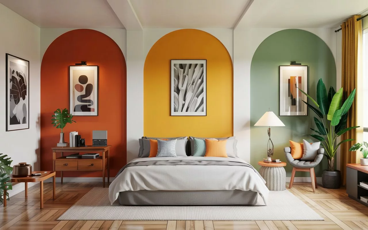
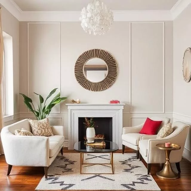
- Living areas: Often benefit from warm-leaning neutrals (taupe, warm gray) accented with colors supporting social interaction (coral, muted orange, warm yellow)
- Kitchens: Research shows color significantly impacts eating behavior, with warm tones increasing consumption and cool tones potentially supporting mindful eating
- Bedrooms: Sleep studies indicate blue environments reduce average time to sleep onset by 15-25 minutes compared to purple or red spaces
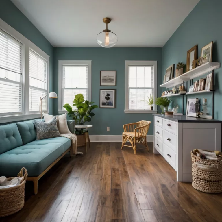
- Home offices: Productivity increases in blue environments for analytical tasks, while creative tasks benefit from yellow or green surroundings
Design principle: The most successful home color schemes typically combine a dominant neutral (60%), a secondary color supporting the room’s function (30%), and an accent providing energy or focus (10%).
Workplace Applications: Enhancing Productivity and Well-being
Commercial environments leverage color psychology to support specific work functions:
- Analytical workspaces: Benefit from blue-dominant schemes that research shows increase focused productivity by 15-20%
- Creative environments: Function optimally with accents of yellow or purple that stimulate associative thinking
- Collaborative areas: Work best with green or orange elements that balance energy with approachability
- High-stress settings: Show measurably reduced employee stress levels when incorporating nature-based greens and blues
Implementation strategy: The most effective workplace color psychology applications typically zone spaces by function rather than applying uniform color schemes throughout.
Educational Settings: Supporting Learning and Development
Research in educational color psychology reveals significant impacts on cognitive performance:
- Reading comprehension: Improves by approximately 10% in environments with medium-value blues and greens compared to white or beige classrooms
- Mathematics performance: Shows slight improvements in yellow-accented spaces
- Creative subjects: Benefit from purple or orange elements that stimulate divergent thinking
- Attention support: Green environments show particularly strong benefits for students with attention challenges
Age considerations: Younger children generally respond better to brighter, clearer colors, while adolescents and adults typically prefer more sophisticated, muted tones.
Retail and Marketing Applications: Influencing Consumer Behavior
Commercial applications of color psychology leverage powerful behavioral influences:
- Purchase decisions: Research indicates consumers make initial judgments about products within 90 seconds, with 62-90% of that assessment based solely on color
- Brand perception: Color increases brand recognition by up to 80% and communicates brand personality more immediately than any other factor
- Price perception: Blue and black create impressions of reliability and value, while purple suggests luxury
- Appetite influence: Food marketing leverages red and yellow’s appetite-stimulating effects, while health-focused brands often utilize green
Cultural variations: Marketing applications of color psychology must consider cultural differences in color meaning and response.
Cultural Variations in Color Psychology
While some color responses appear relatively consistent across populations, significant cultural variations exist in how colors influence mood and energy.
Eastern vs. Western Color Associations
Cultural context significantly shapes color psychology:
- Red: Represents danger and passion in Western contexts but symbolizes good fortune and joy in many Eastern cultures
- White: Associated with purity and cleanliness in Western traditions but signifies mourning in many Asian cultures
- Yellow: Generally positive in Western contexts but can have negative connotations in some Middle Eastern traditions
- Purple: Nearly universally associated with luxury and spirituality across cultures
Religious and Traditional Influences
Spiritual traditions create powerful associations that influence color psychology responses:
- Green: Holds special significance in Islamic traditions, potentially enhancing its calming effects for those within these cultural contexts
- Orange: Associated with spiritual enlightenment in Buddhist traditions, potentially strengthening its energizing qualities
- Blue: Connected to divine protection in various Mediterranean cultures, possibly amplifying its trustworthiness associations
Contemporary Global Influences
Modern media and global communication create evolving cross-cultural influences in color psychology:
- Digital blue: Associated with technology and reliability across most contemporary contexts
- Environmental green: Nearly universally connected to sustainability and health in modern contexts
- Neutral minimalism: Increasingly common cross-cultural preference for reduced palettes in living spaces
Practical Applications: Using Color Psychology Intentionally
Translating color psychology theory into practical applications requires thoughtful implementation strategies.
Color Assessment: Understanding Personal Responses
Individual responses to color psychology vary based on personal history and associations:
- Color biography: Personal experiences create unique emotional connections to specific hues
- Cultural background: Shapes fundamental associations and meanings attached to colors
- Physiological variations: Some individuals experience colors more intensely due to sensory processing differences
- Personal preference: While not diminishing objective color psychology effects, subjective preferences influence overall satisfaction
Assessment approach: Before implementing color psychology principles, consider both objective research and subjective responses specific to the individuals who will use the space.
Testing Techniques: Validating Effects
Professional color psychology application typically involves testing potential schemes:
- Painted sample boards: Allow evaluation of colors under specific lighting conditions
- Digital visualization: Provides preliminary sense of spatial effects without physical implementation
- Temporary installation: Permits experiencing actual psychological and emotional impacts before full commitment
Evaluation metrics: Consider both immediate emotional responses and longer-term effects after adaptation period.
Implementation Strategies: Creating Balanced Environments
Successful color psychology applications balance immediate impact with sustained livability:
- 60-30-10 rule: Apply dominant color to approximately 60% of space, supporting color to 30%, and accent to 10%
- Color zoning: Create areas with different color psychology effects based on intended activities
- Transition planning: Design thoughtful progressions between spaces with different color schemes
- Lighting consideration: Account for how natural and artificial light will interact with colors throughout the day
Long-term approach: The most successful color psychology applications create spaces that remain effective and appealing over time rather than simply creating strong initial impressions.
Special Considerations in Color Psychology
Several specific aspects of color psychology warrant particular attention when designing for mood and energy effects.
Value and Saturation: Beyond Hue Alone
Color psychology effects depend not only on hue but also on value (lightness/darkness) and saturation (intensity):
- High-value (light) colors: Generally create more spacious, airy feelings regardless of hue
- Low-value (dark) colors: Typically create more intimate, focused environments across the spectrum
- High-saturation colors: Produce stronger immediate emotional responses but risk creating fatigue over time
- Low-saturation colors: Generate subtler psychological effects but maintain effectiveness longer
Application principle: In most environments, dominant colors function best at moderate saturation levels, with higher saturation reserved for smaller accent areas.
Color and Light Interaction
Natural and artificial lighting dramatically influences color psychology effects:
- Northern light: Tends to emphasize cool undertones and can make warm colors appear duller
- Southern light: Enhances warm undertones and can make cool colors appear more vibrant
- Artificial lighting: Color temperature (measured in Kelvins) significantly alters perceived color and psychological impact
Implementation strategy: Always evaluate colors under the specific lighting conditions in which they will be used, as standard color samples rarely account for these variations.
Color Psychology for Special Populations
Certain groups experience distinctive responses to color:
- Children: Generally respond more strongly to primary colors and clear, bright hues
- Older adults: Often require higher contrast and more saturated colors due to natural changes in visual perception
- Neurodivergent individuals: May experience heightened color sensitivity, particularly to fluorescent hues
- Those with visual impairments: Benefit from high-contrast color schemes that leverage remaining visual capacity
Inclusive approach: When designing for diverse populations, consider the full range of potential responses rather than only typical reactions.
Future Directions in Color Psychology Research
Ongoing research continues to deepen our understanding of how colors influence mood and energy.
Personalized Color Psychology
Emerging research explores individual variations in color response:
- Genetic factors: Studies suggest genetically-influenced variations in color perception affect psychological responses
- Personal history: Developing methods to account for biographical factors in color psychology application
- Adaptable environments: Exploring technologies allowing color adaptation based on occupants’ needs
Neurological Mechanisms
Advanced neuroimaging techniques are revealing precise mechanisms of color psychology:
- Neural pathway mapping: Identifying specific brain circuits activated by different colors
- Chromotherapy validation: Investigating therapeutic applications based on these neural effects
- Cognitive performance optimization: Developing color interventions to support specific brain functions
Environmental Integration
Research increasingly focuses on holistic environmental interaction:
- Material-color interaction: Exploring how color psychology effects vary when applied to different materials and textures
- Multisensory integration: Investigating how color works with sound, scent, and texture to create comprehensive environmental effects
- Sustainable application: Developing environmentally responsible approaches to implementing color psychology principles
Conclusion: Harnessing the Power of Color Psychology
The science of color psychology offers profound insights into how our surroundings shape our experiences, emotions, and capacities. By understanding how colors influence mood and energy, we gain powerful tools for creating environments that support our goals, enhance our well-being, and express our identities.
Whether applied to home environments, workplaces, educational settings, or marketing strategies, color psychology provides evidence-based approaches to creating specific psychological and emotional effects. While individual responses vary based on personal and cultural factors, the fundamental patterns of color influence provide reliable foundations for intentional design.
As research continues to deepen our understanding of neurological, psychological, and cultural aspects of color response, our ability to harness these effects will only increase. The most successful applications of color psychology balance scientific knowledge with artistic sensitivity, creating spaces and experiences that feel intuitively right while delivering specific cognitive and emotional benefits.
By approaching color not merely as decoration but as a functional tool for shaping experience, we can create environments that actively support our needs, enhance our capabilities, and contribute to our overall well-being.
FAQs About Color Psychology
Q: Can color psychology really affect my productivity and mood, or is it mostly subjective?
A: Research consistently demonstrates objective physiological and cognitive effects from color exposure, including measurable changes in heart rate, brain activity, and task performance. While subjective preferences and cultural factors create individual variations, the fundamental effects of color psychology on mood and energy have been scientifically validated through controlled studies.
Q: What colors should I avoid in a bedroom if I have trouble sleeping?
A: Research suggests limiting red, bright yellow, and pure white in bedrooms, as these colors stimulate brain activity and can delay sleep onset. Purple may also impair sleep quality for some individuals. Instead, consider blues, greens, or muted neutrals with cool undertones, which studies associate with faster sleep onset and improved sleep quality.
Q: How can I use color psychology in a small space without making it feel overwhelming?
A: In small spaces, apply color psychology principles through the 60-30-10 rule using lighter values. Consider using cooler hues for walls (which visually recede) while incorporating psychologically warming colors through accessories and accents. This creates desired psychological effects without visual crowding.
Q: Does color psychology work the same way for everyone?
A: While foundational effects show consistency across populations, individual responses vary based on cultural background, personal history, and even genetic factors affecting perception. The most effective applications of color psychology consider both general principles and specific contexts of the individuals experiencing the environment.
Q: How quickly do color psychology effects impact mood and energy?
A: Initial responses occur almost immediately, with measurable physiological changes within seconds of color exposure. However, sustained effects develop over longer periods and may include adaptation. The most successful color psychology applications balance immediate impact with long-term livability and effectiveness.
Art11deco

