How to Choose the Perfect Colors for Every Room:
Learn how to choose the perfect colors for every room in your home with our comprehensive guide. Discover color psychology, professional techniques, and room-specific color schemes to create spaces that reflect your style and enhance your wellbeing.
Introduction: The Art of Choosing the Perfect Colors
Choosing the perfect colors for every room in your home is one of the most important yet challenging aspects of interior design. The right color palette does more than just make a space visually appealing it affects your mood, influences behavior, creates atmosphere, and can even impact your physical wellbeing. This comprehensive guide will walk you through the process of selecting ideal colors for every room, taking into consideration psychological effects, architectural features, lighting conditions, and current design trends.
Whether you’re renovating your entire home, refreshing a single room, or simply seeking inspiration for future projects, understanding how to choose the perfect colors will transform your living spaces into personalized sanctuaries that reflect your unique style while optimizing functionality. From cozy bedrooms and productive home offices to welcoming living rooms and energizing kitchens, the perfect color scheme starts with understanding fundamental color principles and applying them thoughtfully to each space.
Understanding Color Theory Basics
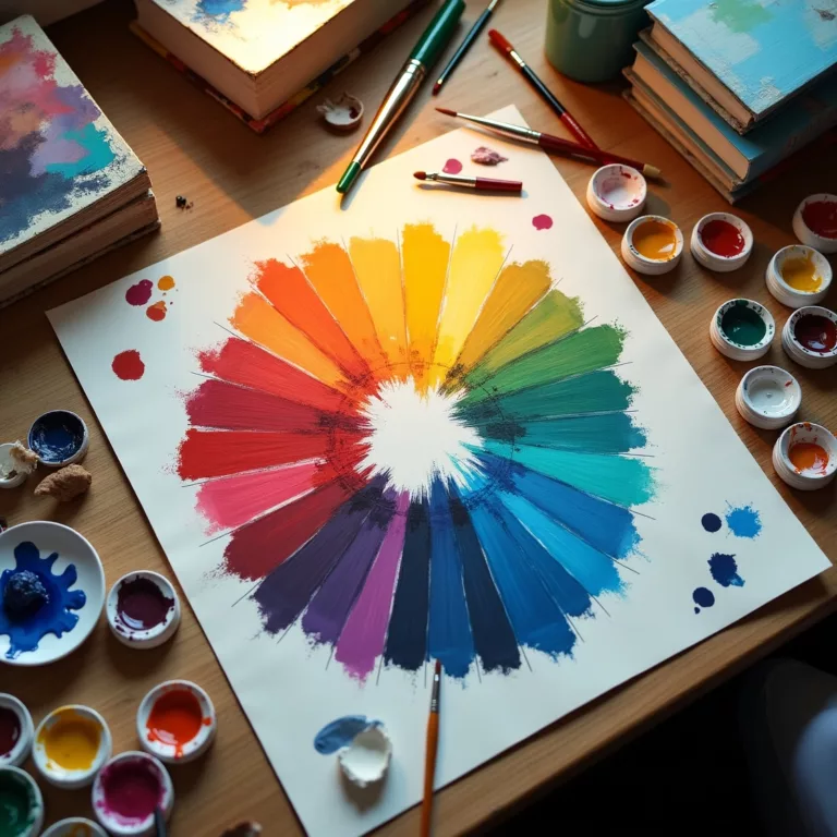
The Color Wheel and Basic Relationships
Before diving into room-specific recommendations, it’s essential to understand how to choose the perfect colors by mastering basic color relationships:
- Primary Colors: Red, blue, and yellow are the foundation from which all other colors derive.
- Secondary Colors: Green, orange, and purple, created by mixing two primary colors.
- Tertiary Colors: The six colors formed by mixing primary and secondary colors (yellow-orange, red-orange, red-purple, blue-purple, blue-green, and yellow-green).
- Color Schemes:
- Monochromatic: Different shades, tints, and tones of a single color
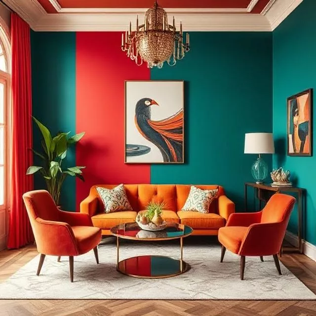
- Complementary: Colors opposite each other on the color wheel (blue/orange, red/green)
- Analogous: Colors adjacent to each other on the wheel (blue, blue-green, green)
- Triadic: Three colors equidistant on the color wheel
- Split-complementary: A base color plus the two colors adjacent to its complement
Understanding these relationships helps you choose the perfect colors that work harmoniously together rather than creating jarring or unbalanced combinations.
Color Properties: Hue, Saturation, and Value
When learning how to choose the perfect colors for rooms, consider these three properties:
- Hue: The pure color itself (red, green, blue, etc.)
- Saturation: The intensity or purity of the color, from vibrant to muted
- Value: The lightness or darkness of a color, from very pale to very dark
Manipulating these properties allows for infinite variations within a color family. For example, a vibrant royal blue and a pale sky blue share the same hue but differ in saturation and value. Understanding these distinctions helps when choosing the perfect colors for creating depth and interest in a room while maintaining harmony.
The Psychology of Colors in Home Design
Colors profoundly affect our psychological and physiological responses:
- Red: Stimulates energy, appetite, and conversation; creates warmth and intimacy
- Orange: Promotes enthusiasm, creativity, and sociability; adds warmth and vitality
- Yellow: Evokes optimism, clarity, and attention; brightens spaces and lifts mood
- Green: Encourages relaxation, balance, and renewal; connects spaces to nature
- Blue: Induces calm, focus, and serenity; lowers blood pressure and heart rate
- Purple: Suggests luxury, spirituality, and contemplation; adds richness and depth
- Neutrals (White, Black, Gray, Beige): Provide versatility, sophistication, and timelessness; create backgrounds that showcase other elements
Understanding these psychological effects is crucial when choosing the perfect colors for rooms with specific functions or desired atmospheres.
The Process of Choosing Perfect Room Colors
Assessing Natural and Artificial Light
Light significantly impacts how colors appear in a space:
- North-facing rooms receive cooler, bluer light that can make colors appear muted. When choosing the perfect colors for these spaces, consider warmer hues to counterbalance the cool light.
- South-facing rooms enjoy warm, consistent light throughout the day. Both cool and warm colors work well here.
- East-facing rooms receive bright morning light that turns softer in the afternoon. Consider how the perfect colors will look at different times of day.
- West-facing rooms experience minimal morning light and intense afternoon sun. Colors can appear more vibrant in the evening.
- Artificial lighting types also affect color appearance:
- Incandescent: Enhances warm colors, subdues cool tones
- Fluorescent: Enhances cool colors, can make warm colors appear dull
- LED: Varies depending on color temperature rating
- Halogen: Closest to natural light, renders colors most accurately
Testing paint samples under different lighting conditions is essential when choosing the perfect colors for any room.
Considering Room Size and Architecture
Spatial characteristics influence optimal color choices:
- Small rooms generally benefit from lighter values that make spaces feel larger and more open. However, dark colors can create cozy intimacy in small spaces like powder rooms or reading nooks.
- Large rooms can handle deeper, more saturated colors that might overwhelm smaller spaces. Alternatively, using lighter colors in large rooms creates an airy, expansive feel.
- Low ceilings appear higher with lighter ceiling colors. Painting the ceiling the same color as walls or using glossier finishes can also visually expand height.
- High ceilings feel more intimate when painted in darker shades or brought down visually with a color that contrasts with the walls.
- Architectural features like crown molding, wainscoting, or built-ins can be highlighted or downplayed through strategic color choices.
Understanding these principles helps you choose the perfect colors that optimize your specific architectural conditions.
Creating Cohesive Color Flow Throughout Your Home
While each room can have its own character, visual continuity creates a harmonious whole:
- Color threading: Repeating accent colors from room to room creates subtle connections.
- Gradual transitions: Moving from warmer to cooler versions of a color, or gradually changing intensity as you move through spaces.
- Neutral backdrops: Using consistent neutral tones for walls while varying accent colors in furnishings and accessories.
- Color zoning: Defining functional areas within open-concept spaces through color changes.
- Visual punctuation: Using bolder colors at transition points like hallways or stairwells.
Choosing the perfect colors with whole-home cohesion in mind creates a more sophisticated, intentional appearance.
How to Choose the Perfect Colors for Specific Rooms
Living Room Color Selection
As the primary gathering space, living rooms benefit from colors that support conversation and relaxation:
- Neutrals with personality: Greige (gray-beige), soft taupe, or warm whites create versatile backdrops that can evolve with changing décor.
- Soothing blues and greens: Mid-tone values promote calm while remaining dynamic enough for active spaces.
- Warm earthy tones: Terracotta, ochre, or olive green foster connection and comfort.
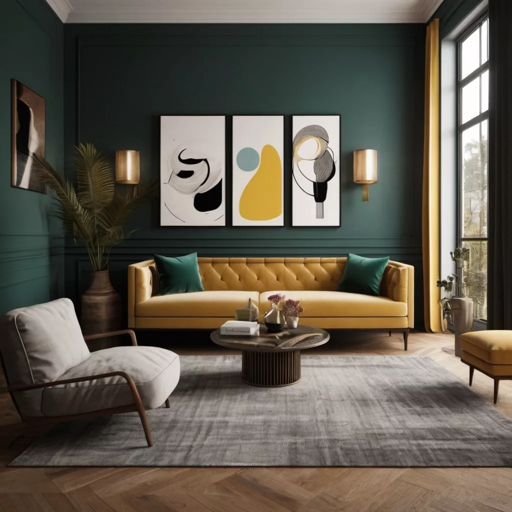
- Bold accent walls: Deeper hues like navy, forest green, or burgundy add drama without overwhelming.
The perfect colors for living rooms often depend on the room’s primary function—entertaining calls for more energetic hues, while family relaxation spaces benefit from calming tones.
Kitchen Color Strategies
Kitchens benefit from colors that feel clean, appetizing, and energetic:
- Classic whites and off-whites: Create brightness and cleanliness while maximizing the perception of space.
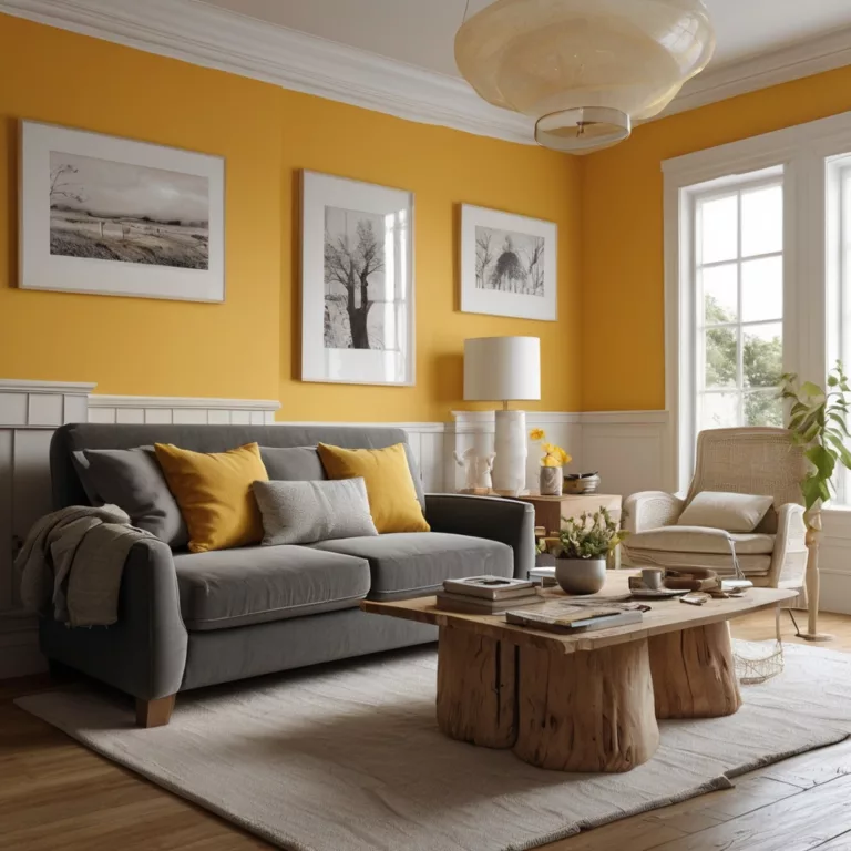
- Yellow and orange tones: Stimulate appetite and conversation, adding warmth to cooking spaces.
- Blues and greens: Counterintuitively effective in kitchens, these cooling colors balance the heat of cooking areas.
- Two-tone approaches: Different colors for upper and lower cabinets create interest while maintaining balance.
- Strategic color pops: Colorful backsplashes or island bases add personality while keeping the overall palette manageable.
When choosing the perfect colors for kitchens, consider durability and cleanability alongside aesthetics.
Dining Room Color Psychology
Dining spaces benefit from colors that enhance appetite and conversation:
- Rich, warm hues: Burgundy, terracotta, or gold create formal elegance and stimulate appetite.
- Nature-inspired greens: Sage, olive, or emerald connect dining to natural cycles of growth and nourishment.
- Dramatic darks: Navy, charcoal, or even black create sophisticated backdrops for evening entertaining.
- Cheerful brights: For casual dining spaces, energetic yellows or corals foster lively family interactions.
The perfect colors for dining rooms often depend on whether the space is used primarily for everyday family meals or special occasions.
Bedroom Color Selection for Rest and Rejuvenation
Bedrooms require colors that promote relaxation and personal expression:
- Restful blues: From pale sky to deep navy, blues lower blood pressure and heart rate, promoting better sleep.
- Soothing greens: Connect to nature and provide a balance of warming and cooling properties.
- Gentle lavenders: Offer relaxation without the potentially chilly effect of some blues.
- Warm neutrals: Beiges and soft browns create cocooning comfort.
- Dramatic darks: For primary bedrooms, deep colors can create intimacy and luxury.
Children’s bedrooms may benefit from more playful hues, while guest rooms should aim for universal appeal when choosing the perfect colors.
Bathroom Color Considerations
Bathrooms require colors that feel clean while creating the desired ambiance:
- Spa-like palettes: Soft blues, greens, and grays evoke water and create tranquil retreats.
- Bright whites: Communicate cleanliness and maximize light reflection.
- Dramatic jewel tones: Small powder rooms can handle bold statements like emerald or sapphire.
- Warm neutrals: Create inviting atmospheres for long soaks in the tub.
Considering moisture resistance and light reflection are important factors when choosing the perfect colors for bathroom environments.
Home Office Color Psychology for Productivity
Home offices benefit from colors that promote focus and creativity:
- Blues and blue-greens: Enhance concentration and productivity.
- Energizing yellows: Boost creativity and optimism (best as accents).
- Grounding greens: Reduce eye fatigue and connect to nature.
- Balanced neutrals: Create professional backgrounds for video calls while remaining calming.
The perfect colors for home offices should align with your specific work tasks analytical work benefits from different hues than creative professions.
Special Color Considerations
Working with Existing Elements
Few rooms are true blank slates. When choosing the perfect colors, consider:
- Flooring: Whether wood, tile, carpet, or other materials, floor colors greatly impact overall room color harmony.
- Large furniture pieces: Sofas, beds, and other substantial items should complement wall colors.
- Fixed features: Elements like fireplaces, countertops, or built-ins need to harmonize with your chosen palette.
- Adjacent rooms: Visible spaces should transition logically from one to another.
- Natural views: Colors that complement the outdoor scenery visible through windows create connection to the exterior.
Sometimes choosing the perfect colors means working backward from existing elements rather than starting with wall color.
Color and Texture Relationships
Color and texture interact to create depth and interest:
- Glossy surfaces intensify color and create reflectivity.
- Matte finishes absorb light and often make colors appear slightly darker.
- Textured surfaces create shadow play that affects color perception.
- Fabric textures like velvet, linen, or silk interact differently with identical colors.
The perfect colors for rooms include consideration of how texture will enhance or modify the appearance of your chosen hues.
Regional and Cultural Color Influences
Local factors can influence optimal color choices:
- Geographic location: Desert environments vs. northern climates benefit from different approaches to color.
- Cultural associations: Color meanings vary across cultures and may influence comfort with certain hues.
- Architectural styles: Different home styles have traditional color palettes that can guide choices.
- Historical precedent: Period homes often have historically appropriate color schemes worth considering.
Choosing the perfect colors sometimes means honoring regional or cultural context while still expressing personal style.
Professional Techniques for Choosing Colors
The 60-30-10 Rule
Interior designers often use this formula when choosing the perfect colors:
- 60% dominant color: Usually applied to walls and large furniture pieces.
- 30% secondary color: Used for furniture, textiles, and significant accents.
- 10% accent color: Reserved for accessories, artwork, and small details.
This approach ensures balance while allowing for personality through accent choices.
Testing Before Committing
Professionals never skip the testing phase when choosing the perfect colors:
- Large paint swatches: View at least 12″x12″ samples rather than tiny chips.
- Sample pots: Apply actual paint to walls and observe at different times of day.
- Digital visualization: Use apps that show how colors will look in your space.
- Fabric testing: Bring home fabric swatches to see how they interact with lighting.
- Mood boards: Create physical or digital collections of all room elements together.
These testing methods prevent costly mistakes and disappointment when implementing your perfect colors.
Color Trends vs. Timeless Choices
When choosing the perfect colors, consider:
- Current trends: Colors like sage green, terracotta, and dusty blue reflect contemporary taste circa 2025.
- Timeless choices: Certain neutrals and classic hues transcend trends.
- Trend incorporation through accessories: Using trendy colors in easily changeable items rather than permanent elements.
- Personal connection: Prioritizing colors you genuinely respond to over those merely popular.
The perfect colors for your home should reflect a balance between contemporary sensibility and lasting appeal.
Room-by-Room Color Selection Guide
Living Room Perfect Color Palettes
For North-Facing Living Rooms:
- Warm neutrals: Creamy white, caramel, golden beige
- Accents: Terracotta, mustard, warm red
For South-Facing Living Rooms:
- Cool neutrals: Soft gray, blue-gray, greige
- Accents: Navy, emerald, charcoal
For Small Living Rooms:
- Light reflective: Pale blue, soft green, warm white
- Strategic dark accents for depth
For Large Living Rooms:
- Medium values: Sage, slate blue, warm tan
- Zoning with color to create intimate areas
Kitchen Perfect Color Combinations
For Traditional Kitchens:
- Cabinet colors: White, cream, gray, navy
- Wall colors: Soft neutrals, butter yellow, pale blue
- Accents: Classic primary colors or black and white
For Contemporary Kitchens:
- Cabinet colors: High-gloss white, charcoal, walnut
- Wall colors: Crisp white, concrete gray
- Accents: Vibrant brights or metallic finishes
For Small Kitchens:
- Light reflective throughout with concentrated color on a single wall
- Strategic use of mirror and glass to expand the space
For Open-Concept Kitchens:
- Colors that transition smoothly to adjacent spaces
- Defining kitchen zone through backsplash or island color
Bedroom Perfect Color Schemes
Primary Bedroom Options:
- Restful retreat: Soft blue, lavender, warm gray
- Romantic sanctuary: Burgundy, navy, chocolate
- Nature-inspired: Sage green, taupe, soft yellow
Children’s Bedroom Ideas:
- Adaptable neutrals with age-appropriate accents
- Gender-neutral options: Green and yellow, coral and turquoise
- Strategic use of color for sleep promotion versus play areas
Guest Bedroom Approaches:
- Universal appeal: Soft neutrals with minimal contrast
- Hotel-inspired: White bedding with selective color accents
- Regional inspiration: Colors reflecting local landscape
Bathroom Color Excellence
Master Bath Retreats:
- Spa-inspired: Soft aqua, pale green, warm stone
- Luxurious: Marble-inspired grays, rich navy, metallic accents
- Nature-connected: Botanical greens, warm wood tones
Powder Room Statements:
- Bold drama: Jewel tones, high-contrast combinations
- Unexpected elements: Colorful ceilings, patterned walls
- Metallic touches for glamour and light reflection
Kids’ Bathrooms:
- Playful yet practical: Easy-clean surfaces in cheerful hues
- Growing room: Base colors that transition through childhood
- Personalized touches through accessories rather than permanent features
Color Selection Tools and Resources
Digital Color Resources
- Paint manufacturer websites: Virtual room painters and curated palettes
- Pinterest and Instagram: Real-home inspiration and trending combinations
- Color palette generators: Create schemes from favorite images
- Design blogs and websites: Expert tips and current color trends
- Home design apps: Visualization tools for testing colors in your space
Professional Color Assistance
- Color consultations: Expert advice tailored to your specific spaces
- Interior designers: Comprehensive color plans as part of design services
- Paint store specialists: Free or low-cost basic color advice
- Design center services: Coordinated selections for new construction
- Online color consultation services: Virtual assistance at various price points
DIY Color Analysis Tools
- Paint fan decks: Comprehensive collections of a manufacturer’s colors
- Large-format color samples: Better than small chips for accurate assessment
- Peel-and-stick samples: Movable, temporary color testing
- Color wheels and guides: Tools for understanding color relationships
- Light meters: Devices that measure actual light conditions in your spaces
Common Color Selection Challenges and Solutions
Working with Challenging Spaces
- Low-light rooms: Choosing the perfect colors means selecting hues that maximize limited light through reflective values and warm undertones.
- Awkward architecture: Strategic color placement can visually correct proportions or distract from problematic features.
- Open floor plans: Creating cohesion while defining zones through thoughtful color transitions.
- Small spaces: Using color to expand visual perception through technique rather than simply defaulting to white.
- Rooms with multiple functions: Zoning through color to delineate areas for different activities.
Color Coordination with Existing Elements
- Working with fixed finishes: Identifying undertones in flooring, countertops, and tiles to ensure harmonious wall colors.
- Enhancing architectural features: Using color to highlight or downplay elements like crown molding, built-ins, or ceiling details.
- Complementing furniture: Choosing the perfect colors that work with existing pieces, especially large-scale items that would be costly to replace.
- Addressing problem colors: Neutralizing or embracing dated or challenging existing colors.
- Creating transitions: Establishing logical color flow between spaces, especially in open-concept homes.
Overcoming Color Indecision
- Starting with inspiration pieces: Using artwork, textiles, or beloved objects as color guides.
- Working with color families: Narrowing choices to a specific color category before selecting exact shades.
- Progressive experimentation: Beginning with less prominent spaces to build color confidence.
- Visualization techniques: Using digital tools, samples, and mood boards to preview effects.
- Professional validation: Seeking expert opinion for confirmation of selections.
Advanced Color Selection Strategies
Creating Color Stories Throughout Your Home
- Thematic connections: Subtle color threads that weave through different spaces.
- Seasonal inspiration: Palettes derived from favorite landscapes or times of year.
- Art-inspired schemes: Colors pulled from beloved paintings or photographs.
- Memory palettes: Colors connected to significant places or experiences.
- Nature-based combinations: Organic color relationships found in natural elements.
Using Color to Solve Design Problems
- Visual expansion: Making small spaces appear larger through strategic color placement.
- Correction of architectural oddities: Using color to balance asymmetrical features.
- Light management: Compensating for problematic lighting conditions.
- Mood adjustment: Counteracting spatial aspects that create unwanted psychological effects.
- Wayfinding enhancement: Using color to guide movement through spaces intuitively.
Evolving Your Color Comfort Zone
- Gradual introduction: Incorporating new colors through accessories before committing to larger applications.
- Color layering: Building complexity by adding related hues to basic schemes.
- Seasonal rotation: Changing accent colors to refresh spaces without complete redecoration.
- Experimental spaces: Using less-visible areas to test more adventurous color concepts.
- Education and exposure: Developing color confidence through study and observation.
Conclusion: Mastering the Art of Perfect Color Selection
Choosing the perfect colors for every room in your home is both an art and a science. By understanding color fundamentals, considering the specific functions and conditions of each space, and applying professional techniques, you can create environments that not only look beautiful but also support your wellbeing and lifestyle.
Remember that color selection is a personal journey—while trends and guidelines provide valuable direction, your own preferences and responses to color should ultimately guide your choices. The perfect colors for your home are those that resonate with you emotionally while meeting practical needs for each space.
Approach color selection with both knowledge and playfulness. Test thoroughly, implement thoughtfully, and remain open to evolution as your color confidence grows. With each successful application, you’ll develop greater trust in your ability to choose the perfect colors for creating a home that truly reflects who you are.
Additional Resources for Color Selection Mastery
Recommended Books
- “The Perfect Palette” by Stephanie Hoppen
- “Color Confidence” by Maria Killam
- “House Beautiful Colors for Your Home” by House Beautiful Magazine
- “Color: A Natural History of the Palette” by Victoria Finlay
- “The Color Scheme Bible” by Anna Starmer
Educational Websites
- Benjamin Moore Color Academy
- Sherwin-Williams Color Tools
- Pantone Color Institute
- Color Matters (colormatters.com)
- Design Seeds (design-seeds.com)
Professional Color Organizations
- International Association of Color Consultants/Designers
- Color Marketing Group
- Intercolor International
- American Society of Interior Designers (ASID)
- Colour Group (UK)
By exploring these resources and applying the principles outlined in this guide, you’ll develop the confidence and expertise needed to choose the perfect colors for every room in your home, creating spaces that are both beautiful and functional for years to come.

