Bold Colors: How to Use Them Without Overwhelming Your Space
Learn expert techniques for incorporating bold colors into your home decor without creating visual chaos. This comprehensive guide covers color theory, strategic placement, and designer tips for balancing vibrant hues in any space.
Introduction to Bold Colors in Interior Design
Bold colors have the remarkable ability to transform any space from ordinary to extraordinary. When used thoughtfully, vibrant hues can energize rooms, express personality, and create memorable design statements that leave lasting impressions. However, many homeowners hesitate to embrace bold colors, fearing they’ll overwhelm their space or quickly become dated.
This comprehensive guide explores how to confidently incorporate bold colors into your interior design while maintaining balance and harmony. Whether you’re looking to refresh a single room or reimagine your entire home, these professional techniques will help you harness the power of color psychology, strategic placement, and thoughtful combinations to create spaces that feel both dynamic and livable.
Understanding Color Psychology: The Impact of Bold Colors
Before diving into specific applications, it’s essential to understand how bold colors affect our mood and perception of space:
Emotional Responses to Bold Colors
- Red stimulates energy and appetite, making it excellent for dining areas but potentially overwhelming in bedrooms
- Orange promotes enthusiasm and creativity, ideal for home offices and creative spaces
- Yellow evokes happiness and optimism but can cause visual fatigue in large doses
- Green balances tranquility with renewal, working well in almost any room
- Blue creates calm and expansiveness, perfect for bedrooms and bathrooms
- Purple suggests luxury and contemplation, excellent for meditation spaces or reading nooks
- Pink (especially bold fuchsia) brings playfulness and warmth to spaces
Spatial Effects of Bold Colors
Bold colors can dramatically alter our perception of room dimensions:
- Warm bold colors (red, orange, yellow) visually advance walls, making spaces feel more intimate
- Cool bold colors (blue, green, purple) visually recede, creating a sense of spaciousness
- Ceiling color affects perceived height—darker, bold ceilings lower a space while lighter ones elevate it
- Bold colors on architectural features can highlight or minimize structural elements
Strategic Approaches to Using Bold Colors
The 60-30-10 Rule for Bold Color Integration
One of the most reliable methods for incorporating bold colors without overwhelming your space is following the 60-30-10 rule:
- 60% dominant color (typically a neutral or softer hue)
- 30% secondary color (can be bold but complementary)
- 10% accent color (your boldest, most vibrant choice)
This formula ensures visual balance while allowing bold colors to make an impact without dominating the environment.
Bold Color Zones: Creating Visual Flow
Another effective approach involves creating designated “color zones” within open layouts:
- Use bold colors to define functional areas within larger spaces
- Create visual connections between rooms with repeating bold color elements
- Establish transitions between bold and neutral zones for visual relief
- Consider sightlines when planning bold color placement across connected spaces
Bold Color Focal Points
Strategic use of bold colors to create focal points draws the eye and organizes the visual hierarchy of a room:
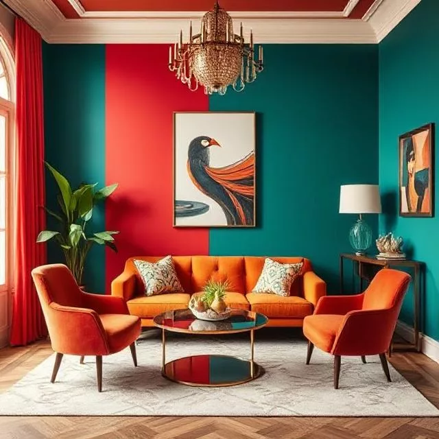
- Bold colored statement furniture (a vibrant sofa or dramatic chair)
- Accent walls in rich, saturated hues
- Dramatic ceiling treatments in unexpected colors
- Colorful kitchen islands or bathroom vanities
- Bold-hued architectural elements like staircases or built-ins
Room-by-Room Guide to Bold Colors
Living Rooms: Bold Colors for Gathering Spaces
The living room offers numerous opportunities for bold color integration:
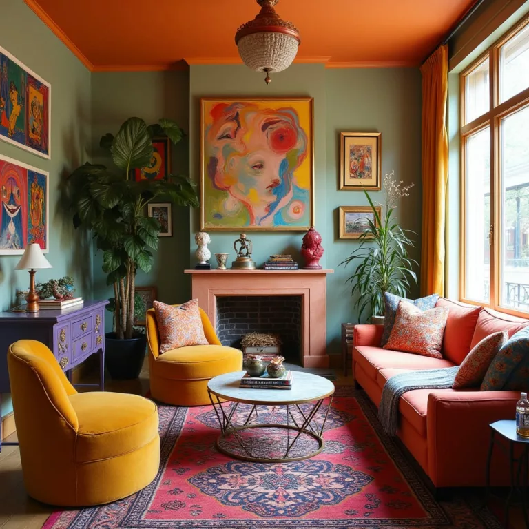
- Consider a bold-colored sofa balanced with neutral walls and floors
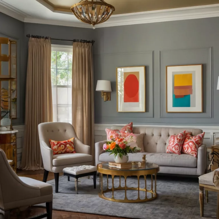
- Alternatively, keep furniture neutral and introduce bold colors through art, pillows, and accessories
- Use bold colors to highlight architectural features like fireplace surrounds or built-in shelving
- Create depth with bold accent walls, especially on focal walls with features worth highlighting
- Layer bold colors through textiles of varying textures for dimension
Kitchens: Bold Colors for Culinary Creativity
Kitchens benefit tremendously from strategic bold color placement:
- Bold-colored cabinetry (either all cabinets or just lowers/uppers)
- Vibrant backsplashes that introduce pattern and color
- Colorful appliances or range hoods as statement pieces
- Bold-hued kitchen islands that anchor the space
- Colorful counter accessories that can be easily changed
Bedrooms: Bold Colors for Personal Sanctuaries
In bedrooms, bold colors require special consideration:
- Use bold colors judiciously, focusing on headboard walls or accent furniture
- Balance vibrant hues with plenty of white space and neutral elements
- Consider the psychological effects of your chosen bold colors—stimulating reds may not be ideal for sleep spaces
- Introduce bold colors through bedding that can be easily changed seasonally
- Use bold colors in adjacent dressing areas or bathrooms rather than the sleeping space itself
Bathrooms: Bold Colors in Small Spaces
Contrary to popular belief, small bathrooms can handle bold colors beautifully:
- Bold wallpaper creates high impact in powder rooms
- Colorful vanities make statements in small spaces
- Vibrant tile work (floors or shower surrounds) adds personality
- Bold-colored fixtures (when chosen carefully) become artistic elements
- Colorful bath linens can introduce bold colors temporarily
Home Offices: Bold Colors for Productivity
Home offices benefit from strategic bold color use:
- Choose bold colors that enhance the specific type of work performed in the space
- Use bold colors on the wall behind your computer to reduce eye strain
- Incorporate energizing colors like orange or yellow in creative workspaces
- Use calming bold blues or greens in high-stress work environments
- Consider bold-colored office furniture against neutral backgrounds
Techniques for Balancing Bold Colors
Neutrals as Supporting Players
Strategic use of neutrals prevents bold colors from overwhelming:
- White, cream, and light gray act as visual palate cleansers
- Natural materials like wood, stone, and jute ground bold colors
- Black accents add definition and sophistication to bold color schemes
- Metallic finishes create transition points between bold colors
- Textural neutrals add depth without competing with bold hues
Pattern Integration with Bold Colors
Patterns help distribute bold colors more evenly throughout a space:
- Geometric patterns organize bold colors into structured arrangements
- Floral and organic patterns soften the impact of vibrant hues
- Stripes and linear patterns direct the eye and control bold color flow
- Color-blocking techniques create modern, artistic divisions of bold colors
- Gradients and ombré effects transition between bold colors and neutrals
Lighting Considerations for Bold Colors
Lighting dramatically affects how bold colors are perceived:
- Natural light reveals bold colors’ true characteristics—north-facing rooms may need warmer bold hues
- Artificial lighting types (incandescent, LED, fluorescent) alter bold color appearance significantly
- Dimmer switches allow bold colors to shift in intensity throughout the day
- Directed lighting can highlight or downplay bold color elements
- Reflective surfaces amplify the impact of bold colors through refraction
Designer Secrets for Bold Color Success
Color Testing Beyond Swatches
Professional designers recommend extensive testing before committing to bold colors:
- Paint large sample boards (at least 2′ x 2′) rather than small swatches
- View bold color samples at different times of day and under various lighting conditions
- Consider how bold colors appear in relation to existing fixed elements
- Use digital visualization tools to preview bold color implementations
- Temporarily introduce bold colors through rentable furniture or removable wallpaper
Creating Cohesion with Bold Colors
Successful bold color schemes maintain visual connections:
- Develop a consistent color story throughout your home with varying intensities of bold colors
- Use transitional spaces to bridge between different bold color zones
- Repeat bold accent colors in adjacent spaces for continuity
- Establish a unified backdrop (flooring, trim color) to ground various bold elements
- Consider color temperature consistency even when using different bold hues
Bold Color Trends vs. Timeless Applications
Navigate the balance between trendy and timeless bold color choices:
- Consider using highly trendy bold colors in easily changeable elements
- Invest in timeless applications for more permanent bold color features
- Analyze historical uses of bold colors for insights into lasting appeal
- Recognize regional influences on bold color perception and longevity
- Balance contemporary bold color trends with classic applications
Common Bold Color Mistakes to Avoid
Color Matching Pitfalls
Even professionals sometimes struggle with these common bold color coordination issues:
- Mismatched undertones creating visual discord between bold colors
- Improper balance between warm and cool bold hues
- Competing bold colors of similar intensity fighting for attention
- Ignoring the influence of existing fixed elements when selecting bold colors
- Using too many distinct bold colors without a unifying element
Bold Color Application Errors
Technical mistakes can undermine even the best bold color schemes:
- Improper surface preparation leading to uneven bold color appearance
- Incorrect paint finish choices that don’t support the bold color concept
- Inadequate lighting to properly showcase bold color selections
- Poor transitions between bold color areas creating visual jarring
- Insufficient testing before large-scale bold color implementation
DIY Bold Color Projects for Different Commitment Levels
Low-Commitment Bold Color Introductions
For those hesitant about bold colors, start small:
- Vibrant throw pillows, blankets, and small accessories
- Bold-colored art pieces or framed fabric
- Colorful area rugs that can be easily changed
- Removable wallpaper in bold patterns or colors
- Painted furniture pieces that can be moved between rooms
Medium-Commitment Bold Color Applications
Ready for more permanent bold color statements:
- Accent walls in vibrant hues
- Bold-colored furniture upholstery
- Colorful window treatments
- Statement light fixtures in bold colors
- Semi-permanent decorative elements like tile decals
High-Commitment Bold Color Investments
For the color confident:
- Full room color schemes in vibrant hues
- Bold-colored built-in elements
- Permanent tile work in vivid colors
- Custom cabinetry in statement colors
- Architectural elements highlighted with bold colors
Bold Colors in Different Design Styles
Modern Minimalism with Bold Colors
Introducing vibrant hues into minimalist aesthetics:
- Strategic pops of single bold colors against neutral backgrounds
- Color-blocking techniques with geometric precision
- Bold-colored functional elements that double as artistic statements
- High-contrast combinations creating visual tension
- Monochromatic bold color schemes in varying intensities
Traditional Spaces with Bold Colors
Updating classic aesthetics with vibrant energy:
- Bold color choices drawn from traditional color wheels but in amplified intensities
- Historical color combinations reinterpreted with contemporary vibrancy
- Bold colored upholstery with classic silhouettes
- Traditional patterns executed in unexpected bold color combinations
- Colorful interpretations of conventional design elements
Eclectic Designs with Bold Colors
Mastering the art of bold color maximalism:
- Multiple bold colors unified through intentional repetition
- Bold color layering techniques that create visual depth
- Global-inspired bold color combinations from different design traditions
- Unexpected bold color juxtapositions creating artistic tension
- Strategic neutral moments that prevent visual overwhelm
Expert Interviews: Professional Insights on Bold Colors
Interior Designer Perspectives
Insights from leading color experts:
- “Bold colors work best when they have purpose and aren’t simply used for shock value.”
- “Consider the transition between spaces—bold colors should tell a cohesive story throughout a home.”
- “The most successful bold color schemes respect the architecture and natural light conditions of a space.”
- “Test bold colors extensively before committing; what works in a magazine spread may not translate to your specific environment.”
- “Bold colors should reflect the personality of the inhabitants while remaining respectful of the home’s context and character.”
Color Psychologist Recommendations
How bold colors influence well-being:
- “Bold colors can dramatically affect mood, productivity, and even physiological responses like heart rate and appetite.”
- “Different people respond to bold colors based on personal associations and cultural backgrounds—there’s no universally ‘correct’ bold color.”
- “Spaces for relaxation may still incorporate bold colors, but consider using them on walls not directly in the line of sight while resting.”
- “Bold colors can help differentiate spaces for neurodivergent individuals who benefit from clear visual boundaries.”
- “The way we perceive bold colors changes as we age, with preferences often shifting toward either greater subtlety or increased vibrancy.”
Conclusion: Embracing Bold Colors with Confidence
Bold colors offer tremendous potential to transform spaces from forgettable to remarkable. By understanding color psychology, employing strategic placement techniques, and balancing vibrant hues with complementary elements, you can create spaces that express personality without overwhelming the senses.
Remember that successful bold color implementation balances personal preference with design principles. Start with smaller bold color introductions if you’re uncertain, and gradually build your color confidence through experimentation and refinement.
The most impressive interiors often feature bold colors deployed with intention and purpose rather than hesitation. By applying the principles and techniques outlined in this guide, you’ll develop the skills and confidence to use bold colors effectively, creating spaces that feel both energized and harmonious.
Resources for Bold Color Exploration
Color Tools and References
- Professional color matching systems (Pantone, Benjamin Moore, Sherwin-Williams)
- Digital color visualization applications
- Color theory books and online courses
- Historical color palettes and references
- Cultural color significance guides
Bold Color Inspiration Sources
- Design publications featuring bold color applications
- Museum exhibitions exploring color in art and design
- Architectural landmarks known for vibrant color schemes
- Nature-inspired bold color combinations
- Fashion-forward color trend forecasts
Armed with these insights, tools, and techniques, you’re ready to explore the transformative potential of bold colors in your own spaces, creating environments that energize, inspire, and delight the senses without overwhelming your space.

