Colors in Fine Art: My Journey Through Mixing Techniques and Contrast
I still remember the first time I truly understood the power of color in art. Standing before Turner’s swirling skies at the Tate, I watched how impossibly luminous oranges seemed to pulse against deep blues, creating not just a sunset, but the feeling of day’s end. That moment changed everything about how I approached my own work and set me on a decades-long exploration of color that I’m excited to share with you today.
The world of color in fine art is endlessly fascinating both deeply technical and profoundly intuitive. After years spent with brushes in hand and countless hours observing how masters manipulate this most essential element, I’ve come to see color as a language with its own grammar, dialects, and poetry. Let’s dive into this vibrant conversation together.
The Living Science Behind Color
People often separate art and science, but anyone who’s struggled to mix the perfect green knows that color inhabits both worlds. I learned this lesson the hard way during my early painting days, wondering why my carefully mixed greens always looked somewhat… dead.
The answer, I discovered, lies in understanding how our eyes actually perceive color. When light hits an object, certain wavelengths get absorbed while others bounce back to our eyes. This isn’t just scientific trivia it’s the reason why that perfect emerald green in the garden seems impossible to capture on canvas. Natural light contains a complexity that our pigments can only approximate.
I’ve found that early morning and late afternoon light reveals this phenomenon most dramatically. Watch how a red apple transforms throughout the day from a muted burgundy at dawn to a vibrant scarlet at midday, then to a warm orange-red as evening approaches. The apple hasn’t changed, but the light illuminating it has shifted across the spectrum, revealing different aspects of its color.
This understanding has practical implications in the studio. North-facing light (in the Northern Hemisphere) has saved countless painters from frustration, providing the most consistent natural illumination. I learned this lesson after completing what I thought was a masterfully subtle portrait, only to see it the next morning under different light looking like my subject had a terrible skin condition! Now I’m religious about consistent lighting.
The distinction between how light creates color and how pigments create color fundamentally shapes our approach:
When I work digitally (additive RGB color), mixing red, green, and blue light at full intensity creates white. But when I mix red, yellow, and blue paints (subtractive color), I get various shades of brown or black as more colors combine. This isn’t a failure it’s just how physical pigments work, absorbing more light with each addition.
Understanding these properties hue (the color family), value (lightness/darkness), and saturation (purity/intensity) transformed my work from simply using color to truly working with color as a malleable, expressive force.
Beyond the Basic Color Wheel
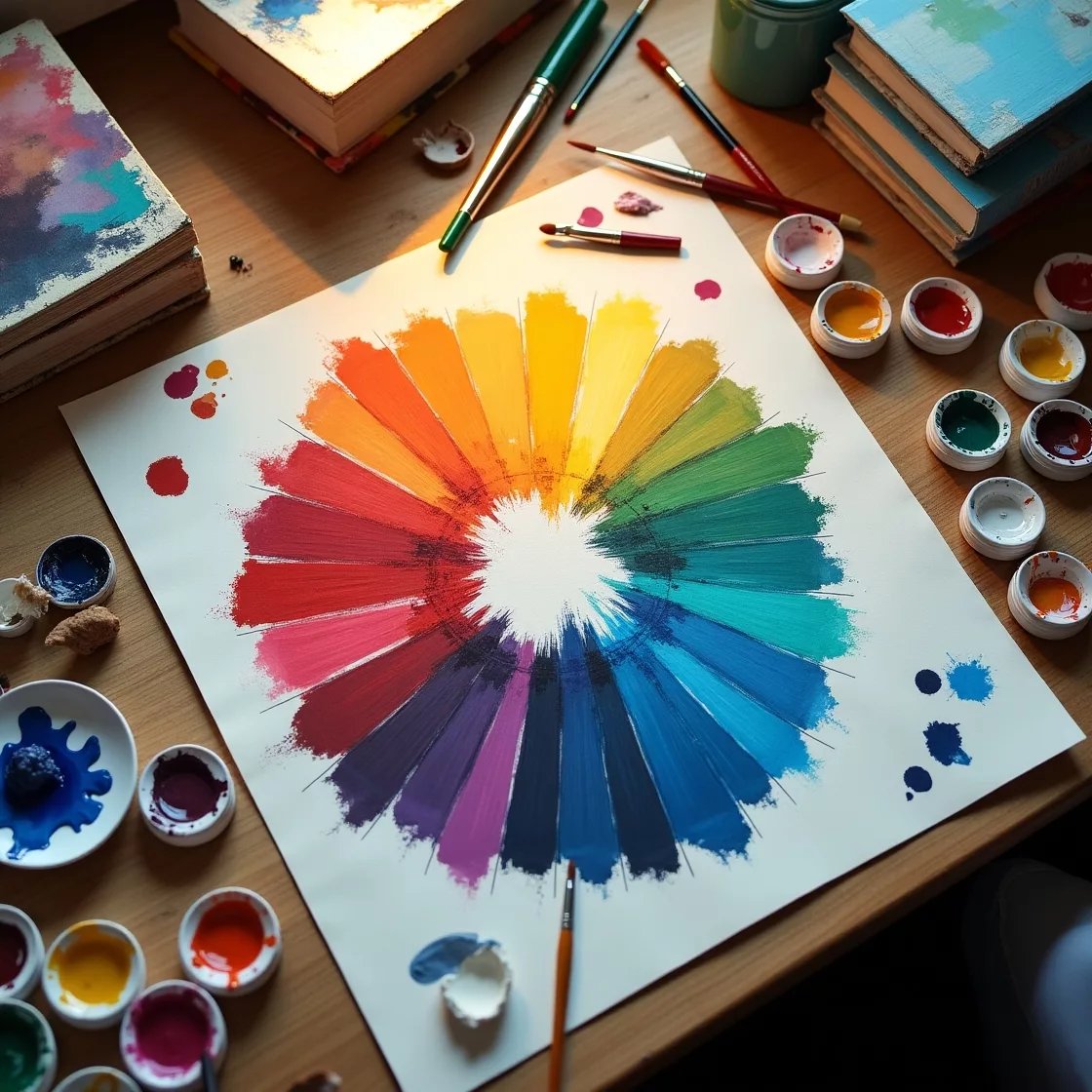
The traditional color wheel we all learned in school offers a starting point, but painting taught me it’s more of a rough map than an exact GPS. Those perfectly arranged primary colors red, yellow, and blue that supposedly create all others? They’re more theoretical than practical.
Try mixing a truly vibrant purple from cadmium red and ultramarine blue, and you’ll see what I mean. The result is usually disappointingly muted compared to a straight-from-the-tube dioxazine purple. This is because physical pigments have biases and limitations that the idealized color wheel doesn’t acknowledge.
I keep a color wheel in my studio not as gospel but as a reminder of relationships. Those relationships complementary, analogous, split-complementary provide useful frameworks, but I’ve found the most interesting work often comes from breaking these “rules” in thoughtful ways.
Take Monet’s haystacks. At first glance, they seem to use straightforward complementary relationships, but look closer and you’ll find he’s inserted unexpected notes of pink alongside green, or touches of turquoise against orange. These subtle deviations create tension and visual interest while maintaining harmony.
Color temperature the perception of colors as warm or cool has become perhaps my most valuable tool. I once struggled with a portrait that looked flat despite careful rendering. Adding cool blue-greens to the shadow side of the face and warm yellow-reds to the light side immediately created convincing dimension, even though the actual color differences were subtle.
What fascinates me is how relative temperature can be. A yellow-green might appear cool next to a cadmium yellow but warm beside a cerulean blue. This relativity means context is everything—no color exists in isolation.
Learning from Masters: Classical Approaches That Still Work
Some of my biggest color breakthroughs came from studying historical techniques, not just theoretical color systems. Limited palettes, in particular, revolutionized my approach.
Years ago, I stubbornly believed more options meant better results, filling my palette with every beautiful tube color I could find. The result? Muddy paintings with no cohesion. When I finally forced myself to try the limited Zorn palette (yellow ochre, vermilion, black, and white), something magical happened. With fewer choices, I really looked at color relationships and learned to create harmonious works.
I discovered that Anders Zorn wasn’t using black as simply “dark” he was using its blue undertones to create surprisingly vibrant mixtures. His black functions partially as a blue, allowing a remarkably full range of expression from just four colors. This economy taught me that limitations often foster creativity rather than hindering it.
Renaissance glazing techniques similarly transformed my understanding of color depth. After experimenting with transparent layers over opaque underpainting, I saw how light could interact with multiple layers of pigment to create luminosity impossible with direct mixing. Looking at a Rembrandt in person shows how this approach creates skin that seems to glow from within—there’s actual optical depth as light penetrates semi-transparent layers and bounces back.
I spent months practicing this technique, learning which pigments work best for glazing (alizarin crimson, phthalo blue, quinacridone colors) and which mediums produce the right transparency. Each glaze is incredibly thin barely tinted oil or acrylic medium but layers build remarkable complexity. My earliest attempts were disastrous (too thick, too rushed), but patience eventually paid off.
The Impressionists taught me yet another approach optical color mixing placing distinct strokes of pure color side by side rather than blending on the palette. I remember my first attempt at this technique in a landscape workshop. My instinct was to mix the perfect green for distant trees, but the instructor challenged me to instead place small strokes of blues and yellows side by side. From a distance, they created a vibrant green that seemed to shimmer with life in a way my premixed green never could.
The Emotional Language of Color
Perhaps the most profound shift in my color understanding came when I began approaching it as an emotional tool rather than simply a descriptive one. Why does Rothko’s work move viewers to tears despite being “just” rectangular fields of color? The answer lies in color’s direct line to our emotional responses.
I’ve witnessed how reds can evoke anything from passionate energy to danger and anger, while blues can suggest serenity or melancholy. These associations aren’t just personal research has established clear emotional patterns, though with fascinating cultural variations. In Western contexts, white often represents purity, while in some Asian traditions, it’s associated with mourning.
My own work took a meaningful turn when I began selecting colors for their emotional resonance rather than literal accuracy. A portrait of my grandfather painted in warm sepias with touches of vibrant blue in the eyes conveyed his warm spirit and sharp intelligence in a way that strictly realistic color never could have.
Digital work has expanded these possibilities even further, offering luminous colors impossible to achieve with physical pigments. Working across traditional and digital media required understanding the translation issues between RGB (screen) and CMYK (print) color spaces often a frustrating process of adjusting and compromising when work moves from one medium to another.
Creating Dynamic Contrast Without Chaos
Contrast creates energy in artwork, but too much creates chaos while too little leads to dullness. Finding that balance took years of practice and analysis.
Johannes Itten’s seven contrast types provided a framework that transformed my understanding:
- Contrast of hue (different color families)
- Light-dark contrast (value differences)
- Cold-warm contrast (temperature shifts)
- Complementary contrast (opposite colors)
- Simultaneous contrast (how colors appear to shift near complements)
- Contrast of saturation (vivid versus muted colors)
- Contrast of extension (proportional relationships between colors)
Understanding these distinct types helped me diagnose why certain compositions felt unresolved. Often, I was relying too heavily on one type of contrast while neglecting others. A landscape might have strong value contrast but lack temperature variation, resulting in a piece that felt technically correct but emotionally flat.
I’ve found that creating focal points through strategic contrast is particularly powerful. In a series of floral paintings, I kept most of the composition in muted, closely related hues, then placed one intensely saturated red flower as a focal point. The controlled use of saturation contrast immediately directed viewers’ eyes exactly where I intended.
Atmospheric perspective through color has become one of my favorite techniques for creating depth. During a painting trip to the mountains, I observed how distant peaks appeared progressively bluer, lighter, and less distinct. Replicating this effect decreasing saturation with distance, shifting colors toward blue/purple in far elements, and reducing value contrast in background components creates convincing spatial depth even in relatively flat compositions.
Getting Your Hands Dirty: Practical Mixing
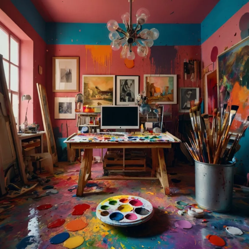
All the theory in the world means little without practical application, and understanding pigment characteristics revolutionized my mixing approach.
Each pigment has its own “personality” that affects how it behaves in mixtures:
- Some colors have tremendous tinting strength (like phthalo blue, which can overpower a mix with just a tiny amount)
- Some are transparent while others are opaque (affecting their use in glazing)
- Many reveal surprising undertones when diluted (like burnt sienna’s orange glow)
- Some granulate or separate when wet (creating beautiful textural effects, especially in watercolor)
Learning these characteristics through systematic experimentation saved me countless hours of frustration. I created mixing charts for all my core colors, testing how each interacted with others and discovering which combinations created the most vibrant secondaries versus which turned to immediate mud.
The difference between physical and optical mixing continues to fascinate me. In my studio, I often place a physically mixed color swatch next to an area where I’ve created a similar hue through hatching or small strokes of separate colors that blend visually. The optically mixed area invariably appears more vibrant and energetic a phenomenon the Impressionists exploited to brilliant effect.
Creating luminous shadows was perhaps my greatest color challenge. Early in my painting journey, shadows inevitably became flat and muddy lifeless holes in otherwise decent paintings. The breakthrough came when I stopped viewing shadows as “darker versions” of local color and started seeing them as opportunities for rich color complexity.
I abandoned black for shadows entirely, instead creating rich darks by mixing complements or using dark, transparent pigments like alizarin crimson permanent and phthalo green. I began observing how shadows in nature contain reflected light carrying color from nearby objects—the underside of a red apple against a wooden table takes on warm amber tones from the reflected wood.
Different Media, Different Approaches
Each painting medium demands its own approach to color mixing and application.
Oil paint’s slow drying time allowed me to develop techniques impossible in faster-drying media. The ability to blend edges while the paint remains workable creates subtle transitions between color areas. Glazing becomes particularly effective as transparent layers can be built gradually over weeks, creating remarkable luminosity and depth.
I still remember my first attempt at alla prima (wet-into-wet) oil painting a complete disaster as I didn’t understand how to control the consistency of the paint. Too thin in some areas, too thick in others, everything became a muddy mess. Learning to adjust medium proportions and maintain proper viscosity eventually led to successful single-session paintings with rich, direct color application.
Watercolor demanded a complete rethinking of my approach. Its transparency means the white paper provides the light a fundamentally different concept from oils where light colors are physically added. Learning to preserve white areas rather than adding them later was a challenging adjustment.
The layering process in watercolor requires patience and planning each wash must dry before applying the next to maintain clarity. When I rush this process, colors become muddy as wet layers blend unintentionally. But the unique luminosity achieved through successive transparent washes creates effects impossible in other media.
Acrylics bridge these worlds with their versatility. They can be used in transparent glazes like watercolor or with impasto techniques like oils. Their quick drying time allows for rapid layering but demands decisive application. I often use them for underpainting that establishes strong color foundations, sometimes finishing with oil layers for subtle blending.
Historical Color Revolutions
Studying art history revealed how color approaches have evolved, often revolutionizing artistic expression.
Renaissance masters developed oil glazing techniques that created unprecedented luminosity, visible in the glowing flesh tones of Titian’s portraits. They worked with a limited palette by necessity many pigments we take for granted didn’t exist yet but created remarkable depth through careful layering and strategic use of precious materials like lapis lazuli for ultramarine blue.
The Impressionist color revolution still inspires my work daily. Their rejection of black, embrace of colored shadows, and observation of momentary light effects transformed how artists approach color. Monet’s haystacks series, showing identical subjects under different lighting conditions, demonstrates how profoundly light shapes our perception of color. His work helped me understand that objects don’t “have” color they have a relationship with light that creates color.
Abstract Expressionists pushed color into new emotional territory. Standing before a Rothko painting changed my understanding of how color can communicate his large, luminous rectangles create an enveloping experience that works directly on the emotions without representational content. Josef Albers’ systematic investigations of color interaction through his “Homage to the Square” series revealed how dramatically colors transform when placed in different contexts.
Developing Your Color Vision
My color journey accelerated when I adopted systematic practice approaches.
Creating mixing charts while admittedly tedious built muscle memory and revealed the unique properties of my palette. Particularly useful was developing charts showing mixtures between complementary pairs, which helped me understand how to create sophisticated neutrals rather than mud.
Copying master works with attentive analysis taught me how artists solved specific color problems. When I meticulously copied a Sorolla beach scene, I discovered he used surprisingly saturated blues in shadow areas that somehow didn’t look garish in context. This taught me how context shapes our perception of what reads as “natural” color.
Direct observation studies, particularly outdoors, shattered my preconceptions about color. The shadows on snow that I assumed would be blue-gray revealed themselves to contain purples, greens, and even oranges from reflected light. These discoveries simply can’t be made through theoretical study alone they require eyes-open observation.
Advanced Color Relationships
As my color understanding developed, subtler concepts became increasingly important.
Simultaneous contrast where colors appear to shift when placed beside their complements creates visual energy that static color cannot. I exploit this phenomenon by placing tiny accents of complementary color within larger fields, creating vibration and interest. A predominantly green landscape comes alive with small touches of red-violet that make the greens appear more intense through contrast.
Breaking color into component parts rather than mixing completely on the palette creates luminosity impossible through direct mixing. In a recent seascape, rather than mixing a flat “ocean blue,” I layered strokes of phthalo blue, ultramarine, and touches of viridian that the eye blends at a distance. The result has a dimensional quality and suggests the movement of water in a way uniform color never could.
Complex compositions demand orchestrated color relationships. I think of color much as a composer thinks of musical instruments some dominate while others provide support, with themes that recur throughout the piece in variations. A dominant blue color scheme might feature strategic violations in orange for emphasis, with transitions between color areas that maintain harmony through shared undertones.
The Personal Color Journey
After years of study and practice, I’ve learned that color mastery is more journey than destination. Technical understanding provides necessary foundations, but meaningful color expression emerges from deeply personal responses to the visual world.
I maintain a color journal documenting successful mixtures and combinations from nature and art that speak to me. This personal reference library has become increasingly valuable over time, helping me recognize recurring preferences that have developed into something of a personal color signature a tendency toward muted teals sparked with unexpected notes of coral that appears throughout my work.
The balance between knowledge and intuition defines this journey. Understanding the science and theory of color gives me the vocabulary needed for expression, but the most compelling color moments in my work often emerge from instinctive responses rather than calculated decisions.
This journey through color continues to reward both systematic study and serendipitous discovery. Each painting presents new color puzzles to solve, maintaining the perfect balance of technical challenge and emotional expression that first drew me to art.
Whether you’re just beginning to explore color or have been painting for decades, I encourage you to approach color with both analytical rigor and childlike wonder. Observe color relationships in nature, experiment fearlessly, and develop your unique color voice that speaks to your personal vision of the world.
The most valuable advice I can offer? Train your eyes to truly see color rather than letting your brain tell you what color things “are.” That apple isn’t simply “red” it contains infinite variations of warm and cool reds, reflected greens from nearby leaves, and perhaps hints of blue from the sky. Learning to see these subtleties transforms not just your artwork but your perception of the visual world around you, making everyday life richer and more vibrant.
What color discoveries are waiting for you in your next painting?
A note on further exploration: If you’re interested in deepening your color understanding, the following resources have been particularly valuable in my own journey:
- Josef Albers’ “Interaction of Color” – A revolutionary approach to understanding color relationships through direct experiments
- Richard Schmid’s “Alla Prima II” – Contains excellent practical advice on color mixing from a master painter
- James Gurney’s “Color and Light” – Combines scientific understanding with artistic application
- Betty Edwards’ “Color: A Course in Mastering the Art of Mixing Colors” – Excellent for beginners
- Michael Wilcox’s “Blue and Yellow Don’t Make Green” – Challenges traditional color theory with practical mixing information
Art11deco
