Color Wheel 101: Master the Art of Color Mixing
Introduction to the Color Wheel and Color Mixing
The color wheel is the fundamental tool for anyone looking to master the art of color mixing. Whether you’re a painter, designer, digital artist, or hobbyist, understanding how to use a color wheel effectively can transform your creative work. This comprehensive guide will walk you through everything you need to know about color wheel 101 and help you master the art of color mixing with confidence and precision.
Color mixing isn’t just about combining random hues and hoping for the best it’s a systematic approach grounded in color theory that allows artists and designers to create harmonious palettes, striking contrasts, and emotional depth. The color wheel serves as your roadmap to navigate this complex but rewarding journey.
What is a Color Wheel?
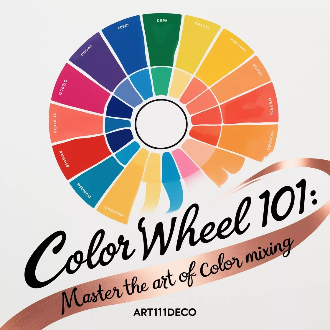
A color wheel is a circular diagram that organizes colors based on their relationships with one another. The modern color wheel has evolved from Sir Isaac Newton’s first circular color diagram created in 1666, where he arranged the spectrum of colors in a circle to demonstrate the natural progression of colors and their relationships.
The Basic Structure of a Color Wheel
At its most fundamental level, the color wheel 101 approach starts with understanding three components:
- Primary Colors: Red, yellow, and blue are considered the primary colors in traditional color theory. These colors cannot be created by mixing other colors together and form the foundation of the color wheel.
- Secondary Colors: Orange, green, and violet are secondary colors that result from mixing equal parts of two primary colors:
- Red + Yellow = Orange
- Yellow + Blue = Green
- Blue + Red = Violet (Purple)
- Tertiary Colors: These are created by mixing a primary color with an adjacent secondary color, resulting in colors such as red-orange, yellow-green, blue-violet, etc. There are six tertiary colors that fill in the gaps between primary and secondary colors on the wheel.
Understanding this basic structure is essential for anyone looking to master the art of color mixing. The color wheel provides a visual representation of how colors relate to each other and helps predict the outcomes of various color combinations.
Color Theory Basics for Effective Color Mixing
Before diving deeper into color mixing techniques, it’s important to understand some fundamental concepts of color theory that will enhance your ability to master the art of color mixing.
Color Properties
Every color has three main properties:
- Hue: This is the color itself (red, blue, etc.) and represents the dominant wavelength of light reflected from a surface.
- Saturation (also called chroma): This refers to the intensity or purity of a color. A highly saturated color appears vivid, while a less saturated color appears more muted or gray.
- Value (also called brightness or luminance): This describes how light or dark a color is. Adding white creates a tint, while adding black creates a shade.
When using the color wheel for color mixing, understanding these properties allows for more precise adjustments and greater control over your color palette.
Color Temperature
Colors are often categorized as either warm or cool:
- Warm Colors: Reds, oranges, and yellows evoke feelings of warmth, energy, and excitement.
- Cool Colors: Blues, greens, and purples tend to create a sense of calm, serenity, and space.
The color wheel clearly illustrates this temperature divide, with warm colors typically occupying one half of the wheel and cool colors the other. Understanding color temperature is crucial when you want to master the art of color mixing to create specific moods or atmospheric effects in your work.
Color Relationships on the Color Wheel
The color wheel serves as a tool for identifying various color relationships that can guide your mixing decisions:
Complementary Colors
Complementary colors sit directly opposite each other on the color wheel (e.g., red and green, blue and orange, yellow and purple). When placed side by side, complementary colors create maximum contrast and visual vibration. When mixed together, they tend to neutralize each other, creating browns and grays.
Analogous Colors
Analogous colors are groups of three to five colors that appear next to each other on the color wheel. These color schemes are naturally harmonious and can create a serene, unified look. When mixing analogous colors, you’ll typically get pleasing transitions that maintain color harmony.
Triadic Colors
A triadic color scheme uses three colors equally spaced around the color wheel, forming a triangle. This arrangement provides strong visual contrast while maintaining harmony. Mixing triadic colors can produce interesting and balanced results when you want variety without sacrificing cohesion.
Split-Complementary Colors
This scheme includes a base color and the two colors adjacent to its complement. It provides the same strong visual contrast as complementary colors but with less tension. For those learning to master the art of color mixing, this is an excellent scheme to practice with.
Tetradic (Double Complementary) Colors
This scheme uses four colors arranged in two complementary pairs. This rich color scheme offers many possibilities for variation but requires careful balancing to avoid overwhelming the viewer.
Practical Color Mixing Techniques
Now that we’ve covered the theoretical foundations of color wheel 101, let’s explore practical techniques to help you master the art of color mixing.
Subtractive vs. Additive Color Mixing
There are two primary systems of color mixing:
- Subtractive Color Mixing: This is used in physical media like paint, ink, and dyes. As you mix pigments, wavelengths of light are increasingly absorbed (subtracted), resulting in darker colors. Mix all primary colors, and you get a dark brown or black.
- Additive Color Mixing: This applies to light sources like computer screens and televisions. The primary colors in additive mixing are red, green, and blue (RGB). As you add more light wavelengths together, colors become lighter, eventually producing white.
Understanding which system applies to your medium is crucial for predicting mixing results accurately.
Paint Color Mixing Guide
For painters looking to master the art of color mixing:
Creating Secondary Colors
- Mix equal parts red and yellow to create orange
- Mix equal parts yellow and blue to create green
- Mix equal parts blue and red to create purple
Creating Tertiary Colors
- Red-Orange: 2 parts red, 1 part yellow
- Yellow-Orange: 2 parts yellow, 1 part red
- Yellow-Green: 2 parts yellow, 1 part blue
- Blue-Green: 2 parts blue, 1 part yellow
- Blue-Purple: 2 parts blue, 1 part red
- Red-Purple: 2 parts red, 1 part blue
Adjusting Tone, Value, and Saturation
- To lighten a color (increase value): Add white
- To darken a color (decrease value): Add black (with caution as it can dull colors)
- To dull a color (decrease saturation): Add its complementary color
- To neutralize a color: Add gray or mix with its complement until desired neutrality is achieved
Digital Color Mixing
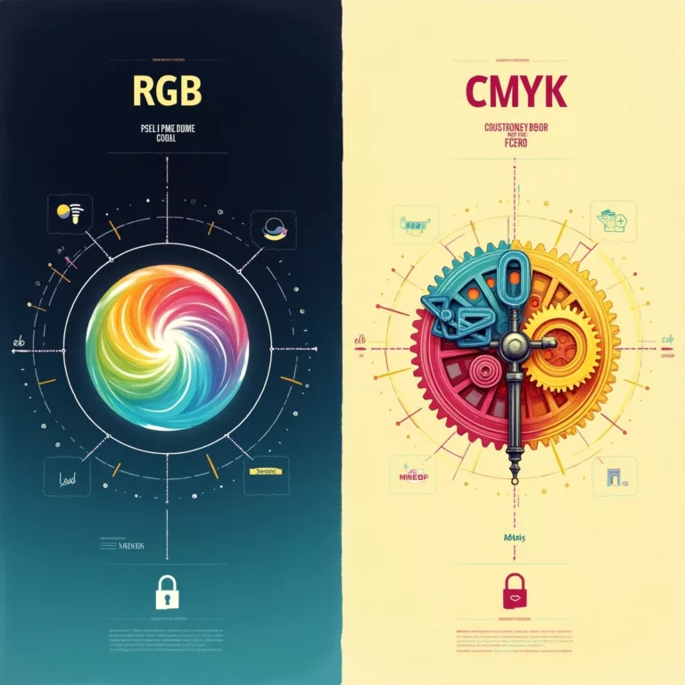
For digital artists working with RGB or CMYK color models:
- RGB (Red, Green, Blue) is used for screens and digital displays
- CMYK (Cyan, Magenta, Yellow, Black) is used for print
Digital color wheels and color pickers make it easy to select precise hues, saturations, and values. Many digital programs also provide color harmony tools that automatically generate complementary, analogous, or other color schemes based on your selections.
Common Color Mixing Problems and Solutions
Even when you understand color wheel 101 principles, you may encounter some challenges as you practice to master the art of color mixing:
Problem: Muddy Colors
Solution: Be mindful of how many colors you’re mixing together. The more colors you combine, especially if they’re from different parts of the color wheel, the muddier the result will be. Start with just two or three colors, and use colors that are relatively close on the color wheel.
Problem: Colors Appearing Different When Dry
Solution: With many painting media, colors can appear darker, lighter, or slightly different in hue when dry compared to wet. Make test swatches and allow them to dry before committing to large areas of your artwork.
Problem: Inconsistent Color Matching
Solution: Keep detailed notes of the exact proportions used in your mixtures. Consider creating a personal color mixing chart for reference. For digital work, save your color codes.
Problem: Colors Not Mixing as Expected
Solution: Check the quality and pigmentation of your materials. Some lower-quality paints may contain fillers that affect their mixing properties. Additionally, some pigments are naturally more dominant than others when mixed.
Color Mixing for Different Media
Different artistic media require slightly different approaches to master the art of color mixing:
Oil Paints
Oil paints have a slow drying time, allowing for extended color mixing directly on the canvas (wet-on-wet technique). Their transparency can be adjusted using mediums, and they maintain vibrant colors when dry.
Mixing Tip: When mixing oils, start with the lighter color and gradually add the darker color in small amounts until you achieve the desired result.
Acrylic Paints
Acrylics dry quickly and darken slightly in the process. They’re versatile and can be used in techniques similar to both watercolors and oils depending on how much water is added.
Mixing Tip: Pre-mix larger quantities of your colors if you need consistency across a large area, as matching mixed acrylics exactly can be challenging once they’ve dried.
Watercolors
Watercolor mixing relies heavily on controlling the water-to-pigment ratio. Colors blend on the paper, and transparency is key to achieving luminosity.
Mixing Tip: Work from light to dark, as watercolors lighten when dry and it’s easier to darken a mixture than to lighten it.
Digital Media
Digital platforms offer unlimited color mixing potential without material waste. Most programs include color wheel interfaces to facilitate easy selection and mixing.
Mixing Tip: Experiment with different blending modes to achieve unique mixing effects that might be difficult with traditional media.
Advanced Color Mixing Concepts
As you become more comfortable with basic color wheel 101 principles and are ready to truly master the art of color mixing, consider these advanced concepts:
Split Primary Palette
Instead of using a single red, yellow, and blue, advanced artists often use two versions of each primary—one with a warm bias and one with a cool bias:
- Warm red (cadmium red) and cool red (alizarin crimson)
- Warm yellow (cadmium yellow) and cool yellow (lemon yellow)
- Warm blue (ultramarine) and cool blue (phthalo or cerulean)
This expanded palette of six “primary” colors allows for a much wider range of mixed colors and more control over color temperature.
Limited Palette Approaches
Paradoxically, limiting your palette can help you master the art of color mixing more quickly. Famous approaches include:
- The Zorn Palette: Named after Swedish artist Anders Zorn, this palette uses just four colors: yellow ochre, vermilion (or cadmium red light), ivory black, and white. Despite its simplicity, it can produce a surprisingly wide range of naturalistic colors, especially for portraiture.
- The Primary Triad: Using just red, yellow, blue, and white forces you to mix every other color you need, rapidly building your color mixing skills.
- Complementary Limited Palette: Choose two complementary colors plus white. The limited range forces creativity while ensuring color harmony.
Optical Color Mixing
Rather than physically blending colors together, optical mixing places small dots or strokes of pure color side by side, allowing the viewer’s eye to blend them visually from a distance. This technique was famously used by Pointillist painters and creates vibrant, luminous effects that can’t be achieved through traditional mixing.
Creating Color Harmony Using the Color Wheel
One of the main purposes of mastering the art of color mixing is to create harmonious color schemes in your work:
Monochromatic Harmony
Using variations of a single hue by adjusting its saturation and value creates a cohesive, elegant look. Mix your chosen color with white, black, or gray to create a full monochromatic palette.
Complementary Harmony
The high contrast of complementary colors creates visual excitement, but can be jarring if used in equal amounts. Try using one color as dominant and its complement as an accent.
Analogous Harmony
For a serene, cohesive feel, mix colors that sit adjacent on the color wheel. This scheme works well for landscapes and designs where you want to evoke a specific mood.
Split-Complementary Harmony
This offers more nuance than a straight complementary scheme while maintaining visual interest. It’s an excellent choice for beginners looking to master the art of color mixing while creating balanced compositions.
Color Mixing for Specific Applications
Different creative fields have their own approaches to color mixing:
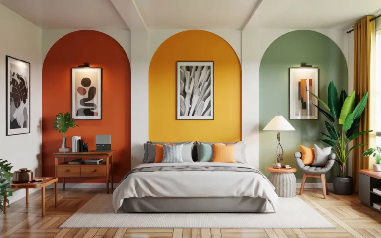
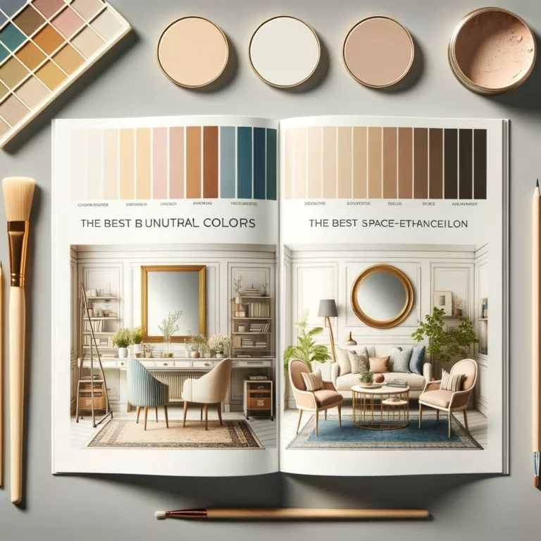
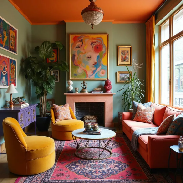
Interior Design
Interior designers use the color wheel to create rooms with specific moods and functions. Understanding color relationships helps in selecting wall colors, furniture, and accessories that work together harmoniously.
Fashion Design
Fashion designers consider how colors interact not just with each other but with the wearer’s skin tone, hair color, and the environment. Seasonal color analysis is heavily based on color wheel principles.
Graphic Design
Graphic designers use color mixing principles to create impactful visuals that communicate effectively. Brand colors are carefully selected based on color psychology and color wheel relationships.
Fine Art
Painters use color mixing to create depth, atmosphere, emotion, and realism. Advanced techniques like glazing (applying thin, transparent layers of color over dried layers) create luminous effects that can’t be achieved with direct mixing.
Building Your Own Color Mixing Reference
As you practice and master the art of color mixing, creating your own reference materials will accelerate your learning:
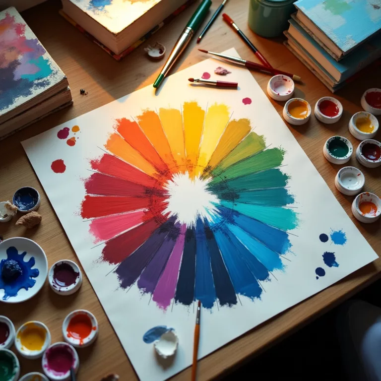
Create a Color Wheel
Making your own color wheel using your specific paints or materials provides an invaluable reference that reflects the actual behavior of your unique supplies.
Make Mixing Charts
Create a grid showing the results of mixing each of your colors with every other color in your palette. This reference will save you time and materials in future projects.
Keep a Color Journal
Document successful color mixtures, noting exact proportions and the specific brands of pigments used. This becomes especially valuable for reproducing colors in large projects or commissioned work.
Conclusion: Mastering the Art of Color Mixing
Understanding the color wheel and color mixing principles opens up endless creative possibilities. While the science of color provides a solid foundation, remember that color mixing is also an art that improves with practice and experimentation.
By starting with color wheel 101 basics and progressively exploring more complex concepts, you’ll develop an intuitive understanding of how colors interact. This knowledge will serve you in any creative endeavor, allowing you to express yourself with greater precision and impact.
The journey to master the art of color mixing is ongoing—even experienced artists continually discover new combinations and techniques. Embrace the process, keep experimenting, and watch as your color confidence transforms your creative work.
FAQs About Color Wheels and Color Mixing
What is the purpose of a color wheel?
The color wheel visually organizes colors to show their relationships to one another, helping artists and designers understand how colors interact and mix together. It’s an essential tool to master the art of color mixing systematically.
How many colors are on a standard color wheel?
A standard color wheel typically shows 12 colors: three primary colors, three secondary colors, and six tertiary colors. More advanced color wheels may display 24 or more color gradations.
What’s the difference between warm and cool colors?
Warm colors (reds, oranges, yellows) tend to advance visually and evoke energy and excitement. Cool colors (blues, greens, purples) tend to recede visually and evoke calm and tranquility. The color wheel clearly separates these temperature groups.
Why do my mixed colors turn muddy?
Muddiness usually occurs when mixing more than two or three colors, especially colors from opposite sides of the color wheel. To avoid this, limit the number of colors you mix together and understand complementary relationships on the color wheel.
How can I make my colors more vibrant?
To increase vibrancy, use pure pigments, avoid mixing complementary colors (which neutralize each other), and consider using a technique like glazing where transparent layers of color create luminosity without direct mixing.
Is the traditional RYB color wheel scientifically accurate?
The traditional RYB (Red-Yellow-Blue) color wheel used by artists for centuries is more of a practical tool than a scientifically perfect model. More accurate color models like the CIE color space exist, but the traditional color wheel remains valuable for artists learning to master the art of color mixing.
What colors should I start with in my palette as a beginner?
Beginners should start with primary colors (red, yellow, and blue), white, and perhaps black. This limited palette forces you to mix colors and build skills quickly. As you progress, add colors strategically based on the type of work you create most often.
How do digital color wheels differ from traditional ones?
Digital color wheels typically use the RGB (Red-Green-Blue) or HSB (Hue-Saturation-Brightness) models rather than the RYB model used in traditional painting. They offer precise control over color values and instant access to color harmonies.
Resources for Further Learning
To continue your journey to master the art of color mixing using color wheel principles, explore these resources:
Books
- “Color: A Workshop for Artists and Designers” by David Hornung
- “Blue and Yellow Don’t Make Green” by Michael Wilcox
- “Color Problems: A Practical Manual for the Lay Student of Color” by Emily Noyes Vanderpoel
Online Courses
- Color Theory fundamentals on major learning platforms
- Medium-specific color mixing courses (oil painting, digital art, etc.)
Color Mixing Tools
- Physical color wheels with mixing guides
- Digital color wheel applications with harmony generators
- Color mixing charts and journals
