Neutral Colors: How to Keep Them Chic, Not Boring
Neutral colors form the backbone of sophisticated interior design, but there’s a fine line between elegantly understated and utterly forgettable. This comprehensive guide explores how to use neutral colors in ways that are chic, dynamic, and anything but boring. From understanding the psychology behind neutrals to mastering layering techniques that create depth and interest, you’ll discover how to transform your spaces with a palette that’s timeless yet distinctly modern.
Understanding the Power of Neutral Colors in Design
What Exactly Are Neutral Colors?
Neutral colors are non-competing hues that work harmoniously with most other colors. Traditionally, these include:
- Pure neutrals: Black, white, and gray tones
- Earth neutrals: Browns, tans, beiges, and taupe
- Natural neutrals: Soft greens, blues, and muted terra cottas with reduced saturation
The defining characteristic of neutral colors is their versatility and ability to create a foundation that either stands beautifully on its own or complements more vibrant accent colors.
The Psychology Behind Neutral Colors
Neutral colors affect our perception and emotional response in subtle yet powerful ways:
- White evokes purity, cleanliness, and expansiveness but can feel clinical without warming elements
- Beige and tan create warmth and stability while maintaining a soothing backdrop
- Gray offers sophisticated versatility ranging from cool corporate to warm residential
- Brown grounds spaces with earthy reassurance and natural connection
- Black (as an accent) adds definition, drama, and anchoring weight when used judiciously
Understanding these psychological impacts helps you select neutrals that evoke your desired emotional response rather than defaulting to whatever is currently trending.
The Evolution of Neutral Color Palettes
Historical Context of Neutrals in Design
Neutral colors have evolved significantly throughout design history:
- Early 2000s: Beige dominated with Tuscan-inspired warm neutrals
- 2010s: Gray emerged as the defining neutral, shifting from warm greiges to cooler tones
- Late 2010s: White became dominant in the modern farmhouse and minimalist movements
- 2020s: Warm neutrals returned with more complexity – mushroom tones, soft terracottas, and stone-inspired hues
This evolution demonstrates that neutral colors aren’t static – they have distinct personalities that define design eras.
Current Trends in Neutral Colors
Today’s most chic neutral color applications reflect several key trends:
- Nature-inspired neutrals with subtle organic undertones rather than flat, one-dimensional hues
- High-contrast neutral pairings that create drama without introducing strong colors
- Textural neutrals that rely on material variation rather than color variation
- Warm minimalism that softens the stark white aesthetic with honey tones and oatmeal hues
These trends reflect a sophisticated approach that celebrates neutrals as intentional choices rather than safe defaults.
The Science of Creating Interesting Neutral Palettes
Understanding Undertones in Neutral Colors
The secret to sophisticated neutral colors lies in understanding undertones – the subtle hues beneath the surface color:
- Warm neutrals have yellow, orange, or red undertones
- Cool neutrals have blue, green, or purple undertones
- True neutrals have minimal undertones and work with both warm and cool palettes
Undertone awareness prevents the most common neutral color mistakes, such as pairing warm beige with cool gray or selecting a yellow-based white for a room with cool stone features.
The Role of Light in Neutral Color Perception
Lighting dramatically affects how neutral colors appear:
- Northern exposure brings out cool blue undertones
- Southern exposure enhances warm yellow undertones
- Eastern/morning light casts a golden glow on neutrals
- Western/afternoon light creates warmer, sometimes reddish tones
A neutral that looks perfect in a showroom might appear completely different in your space due to these lighting variables. This is why testing colors in actual rooms at different times of day is crucial for successful neutral color schemes.
Color Theory Applied to Neutrals
Even when working with neutral colors, color theory principles remain important:
- Complementary neutral pairings (like warm beige with cool gray-blue) create subtle tension
- Analogous neutral schemes (like taupe, greige, and warm gray) create harmonious flow
- Monochromatic neutral designs (variations of a single neutral) create sophisticated depth
Understanding these relationships helps create neutral color schemes that feel intentional rather than accidental.
Techniques for Creating Chic Neutral Interiors
Layering Different Neutral Tones
The most sophisticated neutral interiors employ careful layering techniques:
- Start with a foundational neutral for walls and large surfaces
- Add a secondary neutral through larger furniture pieces
- Introduce tertiary neutrals through textiles and medium-sized elements
- Finish with accent neutrals in accessories and small details
This layered approach creates visual interest through subtle shifts rather than stark contrasts.
Texture: The Secret Weapon of Neutral Spaces
Texture becomes particularly crucial in neutral color schemes:
- Contrasting textures (rough vs. smooth, matte vs. shiny) create visual interest
- Natural materials (linen, wool, wood, stone) add inherent textural variation
- Textile layering (through rugs, pillows, throws) adds dimensional complexity
- Architectural textures (beadboard, shiplap, plaster) create surface variation
In neutral spaces, these textural elements often become the focal points that might otherwise be created through color.
Playing with Contrast in Neutral Settings
Strategic contrast prevents neutral colors from falling flat:
- Value contrast (light vs. dark neutrals) creates definition and structure
- Temperature contrast (warm vs. cool neutrals) adds subtle complexity
- Textural contrast (rough vs. smooth surfaces) creates tactile interest
- Finish contrast (matte vs. glossy elements) adds dimensional variation
When properly balanced, these contrasts create sophisticated tension that keeps neutral spaces engaging.
Room-by-Room Guide to Chic Neutral Colors
Living Rooms: Creating Inviting Neutral Spaces
Living rooms offer perfect opportunities for sophisticated neutral color applications:
- Foundation strategy: Select a warm or cool neutral for walls based on the room’s natural light
- Furniture approach: Choose larger pieces in complementary neutrals rather than matching the walls
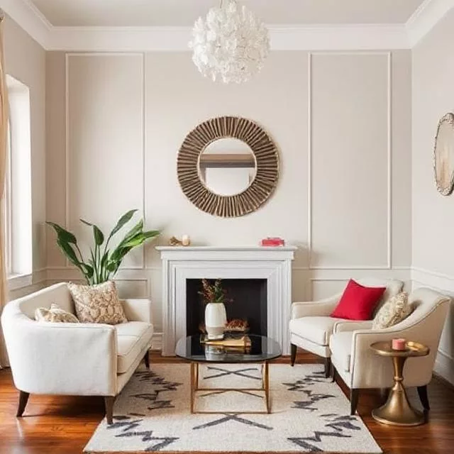
- Textile integration: Layer at least three different neutral tones through rugs, pillows, and throws
- Accent method: Incorporate one or two non-neutral accents that harmonize with your neutral base
For example, a living room with soft greige walls might feature oatmeal linen upholstery, warm wood tones, charcoal accent pillows, and subtle terracotta accessories.
Kitchens: Timeless Neutral Approaches
Kitchens particularly benefit from neutral colors that won’t quickly date:
- Cabinetry considerations: Select cabinet colors with subtle undertones rather than flat neutrals
- Countertop coordination: Choose countertops that complement rather than match cabinet tones
- Backsplash strategy: Use texture rather than bold color to create interest
- Hardware impact: Incorporate metals that enhance your warm or cool neutral direction
A sophisticated neutral kitchen might pair soft putty-colored cabinets with veined marble countertops, textured ceramic backsplash tiles, and brushed bronze hardware.
Bedrooms: Serene Neutral Retreats
Bedrooms call for neutral colors that promote relaxation:
- Wall approach: Consider slightly darker or more saturated neutrals for cocooning comfort
- Bedding strategy: Layer multiple neutral tones with varied textures
- Furniture selection: Mix wood tones intentionally rather than matching perfectly
- Textile integration: Incorporate natural fibers with inherent color variation
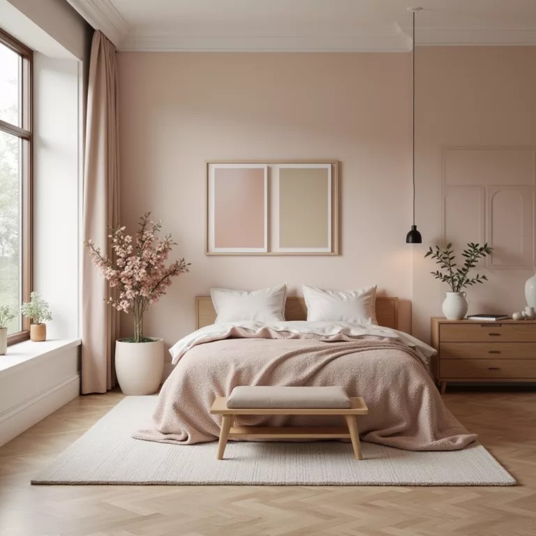
For example, a serene bedroom might feature warm mushroom walls, ivory linen bedding, gray wool throws, and natural wood furniture with varying honey to chocolate tones.
Bathrooms: Spa-Inspired Neutral Palettes
Bathrooms benefit from neutral colors that create clean, calming atmospheres:
- Tile selection: Choose tiles with subtle variation rather than perfectly uniform neutrals
- Fixture coordination: Select fixtures that complement your warm or cool neutral direction
- Textile approach: Incorporate highly textural towels and bath mats
- Accessory strategy: Add organic elements like wooden bath accessories or stone containers
A chic neutral bathroom might combine warm greige tiles with taupe walls, brass fixtures, and textured white towels for a spa-like atmosphere.
Advanced Neutral Color Strategies
Creating Focal Points in Neutral Rooms
Contrary to popular belief, neutral colors can create powerful focal points:
- High-contrast neutral combinations can define architectural features
- Textural focal walls using plaster, stone, or wood create dimension
- Strategically darker neutrals on key walls create depth
- Metallic neutral accents draw the eye through subtle reflectivity
These techniques create hierarchy and interest without departing from a neutral palette.
The New Neutrals: Desaturated Colors as Neutrals
Contemporary design is expanding the definition of neutral colors:
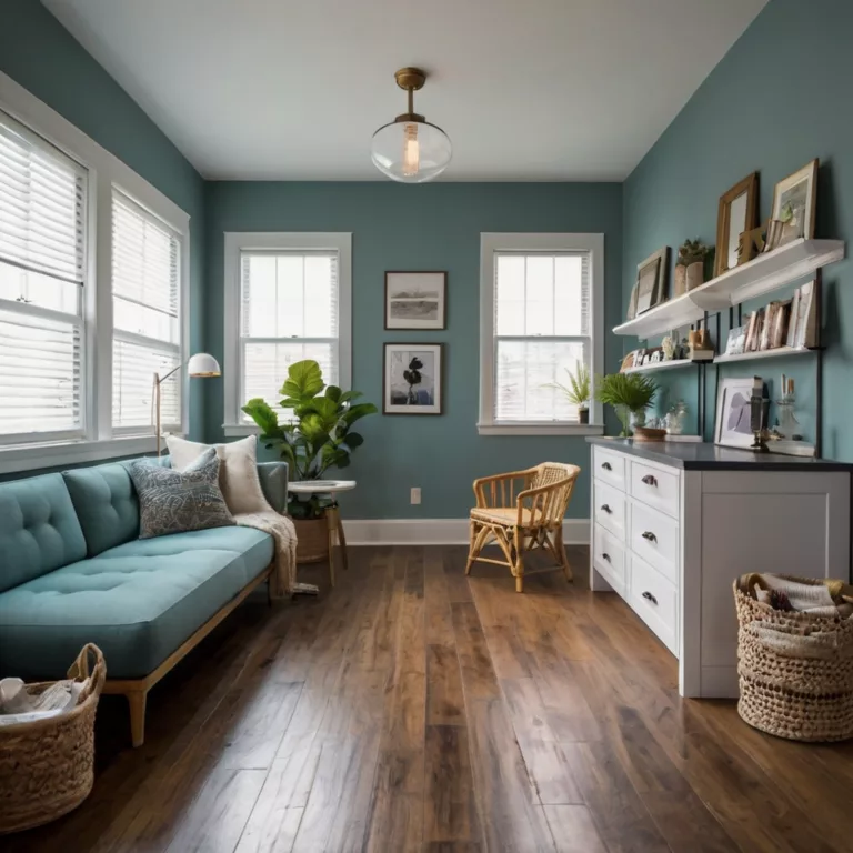
- Desaturated blues (particularly dusty French blues) function as sophisticated neutrals
- Muted sages and olive tones serve as versatile earth-inspired neutrals
- Softened terracottas and clay colors act as warm neutrals with subtle character
- Desaturated mauves and lavenders work surprisingly well as complex cool neutrals
These “new neutrals” offer slightly more personality than traditional options while maintaining versatility.
Balancing Neutral Colors with Statement Pieces
Even in predominantly neutral interiors, strategic non-neutral elements create tension:
- Art selections with limited but impactful color create focal points
- Statement furniture pieces in carefully chosen hues add personality
- Botanical elements bring natural green life to neutral backgrounds
- Curated decorative objects in selective colors create moments of surprise
The key is extreme selectivity – when everything isn’t colorful, the few colored elements become more impactful.
Practical Implementation of Neutral Color Schemes
How to Select the Right Neutral Paint Colors
The paint selection process requires strategic thinking:
- Identify fixed elements in your space that will influence neutral choices
- Determine warm vs. cool direction based on architecture and lighting
- Test at least three options in large swatches on multiple walls
- Observe samples throughout the day as lighting changes
- Consider the complete environment, including flooring, furniture, and adjacent spaces
This methodical approach prevents costly mistakes and ensures harmonious results.
Furniture and Textile Selection for Neutral Spaces
Furnishings play crucial roles in neutral color schemes:
- Establish a neutral hierarchy with varying depths and tones
- Use upholstery as a secondary neutral that complements rather than matches walls
- Select rugs that incorporate multiple neutral tones for cohesion
- Choose wood tones intentionally to enhance your warm or cool direction
These selections should feel curated rather than coincidental for a sophisticated result.
Accessorizing Neutral Rooms Without Breaking the Palette
Accessories provide opportunities for neutral depth:
- Group objects in tonal families rather than matching exactly
- Incorporate natural materials with inherent color variation
- Add metallic elements that reflect and enhance your neutral tones
- Include textural contrasts through baskets, pottery, and sculptural objects
These techniques create visual interest while maintaining the sophisticated restraint of a neutral palette.
Common Neutral Color Mistakes and How to Avoid Them
Underdeveloped Neutral Palettes
The most common mistake with neutral colors is creating spaces that feel flat and unconsidered:
- Problem: Using just one or two neutral tones throughout a space
- Solution: Develop a hierarchy of at least four to five related neutrals that create depth
This approach requires planning a complete neutral color story rather than selecting a single “safe” option.
Mismatched Undertones
Clashing undertones create subtle but persistent visual discord:
- Problem: Combining warm beiges with cool grays, or yellow-toned whites with blue-toned grays
- Solution: Identify undertones before purchasing and ensure harmony across selections
Consider creating an undertone map of your space, identifying the yellow, pink, blue, or green undertones in each element.
Over-reliance on Gray
While gray has dominated recent design trends, using it without consideration can create cold, uninviting spaces:
- Problem: Default selection of cool grays without balancing warm elements
- Solution: Either select grays with warmer undertones or balance cool grays with warm textiles and woods
The most successful gray rooms incorporate warming elements that prevent a corporate or sterile feeling.
Texture Deficiency
Neutral spaces without textural variation quickly become forgettable:
- Problem: Smooth surfaces throughout with little tactile interest
- Solution: Incorporate multiple textural elements through materials, textiles, and architectural details
Consider texture as important as color in your design planning process, particularly for neutral spaces.
Case Studies: Successful Neutral Color Applications
Residential Case Study: A Sophisticated Family Home
A 3,200-square-foot residence successfully employed neutrals by:
- Using Benjamin Moore’s “Edgecomb Gray” (a sophisticated greige) as a foundational neutral
- Adding depth through slightly darker “Revere Pewter” in connecting spaces
- Incorporating furniture in oatmeal linens and warm leather tones
- Creating texture through sisal rugs, basket weaves, and varied woods
- Adding minimal accent colors through carefully curated art and accessories
The result felt simultaneously cohesive, sophisticated, and warmly inviting rather than bland.
Commercial Case Study: Boutique Hotel Lobby
A luxury boutique hotel created distinctive character through neutrals by:
- Establishing a base of warm limestone tones throughout architectural elements
- Adding rich cognac leather seating for warm depth
- Incorporating sculptural plaster wall treatments for textural interest
- Using matte black metal accents for definition and contrast
- Integrating minimal but impactful touches of deep emerald for unexpected sophistication
This approach created memorable spaces that photographed beautifully while maintaining timeless appeal.
Retail Case Study: High-End Clothing Boutique
A fashion retailer successfully used neutrals to highlight merchandise by:
- Creating walls in warm ivory with subtle texture to provide depth without distraction
- Installing weathered oak flooring with rich natural variation
- Incorporating brushed brass fixtures with gentle reflectivity
- Adding architectural interest through plastered arched details
- Using soft seating in oatmeal bouclé for textural contrast
This neutral foundation created a sophisticated backdrop that allowed merchandise to shine while still feeling distinctively designed.
Professional Designer Insights on Neutral Colors
Designer Tricks for Elevated Neutral Spaces
Top interior designers rely on several key techniques when working with neutral colors:
- 60-30-10 rule for neutrals: 60% primary neutral, 30% secondary neutral, 10% accent neutral or color
- The power of repetition: Repeating specific neutral tones throughout a space creates intentionality
- Strategic contrast points: Creating specific high-contrast moments rather than uniform contrast
- Importance of transitions: Using threshold spaces to bridge between slightly different neutral schemes
These professional approaches elevate neutral spaces from basic to brilliantly designed.
Expert Color Formulas for Foolproof Neutral Combinations
Designers often rely on proven neutral color combinations:
- Warm sophisticated: Ivory + taupe + cognac + touches of black
- Cool contemporary: Soft white + greige + charcoal + natural linen
- Organic modern: Bone white + mushroom + cedar + slate
- Timeless elegance: Cream + camel + chocolate + burnished brass
These formulas provide starting points that can be customized to specific spaces and preferences.
Designer-Recommended Neutral Paint Colors
Interior design professionals consistently recommend certain neutral paint colors for their versatility and sophistication:
- Benjamin Moore “White Dove”: A soft white with subtle warmth that avoids feeling stark
- Farrow & Ball “Elephant’s Breath”: A complex greige with subtle lilac undertones
- Sherwin-Williams “Accessible Beige”: A perfectly balanced beige that works with most design styles
- Benjamin Moore “Pale Oak”: A sophisticated light neutral that reads differently throughout the day
- Farrow & Ball “Strong White”: A nuanced off-white with subtle gray undertones
These selections have stood the test of time in countless designer projects.
Neutral Colors Across Different Design Styles
Modern Minimalist Approaches to Neutrals
Minimalist design relies heavily on neutral colors with specific characteristics:
- Architectural whites with subtle undertones rather than stark brightness
- Concrete grays that embrace natural variation
- Textural natural materials like unfinished woods and stones
- High contrast neutrals that create definition without color
The minimal neutral palette depends on perfect execution and material quality rather than variety.
Traditional Applications of Neutral Colors
Traditional design employs neutrals differently:
- Creamier whites that avoid contemporary starkness
- Richer taupes and beiges with more saturation than modern interpretations
- Multiple wood tones creating warmth through variety
- Subtle pattern play within neutral color families
These approaches create timeless interiors that feel established rather than trendy.
Transitional Blending of Neutral Approaches
Transitional design—the most popular contemporary approach—blends traditional and modern neutral strategies:
- Slightly warmed whites that avoid both stark modernism and yellow-toned traditionalism
- Sophisticated greiges that bridge gray and beige worlds
- Careful mixing of cool and warm neutrals for balanced tension
- Textural contrast through both natural and manufactured materials
This balanced approach creates versatile interiors that feel current without being trendy.
Future Trends in Neutral Color Applications
Emerging Neutral Color Directions
Design forecasting indicates several emerging trends in neutral colors:
- Brown revival: The return of chocolate and coffee tones as sophisticated alternatives to black
- Earthy minimalism: Nature-inspired neutrals replacing starker modernist palettes
- Neutral color blocking: Using multiple neutral tones in geometric configurations
- Textural color: Neutrals that incorporate subtle texture through application techniques
These trends suggest neutrals will continue gaining complexity rather than remaining simple background players.
Sustainability’s Impact on Neutral Color Preferences
Environmental consciousness is influencing neutral color trends:
- Natural pigment revival: Interest in earth-derived colors with subtle variation
- Undyed natural materials: Embracing the inherent colors of sustainable fibers
- Limewash and mineral-based finishes: Returning to traditional applications with natural depth
- Locally-sourced material palettes: Creating neutral schemes based on regional materials
These approaches connect neutral color selection to broader environmental values.
Technology and Neutral Colors
Advancing technology is influencing how we experience neutral colors:
- Smart lighting effects: Programmable lighting that subtly shifts neutral tones throughout the day
- AR color visualization: Apps allowing precise previewing of neutral colors in actual spaces
- Material innovation: New composites offering sustainable alternatives with unique neutral characteristics
- Digital-physical integration: Screen-friendly neutrals that work well both in-person and on camera
These developments are expanding how neutral colors function in contemporary environments.
Conclusion: The Timeless Sophistication of Well-Executed Neutral Colors
Far from boring, neutral colors offer endless possibilities for creating spaces with depth, character, and sophistication. The key lies in understanding neutrals not as absence of color but as complex, nuanced hues worthy of thoughtful application. By mastering undertones, embracing texture, creating contrast, and developing layered neutral palettes, you can create interiors that are simultaneously timeless and distinctly contemporary.
Remember that successful neutral spaces rely on intentionality—deliberate selections and combinations rather than default choices. Whether you’re drawn to warm or cool neutrals, traditional or contemporary applications, the principles outlined in this comprehensive guide will help you create neutral spaces that are undeniably chic, never boring.
FAQs About Chic Neutral Colors
Q: What’s the difference between warm and cool neutrals?
A: Warm neutrals have yellow, orange, or red undertones that create cozy, inviting atmospheres. Cool neutrals contain blue, green, or purple undertones and tend to create fresher, more spacious-feeling environments. The key to sophisticated neutral schemes often lies in balancing these qualities or committing fully to one direction.
Q: How many different neutral tones should I include in a room?
A: For a well-developed neutral scheme, incorporate at least 3-5 different neutral tones that relate to each other but provide subtle variation. This creates depth without becoming chaotic. These can be distributed across walls, larger furniture, textiles, and accessories.
Q: Can I mix warm and cool neutrals?
A: Yes, but with intention. The most successful mixing occurs when you establish a dominant temperature direction (primarily warm or primarily cool) and then incorporate complementary neutrals from the opposite temperature as accents. Random mixing without a plan typically creates discord.
Q: What’s the biggest mistake people make with neutral colors?
A: The most common mistake is treating all neutrals as interchangeable without attention to undertones. This results in combinations that subtly clash, creating spaces that feel “off” without an obvious reason why. Always compare neutrals side by side under your actual lighting conditions before committing.
Q: How do I prevent a neutral room from feeling boring?
A: Focus on texture, contrast, and layering. Incorporate multiple textures through natural materials, textiles, and architectural elements. Create strategic contrast through varying tones and finishes. Layer neutrals from light to dark to create visual hierarchy and interest without departing from your neutral palette.

