Practical Color Tips & Tricks:
Introduction
Color is one of the most powerful tools in design, influencing everything from mood and perception to functionality and usability. Whether you’re decorating your home or designing digital interfaces, understanding color theory and application can transform your projects from ordinary to extraordinary. This comprehensive guide explores practical color tips and tricks for both homeowners and designers, complete with tools, techniques, and professional insights to help you harness the full potential of color in your creative endeavors.
Understanding Color Theory: The Foundation
The Color Wheel Explained
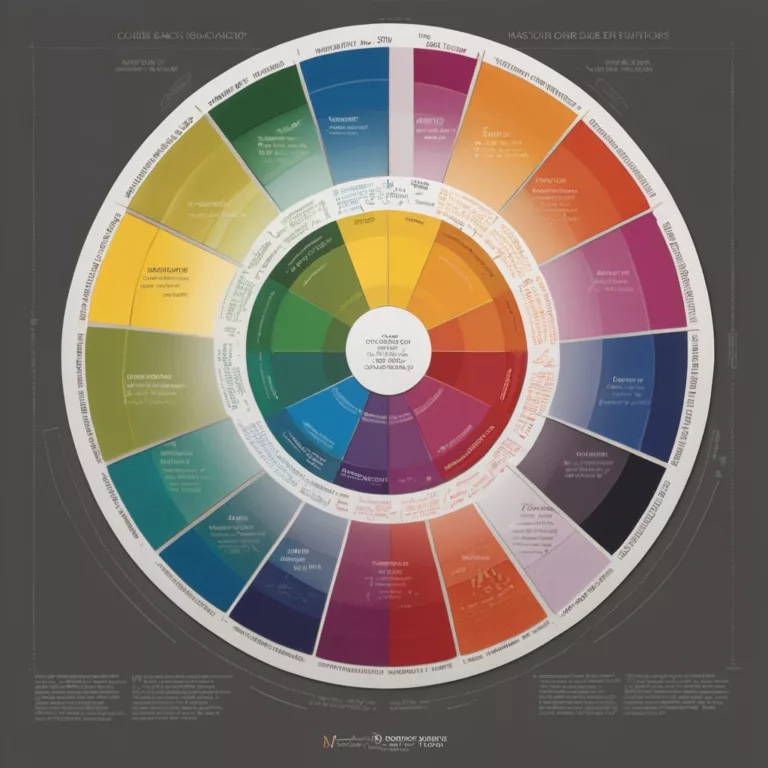
The color wheel serves as the fundamental framework for understanding color relationships. Developed initially by Sir Isaac Newton in 1666, this tool has evolved into an essential guide for designers and artists alike.
Primary Colors: Red, blue, and yellow form the foundation of the color wheel. These colors cannot be created by mixing other colors.
Secondary Colors: Green, orange, and purple result from mixing primary colors.
Tertiary Colors: The combinations between primary and secondary colors create tertiary colors like red-orange or blue-green, adding nuance and depth to the spectrum.
Color Harmonies That Work
Understanding how colors work together is crucial for creating visually pleasing environments:
- Complementary Colors: Colors positioned opposite each other on the color wheel (like blue and orange) create vibrant, high-contrast combinations that draw attention.
- Analogous Colors: Colors adjacent to each other on the wheel (such as blue, blue-green, and green) offer a harmonious, cohesive look that’s easy on the eyes.
- Triadic Colors: Three colors equidistant on the color wheel create a balanced yet vibrant scheme.
- Monochromatic Colors: Different shades, tones, and tints of a single color create a sophisticated, unified appearance.
The Psychology of Color
Colors evoke emotional and psychological responses that can significantly impact how spaces feel:
- Red: Energizing and stimulating, red increases heart rate and creates excitement.
- Blue: Calming and serene, blue reduces stress and promotes tranquility.
- Yellow: Optimistic and cheerful, yellow creates warmth and energy.
- Green: Balancing and refreshing, green connects to nature and promotes restfulness.
- Purple: Luxurious and creative, purple stimulates imagination and contemplation.
- Orange: Friendly and enthusiastic, orange promotes socialization and comfort.
- White: Clean and spacious, white creates an impression of openness and purity.
- Black: Sophisticated and powerful, black adds drama and definition.
Understanding these psychological impacts allows for intentional color selection based on the desired mood and function of a space.
Creating the Perfect Color Palette for Your Home
Assessing Your Space
Before selecting colors, consider these critical factors:
- Natural Light: Rooms with north-facing windows receive cooler light, while south-facing rooms enjoy warmer illumination. East-facing spaces get morning light, while west-facing areas receive afternoon light. Each lighting scenario affects how colors appear.
- Room Function: Different spaces serve different purposes. Bedrooms benefit from calming colors, while social areas might warrant more energetic hues.
- Room Size: Light colors make small spaces feel larger, while darker tones can make large rooms feel cozier.
- Architectural Features: Consider how color can highlight or downplay architectural elements.
- Existing Elements: Factor in flooring, furniture, and fixtures that will remain in the space.
The 60-30-10 Rule
Professional designers often employ the 60-30-10 rule for balanced color distribution:
- 60%: The dominant color, typically applied to walls
- 30%: The secondary color, used for furniture and textiles
- 10%: The accent color, incorporated through accessories and small details
This ratio creates visual interest while maintaining harmony and preventing overwhelm.
Color Schemes for Different Home Styles
Modern Minimalist: Neutral base colors with carefully selected pops of bold color
- Base: Whites, grays, blacks
- Accents: Bold primary colors or sophisticated jewel tones
Traditional/Classic: Rich, timeless colors with subtle variations
- Base: Warm neutrals, sage greens, navy blues
- Accents: Burgundy, gold, deep green
Bohemian/Eclectic: Vibrant, layered colors with global influences
- Base: Warm earth tones, terracotta, olive
- Accents: Magenta, turquoise, marigold
Scandinavian: Light, airy colors that maximize brightness
- Base: White, light gray, pale wood tones
- Accents: Soft pastels, black accents
Industrial: Raw, utilitarian colors with texture
- Base: Concrete gray, brick red, weathered brown
- Accents: Metal tones, distressed black
Color Flow Between Rooms
Creating a cohesive color story throughout your home enhances the overall design:
- Choose a Core Color Palette: Select 3-5 colors that will appear throughout your home.
- Vary Intensity: Use different intensities of the same colors to create variety while maintaining cohesion.
- Connect Open Spaces: In open floor plans, ensure colors flow naturally from one area to another.
- Use Transitional Spaces: Hallways and landings can serve as color transitions between rooms.
- Create Visual Threads: Repeat accent colors in different rooms to tie the home together.
Working with Neutrals
Neutrals form the backbone of most color schemes:
- Warm Neutrals: Beige, tan, cream, and brown create cozy, inviting spaces.
- Cool Neutrals: Gray, silver, and cool white offer a contemporary, sophisticated feeling.
- True Neutrals: Colors like greige (gray-beige) work well with both warm and cool color schemes.
When selecting neutrals, pay attention to undertones—the subtle hues that become apparent when colors are placed side by side. A seemingly simple white might have yellow, pink, or blue undertones that affect how it pairs with other colors.
Testing Colors Effectively
Never commit to a color without testing it first:
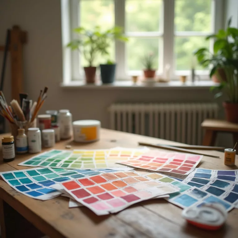
- Paint Samples: Apply large swatches (at least 2’x2′) on multiple walls.
- Observe Throughout the Day: Check how colors appear in morning, afternoon, and evening light.
- Consider Artificial Lighting: Test colors under the lighting conditions you typically use.
- View With Existing Elements: Ensure colors work with flooring, cabinetry, and furniture.
- Use Peel-and-Stick Samples: Many paint companies offer adhesive samples that can be moved around.
Top Color Picker Tools & Apps
Digital Color Tools for Designers
Adobe Color CC
- Features: Color wheel, harmony rules, extraction from images, accessibility tools
- Best for: Integration with Adobe Creative Suite, creating accessible color combinations
- URL: color.adobe.com
Coolors
- Features: Random palette generation, palette from image, contrast checker
- Best for: Quick inspiration and palette generation
- URL: coolors.co
Colormind
- Features: AI-powered palette suggestions, extraction from images, UI preview
- Best for: Real-world application visualization
- URL: colormind.io
Paletton
- Features: Advanced color theory implementation, color scheme wizard
- Best for: Creating theoretically sound color relationships
- URL: paletton.com
ColorSpace
- Features: Generate multiple palette variations from a single color
- Best for: Exploring various directions from a starting point
- URL: mycolor.space
Mobile Apps for On-the-Go Color Selection
Pantone Connect
- Features: Access to Pantone color libraries, capture colors from surroundings
- Best for: Professional designers needing Pantone reference
ColorSnap (Sherwin-Williams)
- Features: Match colors to Sherwin-Williams paint colors, visualization tools
- Best for: Home decorators planning to use Sherwin-Williams products
Color Harmony
- Features: Color wheel, harmony rules, saved palettes
- Best for: Learning color theory while creating palettes
Adobe Capture
- Features: Extract colors from camera or photos, create color themes
- Best for: Capturing real-world inspiration
Picular
- Features: Color search engine based on natural language
- Best for: Finding colors associated with concepts or objects
Physical Color Tools
Pantone Color Formula Guide
- Provides standardized color references used across industries
Paint Fan Decks
- Comprehensive collections of paint colors from specific manufacturers
Color Wheels
- Physical tools for understanding color relationships
Munsell Color System Books
- Professional-grade color identification and matching tools
NCS (Natural Color System) Index
- Logical color notation system based on how humans perceive color
Advanced Color Techniques for Designers
Color for Digital Interfaces
Effective digital design requires understanding how colors function on screens:
- RGB vs. CMYK: RGB (Red, Green, Blue) is for digital displays, while CMYK (Cyan, Magenta, Yellow, Black) is for print. Converting between them requires careful adjustment.
- HEX Codes: Six-digit codes (#FFFFFF for white) provide precise color specification for web design.
- Color Accessibility: Ensure sufficient contrast ratios (minimum 4.5:1 for normal text) to accommodate users with visual impairments. Tools like WebAIM’s Contrast Checker can verify compliance.
- Color Consistency Across Devices: Implement color management systems to maintain consistency across different screens and devices.
Using Color to Guide User Experience
In interface design, color serves functional purposes:
- Hierarchy: Direct attention to important elements through strategic color use.
- Navigation: Help users understand where they are and where they can go.
- Feedback: Signal success, warning, or error states.
- Branding: Reinforce brand identity through consistent color application.
Color Trends and Forecasting
Understanding color trends helps create contemporary designs:
- Pantone Color of the Year: This influential forecast affects design across industries.
- Industry-Specific Trends: Different sectors (fashion, interior design, graphic design) have their own color cycles.
- Cultural and Social Influences: Current events and social movements influence color preferences.
- Trend Resources: Publications like WGSN and Color Marketing Group provide professional forecasting.
Problem-Solving with Color
Correcting Color Issues in Existing Spaces
Problem: Room Feels Cold and Uninviting
- Solution: Introduce warm colors through furnishings, artwork, or an accent wall.
- Examples: Terracotta pillows, brass accessories, amber lighting
Problem: Space Feels Too Dark
- Solution: Lighten walls, add reflective surfaces, incorporate brighter accents.
- Examples: Light-colored area rugs, mirrors to bounce light, metallic accessories
Problem: Room Feels Chaotic
- Solution: Reduce the color palette, create unity through repetition.
- Examples: Choose one dominant color family, use varying shades of the same color
Problem: Space Lacks Personality
- Solution: Add unexpected color accents that reflect personal style.
- Examples: Colorful artwork, vibrant textiles, painted furniture
Working with Challenging Colors
Strong Colors: Balance with neutrals and provide visual rest areas.
Trendy Colors: Use in easily replaceable elements rather than permanent fixtures.
Clashing Colors: Find a bridging hue that works with both problematic colors.
Dated Colors: Update with modern interpretations or complementary accents.
Specialized Color Applications
Color for Commercial Spaces
Business environments require strategic color application:
- Retail: Colors can influence purchasing behavior. Red creates urgency, while blue builds trust.
- Offices: Blues and greens improve focus and reduce eye strain. Consider different colors for creative versus analytical work areas.
- Restaurants: Red and orange stimulate appetite, while blue suppresses it. High-end establishments often feature rich, deep colors.
- Healthcare: Soothing blues and greens reduce anxiety, while warm accents prevent an institutional feel.
Color in Art and Expression
Beyond functional applications, color serves expressive purposes:
- Emotional Conveyance: Artists use color to communicate specific feelings and create emotional responses.
- Symbolism: Colors carry cultural and contextual meanings that add depth to artistic work.
- Optical Effects: Understanding techniques like simultaneous contrast can create visual interest and dimension.
Sustainable and Ethical Color Considerations
Eco-Friendly Color Options
Modern color application increasingly considers environmental impact:
- Low-VOC and Zero-VOC Paints: Reduce harmful volatile organic compounds.
- Natural Pigments: Derived from minerals, plants, and other natural sources.
- Sustainable Dyes: Environmentally responsible options for textiles and materials.
Cultural Sensitivity in Color Choices
Colors carry different meanings across cultures:
- White: Represents purity in Western cultures but signifies mourning in many Eastern cultures.
- Red: Symbolizes luck and prosperity in Chinese culture but can represent danger in Western contexts.
- Purple: Associated with royalty in European traditions but with mourning in some Latin American countries.
Understanding these variations is essential for culturally respectful design, especially for global brands and cross-cultural projects.
Conclusion
Color is both science and art, requiring technical knowledge and creative intuition. By understanding color theory fundamentals, leveraging appropriate tools, and applying context-specific techniques, you can transform spaces and designs through thoughtful color selection. Whether you’re refreshing your home or developing professional design projects, these practical color tips and tricks provide a foundation for creating harmonious, purposeful, and visually stunning color schemes.
Remember that while trends come and go, successful color application ultimately depends on understanding the specific needs of your space, audience, and purpose. With practice and experimentation, you’ll develop confidence in creating color palettes that not only please the eye but also effectively serve their intended function.
Resources for Further Learning
Books
- Color: A Course in Mastering the Art of Mixing Colors by Betty Edwards
- The Secret Lives of Color by Kassia St. Clair
- Color Design Workbook by Terry Lee Stone
- Interaction of Color by Josef Albers
Online Courses
- Color Theory on Skillshare
- Adobe Color Fundamentals
- Interior Design: Using Color Effectively
Websites and Communities
- r/ColorBlender (Reddit)
- Design Seeds (design-seeds.com)
- Color Matters (colormatters.com)
By continuing to explore color theory and application, you’ll develop an increasingly refined color sensibility that enhances all your creative projects.

