Primary, Secondary & Tertiary Colors: What You Need to Know
Understanding the Color Wheel: A Comprehensive Guide to Primary, Secondary, and Tertiary Colors
Are you confused about primary, secondary, and tertiary colors? Whether you’re a designer, artist, or just curious about color theory, understanding the color wheel is essential knowledge. Primary, secondary, and tertiary colors form the foundation of all color relationships and harmony. This comprehensive guide will explain everything you need to know about these fundamental color categories, how they work together, and how to use them effectively in your projects.
What Are Primary Colors?
Primary colors are the foundation of color theory and serve as the building blocks for all other colors. By definition, primary colors cannot be created by mixing other colors together they are pure and fundamental.
The Traditional Primary Colors (RYB)
In traditional color theory, which is commonly used in art and painting, the primary colors are:
- Red: A warm, vibrant hue that evokes emotions like passion and energy
- Yellow: A bright, cheerful color associated with happiness and optimism
- Blue: A cool, calming color that suggests tranquility and depth
These three colors form the basis of the RYB (Red-Yellow-Blue) color model, which has been taught to artists for centuries. When using pigments like paint, these three colors can be mixed in various combinations to create virtually any other color.
Other Primary Color Systems
It’s important to note that different color systems define primary colors differently based on their applications:
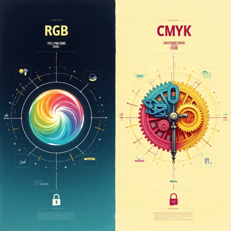
- RGB Color Model: Used in digital displays, where the primary colors are Red, Green, and Blue. These are additive primaries, meaning they add light to create other colors.
- CMYK Color Model: Used in printing, where the primary colors are Cyan, Magenta, Yellow, and Black (K). These are subtractive primaries, as they absorb light to create other colors.
For the purposes of traditional art and design theory, we’ll focus primarily on the RYB model in this guide.
What Are Secondary Colors?
Secondary colors are created by mixing equal parts of two primary colors. In the RYB color model, the secondary colors are:
- Orange: Created by mixing red and yellow
- Green: Created by mixing yellow and blue
- Purple (or violet): Created by mixing blue and red
Secondary colors sit between the primary colors on the color wheel and provide a broader palette for artistic expression. They offer a natural transition between the primary colors and add depth and variety to compositions.
Properties of Secondary Colors
Secondary colors inherit qualities from both of their parent primary colors:
- Orange combines the energy of red with the cheerfulness of yellow, creating a warm, vibrant color associated with enthusiasm and creativity.
- Green blends the cheerfulness of yellow with the calmness of blue, resulting in a balanced color that represents growth, harmony, and freshness.
- Purple merges the energy of red with the tranquility of blue, producing a sophisticated color linked to royalty, luxury, and spirituality.
Understanding these inherited properties can help artists and designers select colors that convey the right emotions and messages in their work.
What Are Tertiary Colors?
Tertiary colors are created by mixing a primary color with an adjacent secondary color in equal parts. This creates a rich spectrum of colors that adds nuance and subtlety to the color wheel. In the RYB model, the six tertiary colors are:
- Red-Orange: Mixing red and orange
- Yellow-Orange: Mixing yellow and orange
- Yellow-Green: Mixing yellow and green
- Blue-Green: Mixing blue and green
- Blue-Purple: Mixing blue and purple
- Red-Purple: Mixing red and purple
Tertiary colors are often named with the primary color first, followed by the secondary color. They create smooth transitions between the primary and secondary colors on the color wheel, allowing for more sophisticated color schemes and combinations.
The Expanded Color Wheel
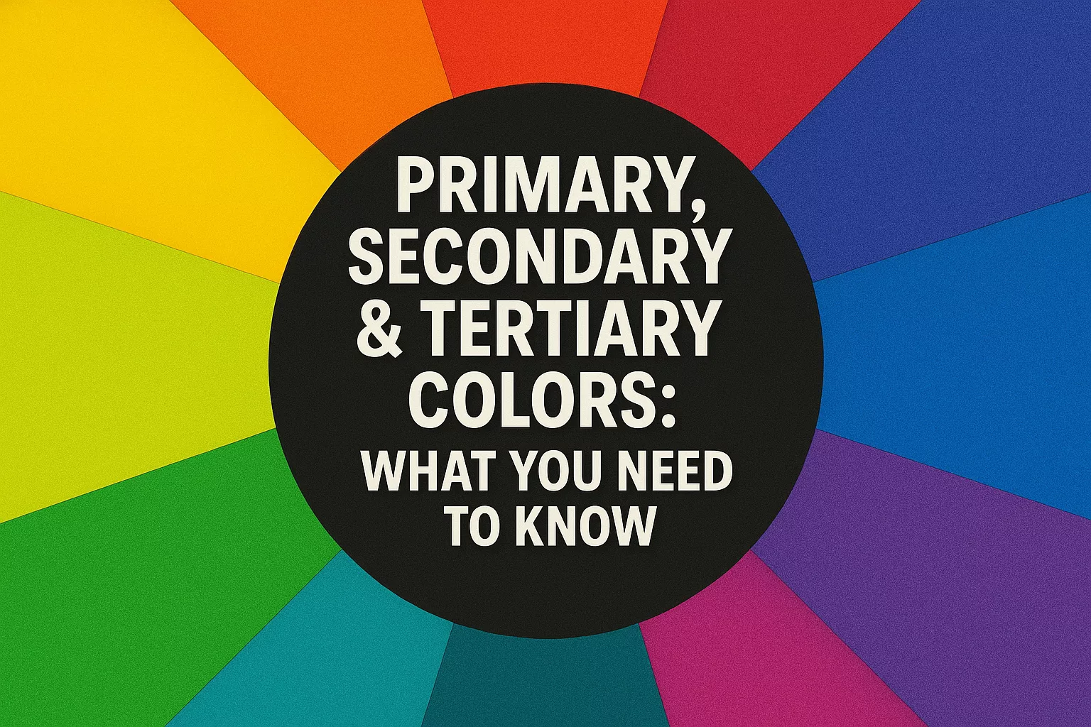
With the addition of tertiary colors, the basic color wheel expands from 6 colors (3 primary and 3 secondary) to 12 colors. This expanded color wheel provides a more complete framework for understanding color relationships and creating harmonious color schemes.
The full 12-color wheel, moving clockwise, includes:
- Red (primary)
- Red-Orange (tertiary)
- Orange (secondary)
- Yellow-Orange (tertiary)
- Yellow (primary)
- Yellow-Green (tertiary)
- Green (secondary)
- Blue-Green (tertiary)
- Blue (primary)
- Blue-Purple (tertiary)
- Purple (secondary)
- Red-Purple (tertiary)
This expanded wheel serves as a valuable tool for designers and artists when selecting color combinations that work well together.
Color Relationships and Harmony
Understanding primary, secondary, and tertiary colors allows you to create harmonious color schemes based on color relationships. Here are some common color schemes derived from the color wheel:
Complementary Colors
Complementary colors sit opposite each other on the color wheel. These high-contrast combinations create vibrant, energetic designs:
- Red and Green
- Blue and Orange
- Yellow and Purple
Split-Complementary Colors
This scheme uses a base color and the two colors adjacent to its complement, creating a balanced but still colorful combination:
- Red with Blue-Green and Yellow-Green
- Blue with Red-Orange and Yellow-Orange
- Yellow with Red-Purple and Blue-Purple
Triadic Colors
A triadic color scheme uses three colors that are evenly spaced around the color wheel, creating a balanced and vibrant look:
- Red, Yellow, and Blue (primary triad)
- Orange, Green, and Purple (secondary triad)
Analogous Colors
Analogous colors are adjacent to each other on the color wheel, creating a harmonious and serene combination:
- Red, Red-Orange, and Orange
- Yellow, Yellow-Green, and Green
- Blue, Blue-Purple, and Purple
Tetradic (Double Complementary) Colors
This scheme uses four colors arranged in two complementary pairs, offering rich possibilities for variation:
- Red, Green, Yellow-Orange, and Blue-Purple
The Psychology of Color
Colors have profound psychological effects on viewers, influencing emotions, perceptions, and behaviors. Understanding these effects can help you choose colors that convey the right message in your designs.
Primary Colors Psychology
- Red: Evokes passion, energy, excitement, and sometimes danger or aggression. It can increase heart rate and stimulate appetite.
- Yellow: Associated with happiness, optimism, and creativity. It captures attention and can create feelings of warmth and cheerfulness.
- Blue: Conveys trust, reliability, and calmness. It has a soothing effect and is often used by businesses to establish credibility.
Secondary Colors Psychology
- Orange: Combines the energy of red and the happiness of yellow, representing enthusiasm, creativity, and warmth.
- Green: Symbolizes nature, growth, and harmony. It has a balancing effect and is often associated with health, freshness, and environmental awareness.
- Purple: Traditionally associated with royalty, luxury, and spirituality. It can convey wisdom, dignity, and creativity.
Tertiary Colors Psychology
Tertiary colors offer more subtle psychological effects, often borrowing traits from their component colors while providing more nuanced emotional responses:
- Red-Orange: Conveys energy, desire, and determination.
- Yellow-Orange: Represents happiness, sociability, and friendliness.
- Yellow-Green: Suggests youth, vigor, and fresh energy.
- Blue-Green: Evokes tranquility, healing, and emotional balance.
- Blue-Purple: Conveys spirituality, intuition, and imagination.
- Red-Purple: Represents passion tempered with wisdom, charm, and elegance.
Practical Applications of Color Theory
Understanding primary, secondary, and tertiary colors has practical applications across various fields:
In Art and Painting
Artists use their knowledge of color theory to:
- Create realistic shadows and highlights
- Establish mood and atmosphere
- Guide the viewer’s eye through a composition
- Express emotions and concepts
Technique Tip: When mixing colors, start with a small amount of the darker color and gradually add it to the lighter color until you achieve the desired shade. This gives you more control over the mixing process.
In Graphic Design
Designers apply color theory principles to:
- Create brand identities that resonate with target audiences
- Design visually appealing and accessible websites
- Develop marketing materials that capture attention
- Create hierarchy and emphasis in layouts
Design Tip: Use primary colors sparingly as accents in professional designs, as they are highly saturated and can overwhelm a composition when used in large areas.
In Interior Design
Interior designers use color theory to:
- Create specific atmospheres and moods in spaces
- Make rooms appear larger or more intimate
- Establish visual flow between rooms
- Complement architectural features
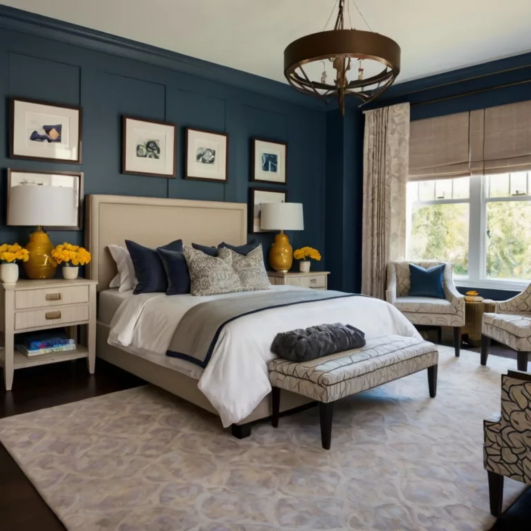
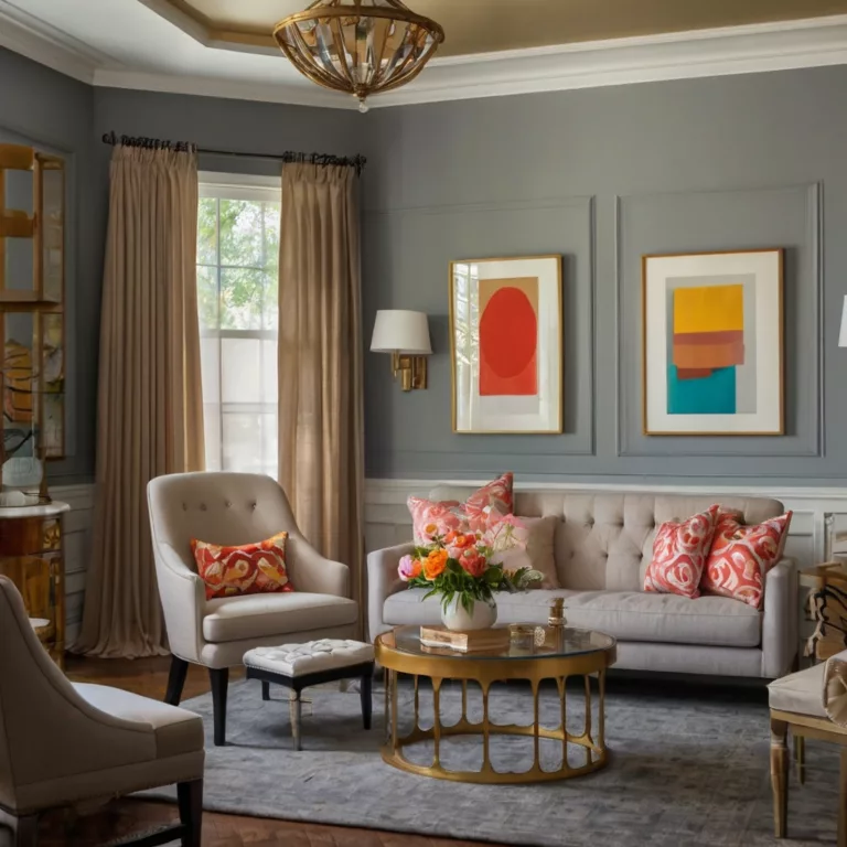
Interior Design Tip: Consider the 60-30-10 rule when designing a space—use a dominant color for 60% of the room, a secondary color for 30%, and an accent color for 10%.
In Fashion
Fashion designers and stylists apply color theory to:
- Create cohesive collections
- Design outfits that flatter different skin tones
- Express seasonal themes and trends
- Make fashion statements through color relationships
Fashion Tip: Understanding your personal coloring (warm vs. cool tones) can help you select clothing colors that enhance your natural features.
Color Mixing Techniques
Whether you’re working with digital or physical media, understanding how to mix colors effectively is a valuable skill.
Physical Color Mixing (Paints, Dyes, Etc.)
When working with physical media like paints, the following techniques can help you achieve the colors you want:
- Gradual Mixing: Add small amounts of one color to another until you reach the desired hue.
- Tinting and Shading: Add white to lighten a color (create a tint) or black to darken it (create a shade).
- Toning: Add gray or a complementary color to reduce a color’s intensity.
- Glazing: Apply transparent layers of color over one another to create depth and richness.
Digital Color Mixing
Digital platforms offer precise control over color:
- RGB Values: Adjust the Red, Green, and Blue values (0-255) to create specific colors.
- HSB/HSV Controls: Modify Hue, Saturation, and Brightness/Value for intuitive color adjustments.
- Hex Codes: Use six-digit hexadecimal codes (#RRGGBB) for exact color matching across platforms.
- Color Pickers: Use eyedropper tools to sample existing colors from images or designs.
Common Color Myths and Misconceptions
Let’s clear up some common misconceptions about color theory:
Myth 1: Black and White Are Colors
Technically, black is the absence of light (in additive color systems) or the presence of all colors (in subtractive systems), while white is the presence of all light or the absence of all colors. They’re considered neutral values rather than true hues on the color wheel.
Myth 2: The Primary Colors Are Always Red, Yellow, and Blue
As we’ve discussed, different color systems have different primary colors. RYB works for traditional art, RGB for digital displays, and CMYK for printing. No single set of primaries is “more correct” than others—they simply serve different purposes.
Myth 3: You Can’t Mix Certain Colors
With pure pigments and precise control, you can mix close approximations of almost any color. The limitations often come from the specific properties of the materials you’re using rather than theoretical impossibilities.
Advanced Color Concepts
For those looking to deepen their understanding of color theory, here are some advanced concepts:
Color Temperature
Colors can be categorized as warm (reds, oranges, yellows) or cool (blues, greens, purples). Color temperature affects the mood and perceived depth of a composition, with warm colors appearing to advance and cool colors receding.
Value and Intensity
- Value refers to the lightness or darkness of a color.
- Intensity (or saturation) refers to a color’s purity or brightness.
Understanding how to manipulate these properties allows for greater control and expressiveness in your use of color.
Color Schemes in Different Cultures
Color meanings vary significantly across cultures:
- Red symbolizes luck and happiness in Chinese culture but can represent danger or warning in Western contexts.
- White is associated with purity in Western cultures but can represent mourning in some Eastern cultures.
- Purple has royal associations in many Western cultures but may have different connotations elsewhere.
Being aware of these cultural differences is important when designing for global audiences.
Color Accessibility Considerations
When using color in design, accessibility should be a priority:
Color Blindness
Approximately 8% of men and 0.5% of women have some form of color vision deficiency. To accommodate these users:
- Don’t rely solely on color to convey information
- Ensure sufficient contrast between text and background
- Use color blindness simulators to test your designs
Contrast Ratios
For text to be readable, the WCAG (Web Content Accessibility Guidelines) recommends:
- A minimum contrast ratio of 4.5:1 for normal text
- A minimum contrast ratio of 3:1 for large text
Various online tools can help you check if your color combinations meet these standards.
Tools and Resources for Working with Color
Here are some valuable resources for exploring and applying color theory:
Color Wheel Tools
- Adobe Color: Create and explore color schemes based on color harmony rules
- Coolors.co: Generate color palettes and browse trending color combinations
- Paletton: Design color schemes with adjustable parameters
Color Reference Guides
- Pantone Color Guide: Industry-standard color matching system
- RAL Color Chart: European color standard used in painting and coatings
- Munsell Color System: Scientific approach to color specification and matching
Books on Color Theory
- “Interaction of Color” by Josef Albers
- “Color: A Natural History of the Palette” by Victoria Finlay
- “The Art of Color” by Johannes Itten
Conclusion: Mastering the Color Wheel
Understanding primary, secondary, and tertiary colors provides a solid foundation for working with color in any medium. This knowledge allows you to:
- Create harmonious color combinations
- Communicate effectively through color
- Evoke specific emotions and responses
- Develop a personal color style and palette
Whether you’re an artist, designer, or simply someone interested in the world of color, the principles outlined in this guide will help you make more informed and effective color choices in your projects.
Remember that while color theory provides valuable guidelines, it’s also important to trust your eye and creative instincts. The most successful use of color often comes from understanding the rules well enough to know when and how to break them for artistic effect.
FAQ About Primary, Secondary, and Tertiary Colors
What is the difference between RGB and RYB color models?
RGB (Red, Green, Blue) is an additive color model used for digital displays, while RYB (Red, Yellow, Blue) is a subtractive model traditionally used in art and painting. RGB colors add light to create other colors, while RYB colors absorb light to create new hues.
Can tertiary colors be created from secondary colors?
By definition, tertiary colors are created by mixing a primary color with an adjacent secondary color. However, you can achieve similar colors by mixing two adjacent secondary colors, though the result may vary slightly in hue and saturation.
How do I know which color scheme to use for my project?
The choice of color scheme depends on your objectives:
- For high energy and contrast, use complementary colors
- For harmony and cohesion, use analogous colors
- For balance and vibrance, use triadic colors
Consider the emotional impact you want to achieve and the context in which the colors will be viewed.
Why do some paint colors look different when they dry?
Many paints undergo a chemical change as they dry, which can affect their appearance. Additionally, wet paint often appears darker and more saturated than dried paint. Always test colors and allow them to dry completely before making final decisions.
How can I improve my color mixing skills?
Practice is key to improving color mixing skills. Create a color wheel from scratch, experiment with different proportions when mixing colors, and keep a record of your color recipes. Many artists maintain color journals where they document their mixing formulas for future reference.
By thoroughly understanding primary, secondary, and tertiary colors, you’ll have the knowledge and confidence to make informed color choices that enhance your creative projects and effectively communicate your vision.
Art11deco

