The Power of Contrast: How to Make Colors Pop
Master the power of contrast in design and photography. Learn practical techniques to make colors pop using contrast principles, color theory, and professional tools. Discover how the power of contrast transforms ordinary visuals into extraordinary ones.
Introduction to the Power of Contrast
The power of contrast is fundamental to creating visually striking designs that capture attention and convey messages effectively. Whether you’re a graphic designer, photographer, digital artist, or marketing professional, understanding how to make colors pop through strategic contrast can elevate your work from ordinary to extraordinary. This comprehensive guide explores the science, art, and practical application of contrast to create visually compelling color combinations that resonate with audiences.
Contrast doesn’t just make designs more attractive—it improves readability, directs attention, establishes hierarchy, and evokes specific emotional responses. By mastering the power of contrast, you’ll gain an essential skill that applies across all visual mediums, from print materials to digital interfaces, photography to fine art.
Understanding the Fundamentals of Contrast
What Is Contrast in Design?
At its core, the power of contrast refers to the juxtaposition of different elements to highlight their differences and create visual interest. In color theory, contrast occurs when two or more colors have significant differences in their properties—including hue, value, saturation, temperature, and complementary relationships.
The human eye naturally gravitates toward contrast. Our visual perception system evolved to detect differences quickly, helping us identify potential threats or opportunities in our environment. In design, this biological tendency becomes a powerful tool for guiding viewers’ attention and creating memorable visual experiences.
The Seven Types of Color Contrast
To fully leverage the power of contrast, it’s essential to understand the different types of contrast relationships:
- Contrast of Hue: The difference between distinct colors on the color wheel, such as blue versus yellow or red versus green.
- Contrast of Value (Light-Dark): The difference between light and dark colors, regardless of hue—black text on a white background represents maximum value contrast.
- Contrast of Saturation: Juxtaposing vivid, saturated colors against muted or desaturated versions creates dynamic visual interest.
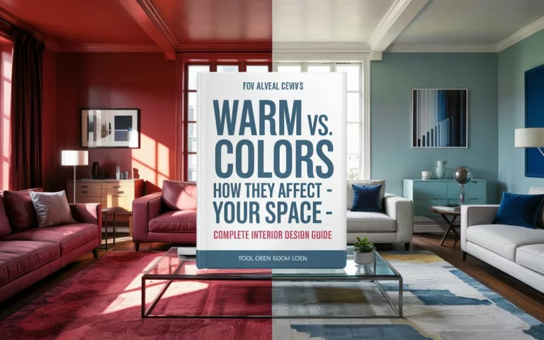
- Contrast of Temperature: The tension between warm colors (reds, oranges, yellows) and cool colors (blues, greens, purples).
- Complementary Contrast: Using colors opposite each other on the color wheel, like blue and orange or purple and yellow, creates maximum vibrancy.
- Simultaneous Contrast: How colors appear to change when placed against different backgrounds—a gray square looks darker on a white background than on a black background.
- Contrast of Extension: The proportion of space occupied by different colors affects their visual impact—a small area of bright color pops dramatically against a larger area of neutral color.
The Science Behind Color Relationships
The power of contrast isn’t just an artistic principle—it’s grounded in the physiology of human vision. Our retinas contain cones that respond to different wavelengths of light, corresponding roughly to red, green, and blue. When complementary colors appear adjacent to each other, they stimulate different sets of cones simultaneously, creating maximum visual stimulation.
This biological response explains why certain color combinations feel more energetic or attention-grabbing. Understanding these principles allows designers to create intentional visual experiences rather than relying solely on intuition.
How to Make Colors Pop Using Contrast Principles
Mastering Value Contrast for Readability and Impact
Value contrast—the difference between light and dark—is arguably the most important type of contrast for both aesthetics and functionality. Here’s how to use value contrast effectively:
- Establish Clear Hierarchy: Use high value contrast for essential elements like headlines and primary calls-to-action.
- Ensure Accessibility: Maintain sufficient value contrast between text and backgrounds to support readability for all users, including those with visual impairments.
- Create Focal Points: A dark element against a light background (or vice versa) immediately draws the eye, making it an effective technique for highlighting key information.
- Add Depth: Varying value creates the illusion of three-dimensionality, adding richness to otherwise flat designs.
To check if your value contrast is sufficient, try converting your design to grayscale. If important elements remain clearly visible, you’ve achieved effective value contrast.
Using Complementary Colors for Maximum Vibrancy
The power of contrast reaches its peak with complementary color combinations:
- Direct Complementary Pairs: Colors opposite each other on the color wheel create the strongest vibration when placed side by side:
- Blue and orange
- Red and green
- Yellow and purple
- Split-Complementary Approach: Instead of using the direct complement, use the two colors adjacent to the complement for a more sophisticated but still vibrant effect.
- Control Visual Tension: Because complementary combinations create such strong vibration, use them strategically for emphasis rather than throughout an entire design.
- Balance with Neutrals: Incorporate neutral colors alongside complementary pairs to provide visual relief and enhance the impact of the contrasting colors.
Temperature Contrast for Emotional Impact
The contrast between warm and cool colors creates specific psychological effects:
- Spatial Perception: Warm colors appear to advance toward the viewer, while cool colors recede, creating a natural sense of depth.
- Emotional Dynamics: Juxtaposing warm and cool colors can represent contrasting emotional states or create a sense of balance between energy and calm.
- Seasonal Associations: Temperature contrast can evoke specific times of year—think of the cool blue sky against warm autumn foliage.
- Cultural Significance: Be aware that temperature associations may vary across different cultures and contexts.
Saturation Contrast for Sophisticated Designs
Controlling the purity of color creates subtle but powerful contrast:
- Pop with Purpose: Place highly saturated elements against desaturated backgrounds to direct attention precisely where you want it.
- Create Atmospheric Effects: Vary saturation to suggest different lighting conditions, distances, or emotional states.
- Develop Color Stories: Use saturation contrast to create relationships between different sections or elements within a cohesive design.
- Avoid Visual Fatigue: Highly saturated designs can become overwhelming quickly—strategic desaturation creates necessary visual rest.
Practical Applications of Color Contrast
The Power of Contrast in Graphic Design
Graphic designers regularly harness contrast to create effective communications:
- Logo Design: The most memorable logos often employ strong contrast principles—think of FedEx’s purple and orange or McDonald’s red and yellow.
- Editorial Design: Magazine layouts use contrast to guide readers through content hierarchically, from headlines to body text to captions.
- Packaging Design: Products stand out on crowded shelves through strategic contrast—either within the package design itself or in contrast to competing products.
- Poster Design: Event posters must communicate essential information quickly while capturing attention from a distance—contrast makes this possible.
Photography and the Art of Contrast
Photographers manipulate contrast to create compelling images:
- Lighting Contrast: The ratio between highlights and shadows defines the mood of a photograph—high contrast for drama, low contrast for softness.
- Color Contrast: Seeking complementary color relationships in compositions—blue sky against orange architecture, for example.
- Subject Isolation: Using contrasting colors to separate subjects from backgrounds, drawing viewer attention precisely.
- Post-Processing: Adjusting contrast selectively to emphasize certain image areas over others.
Web Design and Digital Interfaces
In digital environments, contrast serves both aesthetic and functional purposes:
- Accessibility Requirements: WCAG guidelines specify minimum contrast ratios for text legibility.
- Call-to-Action Effectiveness: Buttons and clickable elements that contrast with surrounding content achieve higher conversion rates.
- Navigation Clarity: Contrasting active states from inactive ones helps users understand where they are in a digital experience.
- Responsive Considerations: Contrast needs may change across different device sizes and lighting conditions.
Fashion and Interior Design Applications
The power of contrast extends beyond digital and print media:
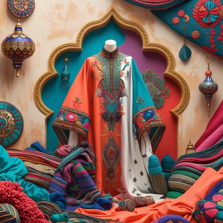
- Color Blocking: Fashion designers use bold contrasting color fields to create striking garments.
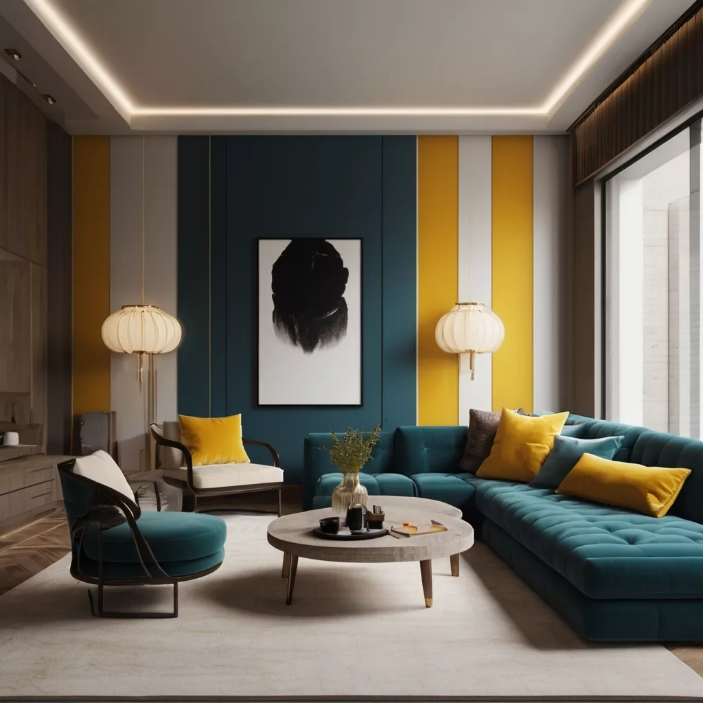
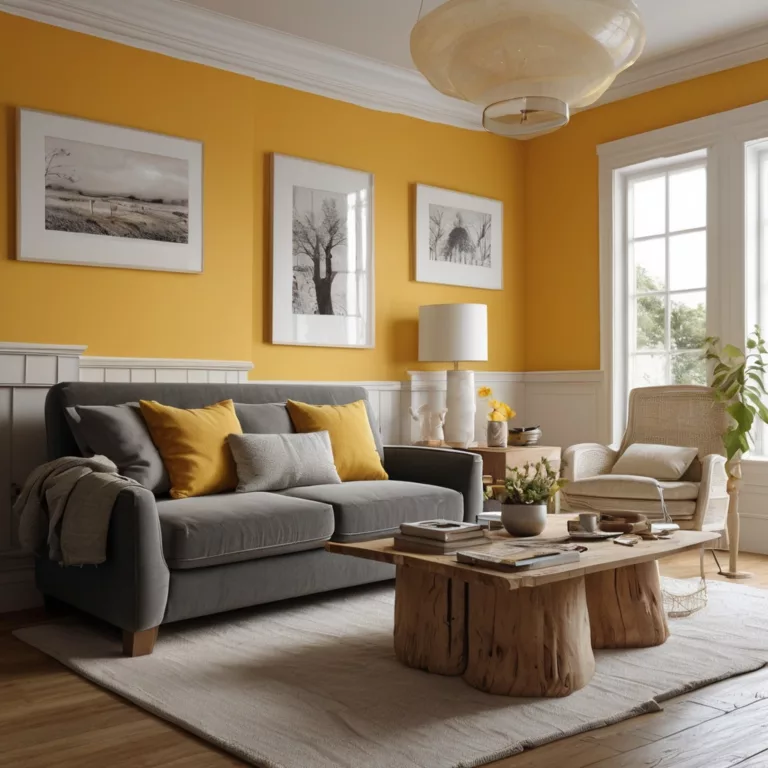
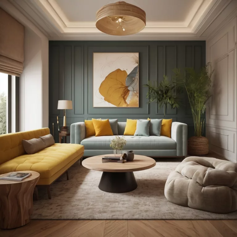
- Accent Walls: Interior designers employ contrast to define spaces and create focal points within rooms.
- Seasonal Trends: Fashion and home decor industries often leverage complementary and temperature contrast in seasonal collections.
- Optical Illusions: Strategic contrast can make spaces appear larger, smaller, higher, or cozier.
Tools and Techniques for Perfecting Color Contrast
Digital Tools for Measuring and Creating Contrast
Several tools help designers implement contrast effectively:
- Contrast Checkers: WebAIM’s Contrast Checker and similar tools verify whether text-background combinations meet accessibility standards.
- Color Scheme Generators: Adobe Color, Coolors, and Color Hunt help identify harmonious contrasting color combinations.
- Design Software Features: Adobe applications offer tools like the Color Guide panel to suggest contrasting color relationships.
- Browser Extensions: Extensions like Colorblindly simulate how designs appear to users with various color vision deficiencies.
Techniques for Finding Perfect Contrast Relationships
Develop your contrast sensitivity with these approaches:
- Photography Inspiration: Study how master photographers use contrast, then apply those principles to your designs.
- Color Mood Boards: Collect examples of contrast relationships that resonate with your project’s goals.
- Thumbnail Testing: Reduce designs to thumbnail size—if important elements remain visible, your contrast is working.
- A/B Testing: For digital projects, test different contrast approaches with real users to determine what performs best.
Common Contrast Mistakes to Avoid
Even experienced designers sometimes fall into these contrast pitfalls:
- Over-Reliance on Hue: Relying solely on color differences without sufficient value contrast, creating problems for color-blind users.
- Vibration Overload: Using too many high-contrast elements, creating visual confusion rather than hierarchy.
- Context Ignorance: Failing to consider how environmental factors like printing limitations or variable lighting conditions affect contrast perception.
- Lack of White Space: Crowding contrasting elements without sufficient separation, reducing their individual impact.
The Psychology of Color Contrast
How Contrast Affects Human Perception
The power of contrast influences how we process visual information:
- Attention Direction: High-contrast elements naturally draw our gaze first, making contrast an attention-management tool.
- Processing Fluency: Appropriate contrast reduces cognitive load, making information easier to understand and remember.
- Emotional Signaling: Different contrast relationships evoke different emotional responses—high contrast for excitement, low contrast for subtlety or sophistication.
- Biological Triggers: Certain high-contrast patterns (like yellow and black) trigger instinctive caution responses evolved from nature’s warning signals.
Cultural Variations in Contrast Perception
Be aware that contrast preferences aren’t universal:
- Regional Color Associations: Colors carry different symbolic meanings across cultures, affecting how contrast relationships are perceived.
- Historical Design Traditions: Different artistic traditions have developed distinct approaches to contrast—Japanese design often employs more subtle contrast than Western traditions.
- Generational Differences: Younger audiences may respond differently to contrast choices than older demographics, partly due to exposure to different media environments.
- Industry-Specific Conventions: Contrast expectations vary across sectors—financial services typically use more conservative contrast than entertainment brands.
Case Studies: The Power of Contrast in Action
Brand Identity: How Leading Companies Use Contrast
Examining successful brands reveals strategic contrast application:
- Coca-Cola: The contrast between white text on a red background creates instant recognition and readability from a distance.
- Apple: Minimalist design with precise value contrast communicates sophistication and clarity.
- Spotify: The bright green against black creates distinctive brand recognition while ensuring the interface recedes appropriately when content should take center stage.
- National Geographic: The iconic yellow rectangle contrasts sharply with any background, maintaining brand presence across diverse content.
Fine Art Masters of Contrast
Historical and contemporary artists offer contrast lessons:
- Johannes Vermeer: Used subtle contrast variations to create luminous, atmospheric effects.
- Vincent van Gogh: Employed complementary color contrast (particularly blue and orange) to create vibrating, emotionally charged scenes.
- Mark Rothko: Created sophisticated color field paintings exploring nuanced contrast relationships.
- Yayoi Kusama: Uses high-contrast polka dots against various backgrounds to create her signature immersive experiences.
Successful Advertising Campaigns Driven by Contrast
Advertising demonstrates contrast’s commercial power:
- Apple’s iPod Silhouette Campaign: Black silhouettes against bright color backgrounds with white iPods created an instantly recognizable visual language.
- Absolut Vodka: The long-running campaign used the distinctive bottle shape as a high-contrast element against varying creative backgrounds.
- Mastercard’s “Priceless” Campaign: The red and yellow circles create a distinctive contrast pattern that remains recognizable even when partially obscured.
- Nike’s Black and White Photography: Using stark value contrast to highlight athletic performance while minimizing distractions.
Advanced Contrast Techniques for Professionals
Creating Dynamic Contrast Systems
For sophisticated projects, develop systematic contrast approaches:
- Contrast Scales: Define a range of contrast relationships that can be applied consistently across a brand or project.
- Contextual Adaptation: Create rules for how contrast should shift across different applications—digital vs. print, small vs. large format.
- Animation and Transition Contrast: In motion design, contrast can shift over time, creating narrative progression.
- Multi-sensory Contrast: Consider how color contrast might align with other sensory contrasts (sound, texture) for immersive experiences.
Using Contrast for Storytelling
Contrast can communicate narrative development:
- Character Development: Use evolving contrast relationships to show character transformation in visual storytelling.
- Environmental Storytelling: Shift contrast as environments change to reinforce narrative progression.
- Emotional Arcs: Align contrast intensity with emotional intensity at different story points.
- Visual Foreshadowing: Establish contrast patterns that subtly suggest upcoming developments.
Accessibility and Inclusive Design Through Contrast
Make your designs work for everyone:
- WCAG Compliance: Understand and implement the Web Content Accessibility Guidelines for text contrast.
- Beyond Minimum Requirements: Aim for robust contrast that works across various vision conditions, not just meeting technical benchmarks.
- Testing with Users: Include people with different vision characteristics in your design testing process.
- Contrast Without Color: Ensure designs remain functional if color is removed entirely—a good test for colorblind accessibility.
Conclusion: Mastering the Power of Contrast
The power of contrast is one of the most versatile and essential tools in visual communication. By understanding contrast types, implementing them strategically, and continuously refining your approach, you’ll create more effective, accessible, and memorable visual experiences.
Remember that contrast exists not just within individual designs but between them. Your unique approach to contrast becomes part of your signature style—whether bold and dramatic or subtle and sophisticated.
As you develop your contrast sensitivity, you’ll begin to see contrast relationships everywhere—in nature, architecture, fashion, and art. This heightened awareness will continuously inform and improve your design decisions, allowing you to make colors truly pop in all your creative work.
Further Resources
Books on Color Contrast
- “Interaction of Color” by Josef Albers
- “Color Design Workbook” by Terry Lee Stone, Sean Adams, and Noreen Morioka
- “The Art of Color” by Johannes Itten
Online Courses
- Color Theory for Designers (Various platforms)
- Accessibility in Design (LinkedIn Learning)
- Color Psychology in Marketing (Coursera)
Tools
- Adobe Color (color.adobe.com)
- Contrast Checker (contrastchecker.com)
- Colormind (colormind.io)
Communities
- Dribbble (for design inspiration)
- Behance (for case studies)
- r/ColorTheory (Reddit community)
By mastering the power of contrast, you’ll not only make colors pop but create visual experiences that communicate effectively, delight viewers, and stand the test of time.
Art11deco
