Top Color Trends for Interior Design in 2025
Welcome to Art11deco, your premier source for cutting-edge interior design inspiration and expert insights. Today, we delve into the transformative world of color trends shaping the interior design landscape in 2025.
Introduction: The Evolution of Color in Design
As we progress through 2025, the interior design world continues its fascinating evolution, with color playing an increasingly pivotal role in how we experience and interact with our living spaces. This year’s color trends reflect our collective desire for environments that nurture both wellness and self-expression, blending technological innovation with a renewed appreciation for natural elements.
At Art11deco, we’ve analyzed emerging patterns from leading design studios, international exhibitions, and industry forecasters to bring you this comprehensive guide to the colors defining interior design in 2025.
1. Neo-Naturals: Advanced Earth Tones
The connection between interior spaces and the natural world has strengthened significantly, evolving beyond the basic earth tones of previous years into what designers are calling “Neo-Naturals.”
Key Colors:
- Terracotta Fusion: A sophisticated evolution of classic terracotta, infused with subtle hints of peach and amber
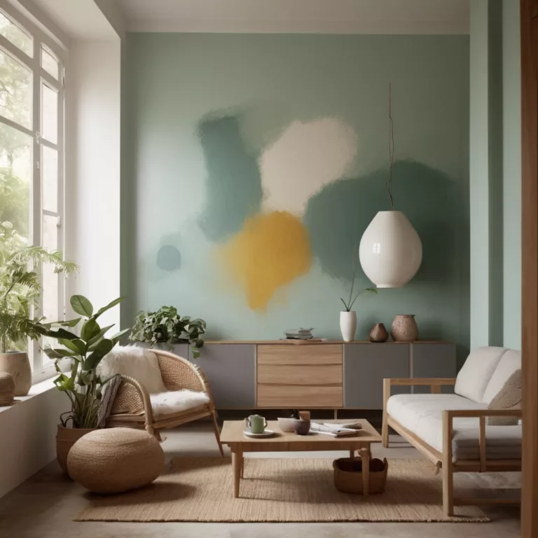
- Matcha Latte: A muted, sophisticated green with warm undertones
- Mushroom Gray: A complex neutral inspired by various forest fungi, offering depth and versatility
- Canyon Clay: A rich, dimensional orange-brown evoking weathered landscapes
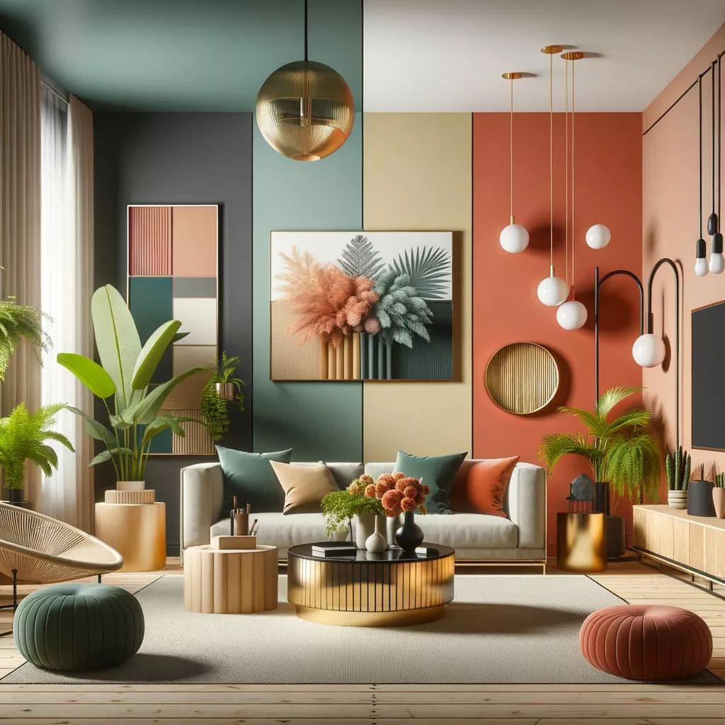
Neo-Naturals work exceptionally well in living rooms and workspaces, creating grounding environments that promote focus and tranquility while maintaining visual interest. These colors pair beautifully with natural materials like brushed wood, raw stone, and handcrafted ceramics.
2. Digital Pastels: The Tech-Inspired Palette
As our physical and digital worlds continue to merge, a new category of colors has emerged that bridges the gap between technology and comfort.
Key Colors:
- Virtual Blue: A soft yet vibrant blue with subtle digital undertones
- Interface Lavender: A gentle purple with a sophisticated technological edge
- Pixel Pink: A subdued, slightly desaturated pink that feels both futuristic and warm
- Cloud Mint: A barely-there green with cool undertones, reminiscent of minimalist digital interfaces
These colors are particularly effective in home offices, creative studios, and entertainment spaces, where they create a forward-looking atmosphere without feeling cold or impersonal. They pair beautifully with smooth surfaces, clear acrylics, and brushed metals.
3. Complex Neutrals: Beyond Beige
The neutral palette has undergone a dramatic transformation in 2025, moving far beyond simple beiges and grays into a territory of complex, multi-dimensional neutral tones.
Key Colors:
- Oyster Silk: A luminous off-white with subtle pearlescent undertones
- Charcoal Cashmere: A soft, warm dark gray with barely-there purple undertones
- Chai Cream: A rich neutral that shifts between beige and pale brown depending on the lighting
- Shadow Taupe: A sophisticated neutral with green-gray undertones that adapts to its surroundings
These complex neutrals serve as perfect foundational colors for any space, creating depth and interest while maintaining versatility. They’re particularly effective in bedrooms, hallways, and transitional spaces, where they create subtle continuity throughout the home.
4. Emotional Chromatics: Bold Colors with Purpose
In response to years of uncertainty, designers are embracing bold, emotionally resonant colors that make definitive statements about personality and purpose.
Key Colors:
- Confidence Coral: A bold, slightly burnt coral that energizes without overwhelming
- Mindful Magenta: A sophisticated, slightly muted magenta that stimulates creativity
- Clarity Cobalt: A deep, true blue that promotes focus and sense of calm
- Optimist Yellow: A warm, golden yellow that brings vital energy while avoiding harshness
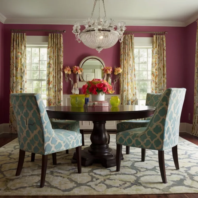
These colors are being used strategically as powerful accents in furniture pieces, statement walls, and architectural details. They’re particularly effective in social spaces like dining rooms and kitchen islands, where they can stimulate conversation and create memorable environments.
5. Biophilic Greens: The Health-Conscious Palette
The wellness movement continues to influence interior design, with an expanded palette of greens that directly reference the healing properties of plants and natural environments.
Key Colors:
- Breathing Sage: A muted, dusty green with gray undertones that promotes relaxation
- Algae Depth: A deep, mysterious green-blue reminiscent of underwater environments
- Forest Therapy: A rich, dimensional green with brown undertones evoking forest floors
- Herb Garden: A bright, invigorating green with yellow undertones reminiscent of culinary herbs
These greens are being incorporated into wellness rooms, bathrooms, and bedrooms, where their stress-reducing properties can be fully appreciated. They’re often paired with living plants, natural fibers, and water elements to enhance their biophilic impact.
6. Artisanal Pigments: Heritage-Inspired Colors
In our increasingly digital world, there’s a strong countermovement toward colors that reference traditional craftsmanship and historical pigments.
Key Colors:
- Indigo Workshop: A rich blue with subtle variations reminiscent of traditional dyeing techniques
- Ceramic Rust: A complex orange-red referencing traditional pottery glazes
- Painter’s Ochre: A rich, textural yellow-brown with historic art references
- Tapestry Blue-Green: A complex teal shade inspired by vintage textiles
These colors bring authenticity and timelessness to contemporary spaces, creating depth and cultural reference points. They’re particularly effective in libraries, conversation areas, and dining spaces, often paired with antique furniture pieces and handcrafted accessories.
7. Adaptive Darks: Sophisticated Depth
Moving beyond simple black, designers are embracing a new category of sophisticated dark tones that bring depth and drama without heaviness.
Key Colors:
- Midnight Botanical: A deep blue-black with subtle green undertones
- Cacao Depth: A rich, warm very dark brown with red undertones
- Cosmic Aubergine: A profound purple-black evoking deep space imagery
- Graphite Evolution: A complex dark gray with subtle blue undertones
These colors are being used to create sophisticated, enveloping environments in media rooms, intimate dining spaces, and accent walls. They pair beautifully with metallic accents, particularly brass and copper, which reflect light and prevent spaces from feeling too closed-in.
Application Strategies: Making These Colors Work
Layering and Transitioning
The most sophisticated interiors of 2025 use color as a transitional element, creating subtle shifts between spaces while maintaining a cohesive overall experience. Consider using related colors from the same family but with different intensities as you move through your home.
The 60-30-10 Rule Evolved
While the classic design rule of 60% dominant color, 30% secondary color, and 10% accent color still applies, designers are now incorporating a fourth dimension: 5% unexpected contrast. This might be a small furniture piece or accessory in a completely unexpected hue that creates visual interest and personality.
Material and Color Integration
The interaction between materials and colors is more important than ever. Consider how light interacts with different surfaces – matte walls in complex neutrals paired with high-gloss cabinetry in the same color family creates sophisticated dimension.
Lighting Considerations
With adaptive lighting becoming standard in many homes, colors are being selected for their performance across different lighting scenarios. The most successful colors for 2025 maintain their integrity from bright daylight to warm evening illumination.
Regional Variations: Global Color Trends
Nordic Countries
The Scandinavian palette continues to evolve beyond minimalist whites, incorporating Deep Baltic (a complex gray-blue) and Hygge Apricot (a warm, subtle orange-beige) to create environments that combat seasonal darkness while maintaining their characteristic clean aesthetic.
Mediterranean Influence
Southern European design embraces Olive Intensity (a deep, rich green with gray undertones) and Solar Terracotta (a bright, warm orange-red), reflecting the region’s sunlight quality and historical architectural elements.
North American Trends
Across North America, Prairie Renewal (a complex beige with subtle green undertones) and Modernist Rust (a sophisticated orange-brown) are dominating residential spaces, reflecting the continent’s landscape diversity and architectural heritage.
Asian Design Influences
From Japan to Singapore, Mindful Gray (a balanced neutral with subtle purple undertones) and Silk Road Red (a sophisticated, slightly muted crimson) are creating contemplative yet energizing spaces that honor cultural traditions while embracing contemporary design principles.
Sustainability Considerations
Color trends in 2025 are inseparable from sustainability concerns. Many leading paint manufacturers have reformulated their products to reduce VOCs and incorporate recycled content. Natural pigments and traditional coloring methods are experiencing a revival, with designers seeking authentic colors that connect to sustainable production methods.
The most forward-thinking designers are considering the emotional sustainability of colors – selecting hues with staying power that won’t feel dated in a few years, reducing the need for frequent repainting and redecoration.
Technology and Color: The Digital Influence
Advancements in AR (Augmented Reality) have revolutionized how we select and test colors in our spaces. Leading paint companies and design firms now offer sophisticated AR tools that show not just how colors will look on walls, but how they will interact with existing furniture, change throughout the day with natural light, and affect mood and functionality.
AI color assistants are becoming commonplace, suggesting complementary palettes based on existing elements in your home and your stated emotional goals for each space.
Conclusion: Your Personal Color Journey
While trend awareness is valuable, the most successful interior spaces reflect personal preferences and needs. At Art11deco, we encourage you to use these trends as inspiration rather than prescription – selecting colors that resonate with your unique lifestyle and aesthetic sensibilities.
The most important design trend of 2025 isn’t any specific color but rather a move toward authentic spaces that support wellbeing, self-expression, and connection. Whether you embrace the bold Emotional Chromatics or prefer the subtle sophistication of Complex Neutrals, the colors you choose should ultimately create environments where you can thrive.
This comprehensive guide to 2025’s color trends represents Art11deco’s commitment to keeping you informed about the latest developments in interior design. We invite you to explore our gallery for visual examples of these colors in action and to contact our design consultants for personalized color recommendations tailored to your specific space and needs.
Art11deco: Where timeless design principles meet contemporary innovation. Follow us for regular updates on emerging trends and transformative design concepts throughout 2025 and beyond.
Art11deco
