Using Accent Colors to Highlight Your Home’s Best Features
Discover expert techniques for using accent colors to showcase your home’s architectural elements and design features. This comprehensive guide explores how strategic accent colors can transform ordinary spaces into extraordinary interiors.
Introduction: The Transformative Power of Accent Colors
Accent colors have remarkable potential to transform ordinary spaces into extraordinary interiors. These strategic splashes of color serve as visual highlighters, drawing attention to your home’s most impressive architectural elements and design features. When thoughtfully applied, accent colors can elevate the entire aesthetic of your home while creating visual intrigue, defining spaces, and expressing your unique personality.
This comprehensive guide explores the art and science of using accent colors effectively to enhance your interior design. From understanding color theory fundamentals to implementing room-specific accent strategies, you’ll discover expert techniques for leveraging accent colors to showcase your home’s best features. Whether you’re refreshing a single room or reimagining your entire home, these professional approaches to accent colors will help you create cohesive, visually captivating spaces.
Understanding Accent Colors: Fundamentals and Function
What Exactly Are Accent Colors?
Accent colors are deliberate color additions used to create visual interest and focal points within a space. Unlike base or dominant colors that set the overall tone of a room, accent colors strategically interrupt visual continuity to highlight specific elements.
The role of accent colors includes:
- Drawing attention to architectural features like crown molding, built-ins, or fireplaces
- Creating visual anchors within open spaces
- Adding personality and emotional resonance to neutral schemes
- Unifying disparate design elements through color repetition
- Directing the viewer’s eye to follow an intentional visual journey
Interior designer Kelly Wearstler explains, “Accent colors are like exclamation points in your design narrative. They emphasize what’s important and give the eye moments of delight as it travels through a space.”
The Psychology Behind Accent Colors
The strategic use of accent colors leverages fundamental principles of human perception and psychology:
Contrast and visual hierarchy:
When surrounded by neutral or subdued colors, vibrant accent colors naturally draw attention due to the contrast effect. Our brains are wired to notice differences and changes, making accent colors powerful tools for directing focus.
Color temperature and emotional response:
Different accent colors evoke specific emotional and psychological responses:
- Red accent colors stimulate energy and excitement
- Blue accent colors promote feelings of calm and reliability
- Yellow accent colors generate sensations of optimism and creativity
- Green accent colors create connections to nature and renewal
- Purple accent colors suggest luxury and contemplation
Spatial perception:
The placement of accent colors affects how we perceive space:
- Accent colors on distant walls can make them appear closer
- Vertical accent colors can make ceilings feel higher
- Horizontal accent colors can make rooms feel wider
- Strategic accent color placement can correct perceived spatial imbalances
Color psychologist Angela Wright notes, “The human response to accent colors isn’t merely aesthetic—it’s neurological. We process color information both consciously and subconsciously, which is why strategic accent colors can transform both the look and feel of a space.”
Color Theory for Accent Colors: Creating Harmonious Combinations
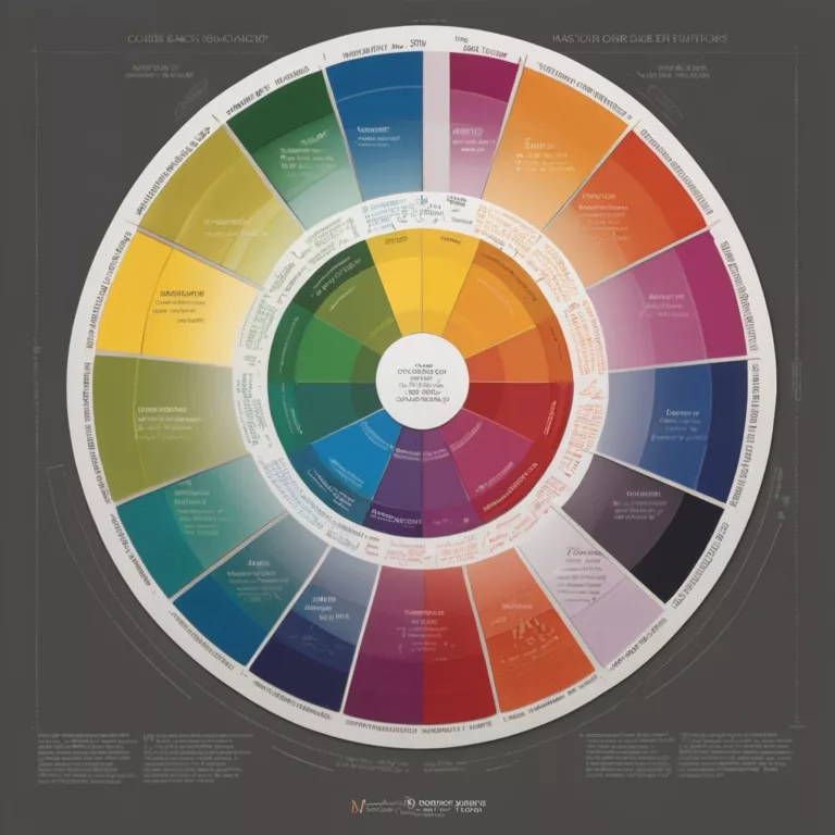
Color Wheel Fundamentals for Selecting Accent Colors
Understanding basic color relationships helps create successful accent color strategies:
Complementary accent colors:
Colors positioned opposite each other on the color wheel (blue/orange, purple/yellow, red/green) create maximum contrast and visual vibration when used as accent colors. These high-energy combinations work well when you want accent colors to truly stand out.
Analogous accent colors:
Colors positioned next to each other on the color wheel create more subtle, harmonious accent colors. These combinations (like blue-green-teal or red-orange-yellow) provide visual interest without dramatic contrast.
Triadic accent colors:
Colors equally spaced around the color wheel create balanced, dynamic accent color schemes. These combinations provide variety while maintaining harmony, making them ideal for more complex accent color strategies.
Monochromatic accent colors:
Different shades, tones, and tints of the same color create sophisticated, cohesive accent color approaches. This strategy works particularly well for elegant, understated interiors.
The 60-30-10 Rule for Accent Colors
Professional designers often implement the 60-30-10 rule when working with accent colors:
- 60% of the space features a dominant base color (often neutral)
- 30% comprises a secondary color that supports the overall scheme
- 10% consists of accent colors that create visual impact
This formula ensures accent colors make a statement without overwhelming the space. In more complex schemes, designers might implement variations like 70-20-10 for more subtle accent colors or 50-25-15-10 to incorporate multiple accent colors.
Interior designer Shea McGee explains, “The beauty of the 60-30-10 rule is that it creates natural balance. Your accent colors get just enough presence to make an impact without fighting for attention or creating visual chaos.”
Strategic Placement: Where to Use Accent Colors for Maximum Impact
Architectural Features Worth Highlighting with Accent Colors
Certain architectural elements particularly benefit from accent colors:
Fireplace surrounds:
As natural focal points, fireplaces respond beautifully to accent colors that draw attention to their craftsmanship and central position.
Crown molding and trim:
Accent colors can transform ordinary millwork into statement features, particularly when the trim has historical or ornate detailing.
Built-in bookcases and cabinetry:
Interior cabinet backs or shelving painted in accent colors create depth and showcase displayed objects while adding personality.
Ceiling medallions and architectural ceiling details:
Often overlooked, ceilings with interesting architectural elements can become standout features with accent colors.
Archways, columns, and room transitions:
These structural elements can be emphasized with accent colors to define spaces within open floor plans.
Window frames and door casings:
Accent colors on these transitional elements create frameworks that enhance views and passageways.
Architect Peter Pennoyer notes, “Accent colors should honor a home’s architectural integrity. When used thoughtfully, they don’t compete with architecture but rather celebrate its distinctive features.”
Creating Focal Points with Accent Colors
Every well-designed room benefits from clearly defined focal points enhanced by accent colors:
Feature walls:
Strategic application of accent colors on a single wall can define the primary visual anchor in a room, particularly walls with distinctive architectural features or those that serve as backdrops for important furniture pieces.
Statement furniture pieces:
A chair, sofa, or cabinet in an accent color creates an instant focal point while adding personality to neutral spaces.
Headboards and bed linens:
In bedrooms, accent colors focused around the bed reinforce it as the room’s central feature.
Kitchen islands:
As the workspace and gathering hub, kitchen islands are natural candidates for accent colors that distinguish them from perimeter cabinetry.
Staircases:
Risers, railings, or runners in accent colors transform utilitarian staircases into sculptural design elements.
Interior designer Amber Lewis suggests, “When selecting focal points for accent colors, consider both architectural logic and functional importance. The best accent color placements make sense intuitively—they highlight what deserves attention naturally.”
Room-by-Room Guide to Accent Colors
Living Rooms: Creating Conversational Flow with Accent Colors
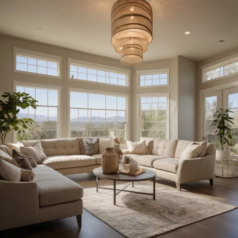
The living room offers multiple opportunities for accent colors that enhance both function and aesthetics:
Accent color strategies for living rooms:
- Use accent colors on architectural focal points like fireplace surrounds or built-in bookcases
- Create color connections between artwork and accessories using consistent accent colors
- Implement accent colors on statement furniture pieces like side chairs or ottomans
- Add accent colors through textiles (pillows, throws, curtains) for easily changeable options
- Consider accent colors on ceiling treatments to draw the eye upward in rooms with height
Living room accent color considerations:
- Scale accent colors appropriately to room size—larger rooms can handle bolder accent colors
- Consider traffic patterns when placing accent colors to create visual flow
- Ensure accent colors support the room’s intended mood (energizing for entertaining spaces, calming for relaxation areas)
- Balance accent colors between upper and lower portions of the room for visual equilibrium
Designer Nate Berkus advises, “Living rooms should tell your personal story. Use accent colors to highlight the architectural features you love while incorporating them into elements that reflect your experiences and personality.”
Kitchens: Functional Highlights with Accent Colors
Kitchens benefit from strategic accent colors that enhance both aesthetics and functionality:
Accent color strategies for kitchens:
- Apply accent colors to islands, peninsulas, or breakfast bars to define activity zones
- Use accent colors on range hoods to create vertical interest and highlight cooking areas
- Consider accent colors for cabinet interiors, particularly glass-front cabinets
- Implement accent colors in backsplashes to create horizontal movement
- Add accent colors through easily changeable elements like bar stools, window treatments, or small appliances
Kitchen accent color considerations:
- Ensure accent colors complement rather than compete with key materials like countertops and flooring
- Consider how accent colors appear under different lighting conditions, especially task lighting
- Select accent colors that maintain appropriate food psychology (blues may suppress appetite, while reds and oranges can stimulate it)
- Balance accent colors with adequate neutral space for visual relief in this high-activity area
Chef and kitchen designer Athena Calderone notes, “The most successful kitchen accent colors acknowledge both aesthetics and function. They should highlight the heart of your kitchen’s work triangle while creating visual harmony with adjoining spaces.”
Bedrooms: Personal Sanctuaries Enhanced by Accent Colors
Bedrooms offer unique opportunities for accent colors that express individuality while supporting rest:
Accent color strategies for bedrooms:
- Focus accent colors on the wall behind the bed to emphasize this natural focal point
- Use accent colors in bedding to create a luxurious, layered effect
- Implement accent colors on architectural features like tray ceilings or millwork
- Consider statement lighting with accent colors to add personality and function
- Add accent colors through artwork that complements the room’s color story
Bedroom accent color considerations:
- Select accent colors that support the desired emotional effect (restful, romantic, energizing)
- Consider how accent colors appear under both natural and artificial lighting
- Balance bolder accent colors with adequate neutral space to maintain a sense of calm
- Ensure accent colors on bedding remain comfortable and not visually overwhelming where you sleep
Sleep environment specialist Dr. Rebecca Robbins suggests, “Bedroom accent colors should be considered in terms of their psychological effects on sleep quality. Cooler accent colors like blues, greens, and lavenders tend to support better rest, while energizing accent colors are best used sparingly or away from the bed area.”
Bathrooms: Spa-Like Retreats with Strategic Accent Colors
Even utilitarian spaces benefit from thoughtful accent colors that enhance their function:
Accent color strategies for bathrooms:
- Use accent colors on vanities to create furniture-like focal points
- Implement accent colors through tile work in showers or on floors
- Add accent colors on walls behind freestanding tubs to create dramatic backdrops
- Consider accent colors on ceiling treatments to add unexpected interest
- Incorporate accent colors through textiles and accessories for easily changeable options
Bathroom accent color considerations:
- Select accent colors that complement skin tones for flattering reflections in mirrors
- Consider how accent colors will perform in humid conditions
- Ensure accent colors support the desired atmosphere (energizing for morning routines, relaxing for spa-like experiences)
- Balance accent colors with reflective surfaces like mirrors and chrome fixtures
Designer Sarah Sherman Samuel notes, “Bathrooms present unique opportunities for accent colors because of their typically smaller footprint and private nature. You can be more experimental with accent colors here, particularly in powder rooms meant to surprise and delight guests.”
Home Offices: Productive Environments with Focused Accent Colors
Work spaces benefit from accent colors that enhance focus and creativity:
Accent color strategies for home offices:
- Implement accent colors on the wall behind video call setups for professional backgrounds
- Use accent colors on shelving or organizational systems to create visual order
- Add accent colors through office chairs or desk accessories for personality
- Consider accent colors on ceiling treatments to stimulate upward thinking
- Incorporate accent colors on built-ins or architectural features to define the work zone
Home office accent color considerations:
- Select accent colors that support your specific work activities (blues and greens for analytical tasks, yellows and oranges for creative work)
- Consider how accent colors will appear on video calls
- Balance stimulating accent colors with neutral zones for visual rest during long work sessions
- Ensure accent colors create appropriate separation between work and living spaces in multipurpose rooms
Productivity expert and designer Tonya Dalton suggests, “Strategic accent colors in home offices can actually improve performance by subtly influencing your brain state. The key is matching accent colors to your specific work requirements while creating an environment that feels both professional and personally meaningful.”
Accent Color Application Techniques
Paint Strategies for Accent Colors
Paint offers versatile, cost-effective options for incorporating accent colors:
Color blocking:
Creating geometric divisions of accent colors on walls or furniture using crisp paint lines
Ombré gradients:
Blending accent colors gradually from dark to light to create subtle transitions
Stenciling:
Adding patterned accent colors to walls, floors, or furniture for custom detail
Striping techniques:
Creating horizontal or vertical bands of accent colors for directional emphasis
Ceiling treatments:
Using accent colors overhead to draw the eye upward and add unexpected interest
Paint specialist Annie Sloan explains, “The application method for accent colors significantly impacts their effect. A high-gloss accent color creates a very different impression than the same color in a matte finish. Consider both the hue and the execution when planning accent colors.”
Beyond Paint: Alternative Accent Color Applications
Multiple mediums can introduce accent colors effectively:
Wallpaper:
Patterned or textured wallpaper incorporating accent colors on feature walls or in architectural niches
Tile work:
Ceramic, porcelain, or glass tiles in accent colors for backsplashes, shower surrounds, or fireplace facades
Fabric applications:
Window treatments, upholstery, pillows, and throws offering easily changeable accent colors
Natural materials:
Stone, wood, and metal finishes with inherent accent colors that add organic variation
Lighting effects:
Color-changing LED systems or colored glass fixtures that project accent colors into spaces
Interior architect Kelly Hoppen notes, “The most sophisticated accent color schemes incorporate varied applications rather than relying solely on paint. Multi-textural approaches to accent colors create richer, more nuanced interiors with greater depth.”
Selecting the Perfect Accent Colors for Your Home
Inspiration Sources for Accent Colors
Finding the ideal accent colors often begins with thoughtful observation:
Existing architectural elements:
Accent colors drawn from stone fireplaces, wood tones, or brick features create natural harmony
Landscape views:
Accent colors that connect interiors with outdoor vistas create indoor-outdoor continuity
Textile patterns:
Accent colors extracted from favorite rugs, fabrics, or upholstery ensure cohesive palettes
Artwork:
Paintings or photographs can inspire accent colors that complement existing color stories
Personal collections:
Books, ceramics, or travel souvenirs often suggest meaningful accent colors with personal significance
Designer Miles Redd suggests, “The most authentic accent colors have a story behind them. Rather than selecting arbitrarily from color trends, connect your accent colors to elements that have meaning in your life.”
Testing Accent Colors Before Committing
Proper testing helps ensure accent colors achieve their intended effect:
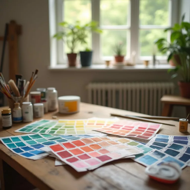
Large-scale samples:
View potential accent colors in at least 24″ x 24″ samples to accurately assess their impact
In-situ evaluation:
Test accent colors in the actual space under both natural and artificial lighting conditions
Digital visualization:
Use design apps and software to preview accent colors without physical application
Temporary applications:
Implement removable solutions like peel-and-stick wallpaper or fabric panels to test accent colors
Observation periods:
Live with sample accent colors for several days to assess their effect over time
Color consultant Maria Killam advises, “Accent colors can look dramatically different depending on lighting, surrounding materials, and scale. Never commit to accent colors based on small swatches or under lighting conditions different from your actual space.”
Common Accent Color Mistakes and How to Avoid Them
Proportion Problems with Accent Colors
Maintaining appropriate balance prevents accent colors from overwhelming spaces:
Too much accent color:
When accent colors dominate more than 10-15% of a space, they stop functioning as accents and become dominant colors
Too little accent color:
Insufficient accent colors fail to create visual impact or establish focal points
Imbalanced distribution:
Accent colors concentrated in one area create visual heaviness instead of harmonious flow
Poor scale consideration:
Accent colors applied without regard to room size can feel disproportionate
The solution: Use the 60-30-10 rule as a starting point, adjusting proportions based on room size, natural light, and desired emotional impact. Create templates or digital mockups to test accent color proportions before implementation.
Coordination Failures with Accent Colors
Ensuring accent colors work harmoniously with existing elements prevents visual discord:
Undertone conflicts:
Accent colors with undertones that fight against existing elements create visual tension
Temperature mismatches:
Extremely warm accent colors in predominantly cool rooms (or vice versa) can feel disconnected
Competing intensities:
Multiple strong accent colors fighting for attention without clear hierarchy
Context-inappropriate choices:
Accent colors that disregard architectural style or regional influences
The solution: Create a comprehensive color board including samples of all fixed elements alongside potential accent colors. View these together under your space’s typical lighting conditions to ensure harmony before implementing accent colors.
Implementation Issues with Accent Colors
Technical application problems can undermine even the best accent color concepts:
Poor preparation:
Inadequate surface preparation leading to accent colors with adhesion or appearance issues
Inappropriate finishes:
Accent colors in finishes that don’t support their intended purpose or location
Inadequate coverage:
Insufficient application technique resulting in uneven accent colors
Poor transitions:
Awkward changes between accent colors and adjacent surfaces
The solution: Research proper application techniques for your specific accent color medium, invest in quality materials appropriate for the location, and consider hiring professionals for technically challenging accent color implementations.
Accent Color Trends and Timeless Approaches
Current Trends in Accent Colors
Popular contemporary approaches to accent colors include:
Biophilic accent colors:
Nature-inspired greens, terracottas, and blues that connect interiors with natural environments
Vintage-inspired accent colors:
Heritage hues like mustard yellow, avocado green, and dusty blue reimagined for modern contexts
Global accent colors:
Internationally-influenced colors like Moroccan blue, Indian pink, and African earth tones
Digital-influenced accent colors:
Vibrant hues inspired by technology and social media aesthetics
Wellness-focused accent colors:
Soft, soothing accent colors that promote mental health and relaxation
Trend forecaster Leatrice Eiseman notes, “Today’s most influential accent color trends reflect broader societal concerns—environmental awareness, cultural appreciation, technological integration, and wellness priorities.”
Timeless Approaches to Accent Colors
Some accent color strategies maintain their effectiveness regardless of passing trends:
Architectural emphasis:
Using accent colors to highlight quality craftsmanship and architectural significance
Natural material enhancement:
Selecting accent colors that complement and elevate natural wood, stone, and metal
Classical color relationships:
Implementing time-tested color wheel relationships that maintain visual harmony
Meaningful personal connections:
Choosing accent colors with emotional or historical significance to the inhabitants
Quality-focused implementations:
Investing in superior application techniques and materials for enduring accent color presence
Designer Thomas O’Brien suggests, “The most enduring accent colors aren’t trend-dependent but rather architecture-appropriate, quality-focused, and personally meaningful. These accent colors may evolve slightly over time but never feel dated because they’re fundamentally connected to the home’s integrity.”
DIY vs. Professional Help with Accent Colors
When to DIY Your Accent Colors
Certain accent color projects are well-suited to DIY approaches:
Appropriate DIY accent color projects:
- Accent walls in standard paint applications
- Furniture refinishing with accent colors
- Textile introductions (pillows, curtains, bedding)
- Accessory styling with accent colors
- Removable applications like peel-and-stick wallpaper
DIY accent color success strategies:
- Start with smaller accent color projects to build confidence
- Invest in proper preparation supplies and quality materials
- Test accent colors thoroughly before full application
- Research specific techniques for your chosen accent color medium
- Allow adequate time for proper accent color implementation
Interior stylist Emily Henderson advises, “The most successful DIY accent color projects are those where you’ve done thorough preparation, both in testing colors and understanding application techniques. Start with lower-risk accent color projects like textiles or accessories before tackling more permanent installations.”
When to Call the Professionals
Some accent color implementations benefit from expert assistance:
Accent color projects for professional consideration:
- Cabinetry finishing or refinishing with accent colors
- Complex paint techniques like murals or faux finishes
- Large-scale wallpaper installation with pattern matching
- Custom window treatments incorporating accent colors
- Specialty surface applications like Venetian plaster or lacquer
Working effectively with color professionals:
- Communicate your accent color vision clearly with inspiration images
- Provide context about your overall design goals and lifestyle needs
- Be specific about your accent color budget constraints
- Ask about maintenance requirements for specialty accent color applications
- Request detailed information about preparation and process
Design-build specialist Sarah Barnard notes, “Professional implementation of accent colors often provides value beyond just technical expertise. Experienced color professionals can suggest refinements to your concept based on past projects, potentially saving you from costly accent color mistakes.”
Seasonal and Temporary Accent Colors
Seasonal Refresh with Accent Colors
Rotating accent colors seasonally creates visual interest throughout the year:
Spring accent colors:
Fresh greens, soft yellows, and delicate pinks that reflect renewal and growth
Summer accent colors:
Vibrant blues, coral tones, and sunny yellows that capture seasonal energy
Fall accent colors:
Warm oranges, deep reds, and golden tones that echo autumn landscapes
Winter accent colors:
Rich jewel tones, metallic accents, and crisp whites that create seasonal warmth
Implementation strategies for seasonal accent colors:
- Create a core neutral base that supports various accent colors
- Invest in seasonal textile collections for easy transitions
- Develop a storage system for rotating accent color items
- Establish signature seasonal accent colors that return annually
- Consider lighting adjustments to enhance seasonal accent colors
Stylist and author Susanna Salk suggests, “Seasonal accent colors connect interiors with the natural world’s rhythms, creating homes that feel dynamic and responsive rather than static. Even subtle seasonal accent color shifts can dramatically refresh familiar spaces.”
Temporary Accent Colors for Special Occasions
Short-term accent colors create memorable experiences for specific events:
Holiday accent colors:
Traditional or contemporary color schemes for seasonal celebrations
Party-specific accent colors:
Thematic accent colors for birthdays, anniversaries, or special gatherings
Experimental accent colors:
Opportunity to test bold accent color concepts before permanent implementation
Implementation strategies for temporary accent colors:
- Focus on easily changeable elements like florals, textiles, and tabletop items
- Consider rentable furniture or decor pieces for significant event accent colors
- Use temporary applications like removable wallpaper or decals
- Implement accent colors through lighting effects like colored bulbs or projections
- Create storage solutions for regularly used special occasion accent colors
Event designer David Stark notes, “Temporary accent colors create visual memories associated with significant moments. Even simple accent color additions—like flowers in specific hues or coordinated table linens—can transform everyday spaces into extraordinary event settings.”
Conclusion: Creating Your Personal Accent Color Strategy
Accent colors offer transformative potential for highlighting your home’s best features while expressing your unique personality. Through thoughtful selection, strategic placement, and appropriate application, these powerful color elements can elevate ordinary spaces into extraordinary environments that feel both cohesive and captivating.
Remember that successful accent colors:
- Enhance rather than compete with architectural features
- Create intentional focal points that guide the eye
- Support the emotional and functional goals of each space
- Connect with your authentic personal aesthetic
- Evolve thoughtfully as your needs and preferences change
By approaching accent colors with both creativity and strategy, you’ll develop confidence in using these powerful design elements to showcase your home’s distinctive character and create spaces that truly reflect who you are.
Resources for Accent Color Exploration
To further develop your accent color expertise, consider these valuable resources:
Color education tools:
- Color theory books specifically for interior applications
- Digital color visualization apps for testing accent color ideas
- Professional color fan decks for precise accent color selection
- Color psychology references for understanding emotional impacts
Inspiration sources:
- Digital platforms featuring tagged accent color implementations
- Local designer showhouses demonstrating regional accent color approaches
- Historical color references for period-appropriate accent colors
- Global design publications showing international accent color trends
With these tools and techniques, you’ll be well-equipped to implement accent colors that highlight your home’s best features while creating visually dynamic, personally meaningful spaces that enhance daily living.
Art11deco

