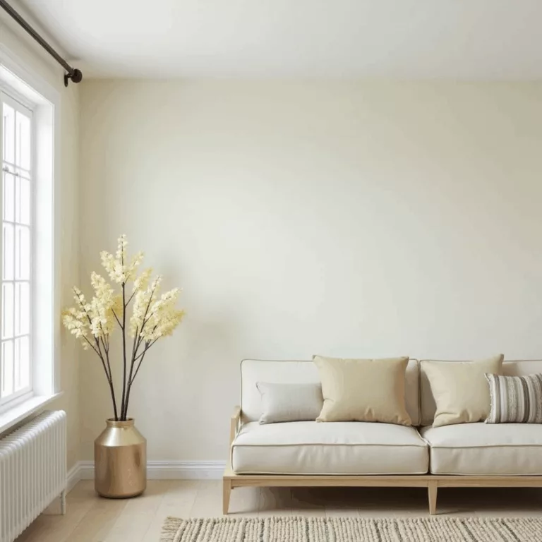
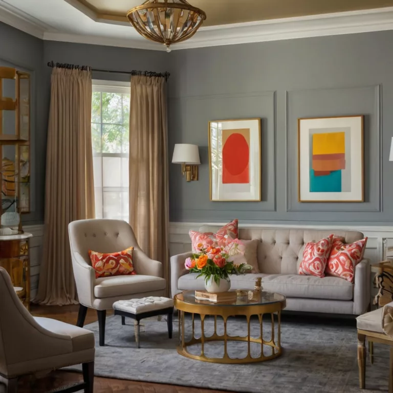
Warm vs. Cool Colors: How They Affect Your Space
Discover how warm vs. cool colors transform your living spaces. This comprehensive guide explores color psychology, practical applications, and expert tips to create the perfect atmosphere with strategic color choices.
Introduction to Warm vs. Cool Colors in Interior Design
The strategic use of warm vs. cool colors stands as one of the most powerful tools in interior design. Color selection goes far beyond aesthetic preferences—it fundamentally shapes how we experience and interact with our living environments. This comprehensive guide delves deep into the fascinating world of color temperature and its profound impact on spatial perception, mood regulation, and overall well-being.
When you understand the fundamental principles of warm vs. cool colors, you gain the ability to transform any space with intentionality and purpose. Whether you’re renovating a home, designing a commercial space, or simply refreshing your current environment, mastering the art of color temperature will elevate your results from merely attractive to genuinely transformative.
Understanding the Color Temperature Spectrum
At its core, the concept of warm vs. cool colors derives from color theory and represents a fundamental organizing principle on the color wheel. This temperature-based classification helps designers and homeowners make informed decisions about their spaces.
What Defines Warm Colors?
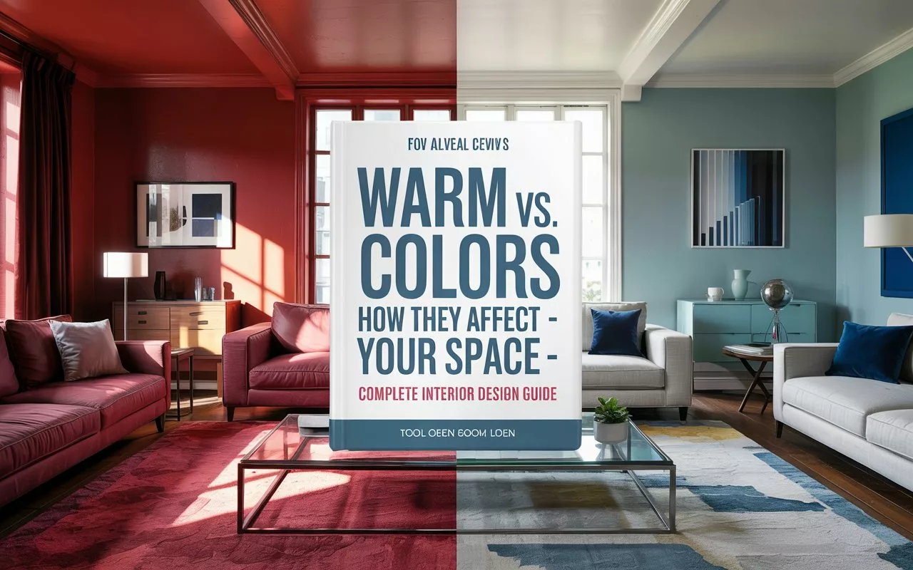
Warm colors encompass reds, oranges, yellows, and their various tints and shades. These hues evoke associations with fire, sunshine, and heat—elements that naturally generate warmth in both physical and psychological senses. The warm side of the color spectrum tends to:
- Create feelings of energy, passion, and stimulation
- Make spaces feel more intimate and cozy
- Visually advance toward the viewer, making spaces appear smaller
- Increase perceived temperature by 6-7 degrees compared to cool-colored rooms
Key warm colors include:
- Red: Passionate, energetic, attention-grabbing
- Orange: Friendly, welcoming, vibrant
- Yellow: Optimistic, cheerful, stimulating
- Warm neutrals: Beige, tan, terracotta, and brown
What Defines Cool Colors?
Cool colors include blues, greens, purples, and their various tints and shades. These hues connect to water, sky, and foliage—natural elements that typically provide relief from heat. The cool side of the color spectrum tends to:
- Promote feelings of calm, relaxation, and serenity
- Make spaces feel more open and expansive
- Visually recede from the viewer, making spaces appear larger
- Decrease perceived temperature by 6-7 degrees compared to warm-colored rooms
Key cool colors include:
- Blue: Calming, peaceful, trustworthy
- Green: Refreshing, balancing, natural
- Purple: Creative, luxurious, contemplative
- Cool neutrals: Gray, silver, and slate
The Transitional Hues: Bridging Warm and Cool
Some colors exist at the intersection of warm and cool temperatures, serving as versatile transitional hues:
- Green-yellow: Can lean warm or cool depending on its specific formulation
- Red-violet: Combines the energy of red with the mystique of purple
- Neutral grays: Can carry subtle warm or cool undertones
These transitional colors offer valuable flexibility in color schemes, acting as mediators between distinctly warm and cool palettes.
The Psychological Impact of Warm vs. Cool Colors
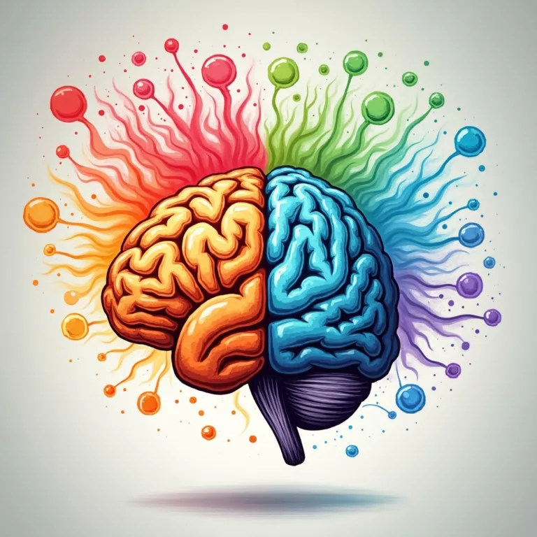
Color temperature profoundly influences our psychological and physiological responses to environments. Understanding these effects enables intentional design choices aligned with a space’s intended function.
Warm Color Psychology
Research consistently shows that warm colors trigger distinct psychological responses:
- Stimulation and Energy: Warm colors increase heart rate, blood pressure, and respiration—ideal for spaces where activity and engagement are desired.
- Appetite Stimulation: Reds and oranges have been shown to increase appetite, explaining their prevalence in restaurant design.
- Perceived Time: People tend to overestimate time spent in warm-colored environments, experiencing minutes as passing more slowly.
- Social Connection: Warm-toned spaces encourage conversation and social interaction, creating environments where people linger longer.
- Attention Direction: The eye naturally gravitates toward warm colors first, making them effective for highlighting architectural features or focal points.
Cool Color Psychology
Cool colors generate distinctly different psychological effects:
- Relaxation and Focus: Cool colors lower heart rate and blood pressure, creating environments conducive to concentration and tranquility.
- Perceived Space: Cool-colored rooms are consistently judged as larger than identically-sized warm-colored spaces.
- Time Perception: Time tends to be underestimated in cool environments, with minutes seeming to pass more quickly.
- Productivity Enhancement: Studies show improved performance on cognitive tasks in cool-colored environments, with decreased emotional reactivity.
- Temperature Regulation: Cool colors can create a subjective sense of temperature reduction, particularly valuable in naturally warm climates or south-facing rooms.
Warm vs. Cool Colors in Different Living Spaces
The strategic application of warm vs. cool colors varies significantly depending on a room’s function, orientation, and desired ambiance.
Living Rooms: Balancing Sociability and Relaxation
Living rooms often benefit from a thoughtful blend of warm and cool elements:
- Warm-dominant schemes create inviting, conversation-friendly environments ideal for entertaining and gathering.
- Cool-dominant schemes establish serene, relaxing atmospheres that encourage unwinding and stress reduction.
- Balanced approaches might incorporate a cool backdrop with warm accents, or vice versa, creating visual interest while serving multiple functions.
Design tip: Consider your living room’s primary purpose. Entertainment-focused spaces generally benefit from warmer palettes, while media rooms and reading nooks often work better with cooler schemes.
Kitchens: Energy vs. Cleanliness
Kitchen design presents fascinating opportunities for color temperature strategy:
- Warm kitchens feel welcoming and conducive to gathering, with colors like red stimulating appetite and conversation.
- Cool kitchens convey cleanliness and order, with blues and greens creating a sense of freshness and hygiene.
- Transitional approaches often work particularly well, such as warm wood cabinetry paired with cool marble or tile.
Design tip: Consider your cooking habits when selecting a kitchen palette. Active home chefs might prefer the energizing quality of warm tones, while those seeking a calm preparation environment might gravitate toward cooler schemes.
Bedrooms: Personal Retreat Spaces
Bedroom color temperature should align with personal temperament and sleep needs:
- Warm bedrooms create cocoon-like environments that feel secure and nurturing, ideal for those who find it difficult to wind down.
- Cool bedrooms promote restful sleep and stress reduction, helping active minds transition to sleep mode more effectively.
- Strategic combinations might incorporate cool walls with warm textiles, creating balance between relaxation and comfort.
Design tip: Consider body temperature preferences when designing bedrooms. Those who tend to feel cold might benefit from warming colors, while “hot sleepers” often prefer the psychological cooling effect of blues and greens.
Bathrooms: Cleanliness and Mood-Setting
Bathroom color temperature significantly impacts both perceived cleanliness and daily mood:
- Warm bathrooms create spa-like environments conducive to relaxation and self-care rituals.
- Cool bathrooms enhance feelings of cleanliness and freshness, with blues particularly effective at conveying hygiene.
- Transition strategies might include cool tiles with warm wood elements or lighting that can shift the perceived temperature.
Design tip: Morning-use bathrooms often benefit from energizing warm elements, while evening-use bathrooms may be more effective with relaxing cool tones.
Home Offices: Productivity and Focus
Home workspace color temperature should align with work style and outputs:
- Warm office elements can stimulate creativity and passion, beneficial for artistic or people-focused work.
- Cool office schemes enhance logical thinking and focus, supporting analytical tasks and detail-oriented work.
- Balanced approaches might use primarily cool colors with strategic warm accents to create an environment supporting multiple work modes.
Design tip: Consider your primary work challenges when selecting office colors. Those struggling with focus might benefit from cooler schemes, while those needing creative stimulation might incorporate warmer elements.
Practical Applications: Using Warm vs. Cool Colors Effectively
Beyond understanding theoretical principles, successful implementation requires practical knowledge of how to use warm vs. cool colors in real-world settings.
The 60-30-10 Rule for Color Temperature
Professional designers often employ the 60-30-10 rule when balancing warm and cool elements:
- 60% – Primary color temperature (usually applied to walls)
- 30% – Secondary color temperature (often found in furniture and textiles)
- 10% – Accent temperature (accessories and small details)
This proportion creates visual harmony while allowing for dynamic contrast between warm and cool elements.
Room Orientation and Natural Light
A space’s exposure significantly impacts optimal color temperature choices:
- North-facing rooms receive cool, indirect light that can make spaces feel chilly. Warm colors help counteract this effect, bringing balance and comfort.
- South-facing rooms receive abundant warm sunlight. Cool colors can provide visual relief and temperature balance in these naturally bright spaces.
- East-facing rooms receive morning light, transitioning to shadow. Adaptable schemes that work in both warm and cool light are ideal.
- West-facing rooms receive afternoon and evening light. Colors should be selected with awareness of how evening amber light will interact with the palette.
Color Temperature and Room Size Perception
Strategic use of warm vs. cool colors can visually alter spatial dimensions:
- Small spaces can appear larger with cool colors, which visually recede and create a sense of openness.
- Large spaces can feel more intimate and cozy with warm colors, which visually advance and create a sense of enclosure.
- Low ceilings seem higher when painted in cool tones, especially when slightly lighter than the walls.
- High ceilings feel more proportional when painted in warm tones that visually bring the surface closer.
Seasonal Considerations in Color Temperature
In regions with distinct seasons, color temperature strategies might include:
- Cold-climate homes often benefit from warming colors that psychologically counteract external chill and shorter daylight hours.
- Hot-climate homes typically feel more comfortable with cooling colors that provide visual relief from external heat.
- Four-season climates might employ adaptable strategies, such as warm-cool neutral backgrounds with seasonal accent changes through textiles and accessories.
Creating Harmony: Balancing Warm and Cool Colors
Few spaces benefit from exclusively warm or cool palettes. The art lies in creating thoughtful balance between temperature extremes.
Techniques for Temperature Integration
Professional designers use several approaches to harmonize warm and cool elements:
- Neutrals as mediators: Warm grays, cool beiges, and true neutrals can bridge temperature divides.
- Graduated transitions: Creating a visual journey from warm to cool areas can guide movement through a space.
- Unified intensity: Maintaining consistent saturation and value levels across warm and cool elements creates cohesion despite temperature differences.
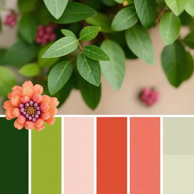
- Natural inspiration: Nature’s combinations of warm and cool (think sunset skies or forest scenes) provide reliable templates for balanced interiors.
Color Temperature Across Connected Spaces
In open-plan homes or spaces with visual connections, temperature flow becomes crucial:
- Temperature zoning: Designating functional areas through color temperature creates distinction without physical barriers.
- Gradient progression: Gradually shifting from warmer to cooler areas (or vice versa) creates natural flow through a home.
- Connector neutrals: Using temperature-flexible neutrals in transitional spaces helps mediate between distinctly warm and cool rooms.
Using Material to Moderate Temperature
Beyond paint and textiles, material selection significantly impacts perceived color temperature:
- Woods: Natural woods generally read as warm, with lighter species like maple offering gentler warmth than darker options like walnut.
- Metals: Gold, copper, and brass read as warm, while silver, chrome, and nickel appear cool.
- Stone: Marble ranges from cool whites to warm travertines, while granite spans from cool blacks to warm ambers.
- Glass: Clear glass generally reads as cool, though it can be manufactured with warm or cool tints.
Advanced Techniques: Color Temperature Mastery
For those seeking sophisticated results, advanced understanding of how warm and cool colors interact reveals powerful design strategies.
The Rule of Temperature Contrast
Controlled temperature contrast creates visual interest and directs attention:
- Focal points stand out most effectively when they contrast with surrounding temperature (warm accents in cool rooms, or vice versa).
- Architectural features gain emphasis through temperature distinction from adjacent surfaces.
- Art display benefits from temperature consideration—warm-dominant artwork often pops against cool backgrounds, while cool-dominant pieces stand out against warm surroundings.
Layering Within Temperature Families
Depth emerges through variations within a temperature category:
- Monochromatic warm schemes gain richness through layering multiple warm hues rather than repeating a single color.
- Tonal cool approaches create sophisticated depth by combining various cool colors with shared undertones.
- Temperature gradients can create visual movement, such as transitioning from yellow-greens to blue-greens in a cool-dominant space.
Lighting’s Effect on Color Temperature
Light sources dramatically influence how warm and cool colors are perceived:
- Incandescent and halogen lighting enhances warm colors while potentially making cool colors appear muddy.
- LED and fluorescent lighting often flatters cool colors while potentially making warm colors appear dull.
- Color-adjustable lighting offers unprecedented flexibility, allowing spaces to shift between warm and cool atmospheres.
Design tip: Always test paint colors under the specific lighting conditions of the space they’ll occupy, observing them at different times of day if natural light is present.
Cultural and Personal Dimensions of Warm vs. Cool Colors
Color temperature preferences and meanings vary significantly across cultural contexts and individual experiences.
Cultural Variations in Temperature Perception
Cultural background influences how warm and cool colors are interpreted:
- Western traditions often associate cool blues with trustworthiness and professionalism, while warm reds connote passion or danger.
- Eastern traditions may view red as auspicious and celebratory, while white (often perceived as cool) can signify mourning in some contexts.
- Regional differences emerge even within cultures—Mediterranean regions often embrace warm terracottas and ochres, while Scandinavian design typically favors cool blues and grays.
Individual Factors in Temperature Response
Personal experience shapes unique relationships with color temperature:
- Past associations with particular colors affect emotional responses regardless of temperature category.
- Genetic factors influence color perception, with some individuals more sensitive to certain wavelengths.
- Neurological diversity can impact color temperature processing—for example, some on the autism spectrum report heightened sensitivity to warm colors.
Generational Trends in Warm vs. Cool Preferences
Historical context creates generational patterns in color temperature preferences:
- 2020s: Increased interest in biophilic design has elevated cool-leaning greens and blues in contemporary interiors.
- 2010s: Saw the dominance of cool grays, eventually warming toward the decade’s end.
- 1990s-2000s: Featured warm beiges, taupes, and Tuscan palettes.
- 1980s: Embraced cool pastels followed by jewel tones spanning both temperature categories.
- 1970s: Characterized by warm earth tones like avocado, harvest gold, and burnt orange.
Practical Tips for Implementing Warm vs. Cool Color Strategies
Translating color temperature theory into actual environments requires practical implementation knowledge.
Testing Before Committing
Professional approaches to color selection include:
- Large-scale samples: Paint significant swatches (at least 2′ x 2′) on multiple walls to observe how light interacts with the color throughout the day.
- Living with samples: Give yourself at least 72 hours with a color sample before making decisions, noting how it feels in different lighting conditions.
- Digital visualization: Use color visualization apps that show potential schemes in real-time through smartphone cameras, though these should supplement rather than replace physical samples.
Budget-Friendly Temperature Adjustments
Color temperature can be modified without complete renovations:
- Textiles and accessories: Pillows, throws, curtains, and rugs offer low-commitment ways to shift a space’s temperature balance.
- Lighting adjustments: Simply changing bulb temperature from cool to warm (or vice versa) significantly impacts color perception.
- Art and décor: Introducing artwork or accessories in warming or cooling colors provides focal points that can influence overall temperature perception.
Professional Consultation Value
For challenging spaces or significant projects, professional guidance offers several advantages:
- Trained perception: Color professionals perceive subtle undertones and temperature interactions that might escape untrained observers.
- Experience-based prediction: Professionals can accurately predict how colors will appear once applied at full scale.
- Whole-home harmony: Design professionals consider how color temperature flows between spaces, creating cohesive environments.
Future Trends in Warm vs. Cool Color Application
The design world continues to evolve in its approach to color temperature, with several emerging trends worthy of consideration.
Biophilic Integration
Research on nature’s psychological benefits is influencing color temperature strategies:
- Natural temperature patterns: Increasing interest in replicating nature’s temperature gradients indoors, such as cooler “sky” ceilings transitioning to warmer “earth” lower walls.
- Seasonal alignment: Growing interest in spaces that adjust temperature balance seasonally, mirroring natural light patterns.
- Complexity appreciation: Moving beyond simple warm/cool designations toward the complex temperature interactions found in natural environments.
Well-being Centered Design
Increasing focus on design’s health impacts is reshaping color temperature application:
- Circadian support: Color schemes that shift from energizing warm morning light to relaxing cool evening atmospheres, supporting natural body rhythms.
- Mood regulation: Spaces designed with temperature zones specifically created to support different emotional needs throughout the day.
- Cognitive consideration: Color temperature strategies tailored to support specific cognitive functions in different areas.
Personalization and Adaptability
Technology is enabling unprecedented color temperature flexibility:
- User-controlled environments: Smart lighting and digital surfaces allowing real-time adjustment of perceived color temperature.
- Responsive design: Emerging materials that naturally shift temperature appearance in response to environmental conditions.
- Individualized optimization: Growing interest in color temperature schemes customized to individual neurological and psychological profiles.
Conclusion: Mastering the Art of Warm vs. Cool Colors
The strategic use of warm vs. cool colors represents one of the most powerful yet accessible tools in environmental design. By understanding the fundamental principles outlined in this guide, anyone can harness color temperature to create spaces that not only look beautiful but actively support wellbeing, functionality, and emotional experience.
Whether you’re planning a comprehensive renovation or simply refreshing a space with new accessories, conscious attention to the balance of warm and cool elements will elevate your results from merely attractive to truly transformative. The most successful environments typically avoid temperature extremes, instead finding harmonious balance points that create spaces feeling simultaneously energizing and relaxing, stimulating and serene.
As you apply these principles to your own environments, remember that the most important measure of success lies not in adherence to rules but in how a space makes you feel. The perfect warm vs. cool balance is ultimately the one that creates environments where you and others feel most alive, productive, relaxed, and at home.
FAQs About Warm vs. Cool Colors
Q: Can I use both warm and cool colors in a small space, or should I stick to just cool colors to make it feel larger?
A: While cool colors generally make spaces feel larger, thoughtfully incorporated warm accents can add necessary dimension without sacrificing spaciousness. Consider using cool colors for large surfaces (walls, floors) while introducing warm elements through accessories and focal points.
Q: How do I determine if a neutral color leans warm or cool?
A: Compare the neutral to pure gray under natural light. Warm neutrals will reveal undertones of yellow, red, or brown, while cool neutrals show undertones of blue, green, or purple. You can also place the neutral between clearly warm and cool samples to see which it appears more harmonious with.
Q: Will warm colors make my north-facing room feel too small or overwhelming?
A: Not necessarily. While warm colors do visually advance, choosing lighter tints rather than saturated warm hues can counterbalance this effect. Warm whites, soft corals, and gentle terracottas can add warmth without significant space-reduction effects.
Q: How can I use warm vs. cool colors to make an uncomfortably tall ceiling feel more proportional?
A: Paint the ceiling in a warm color that’s a few shades darker than the walls to visually bring it lower. Alternatively, extend the ceiling color down the wall by 12-18 inches to create a visual boundary that interrupts the vertical expanse.
Q: Do warm and cool colors affect everyone the same way psychologically?
A: While general tendencies exist across populations, individual experiences with color temperature vary based on cultural background, personal associations, and even neurological differences. Always consider the specific users of a space when making color temperature decisions.

